
FITCRATE
Fitness Supplement Website / UX/UI Design / 2023
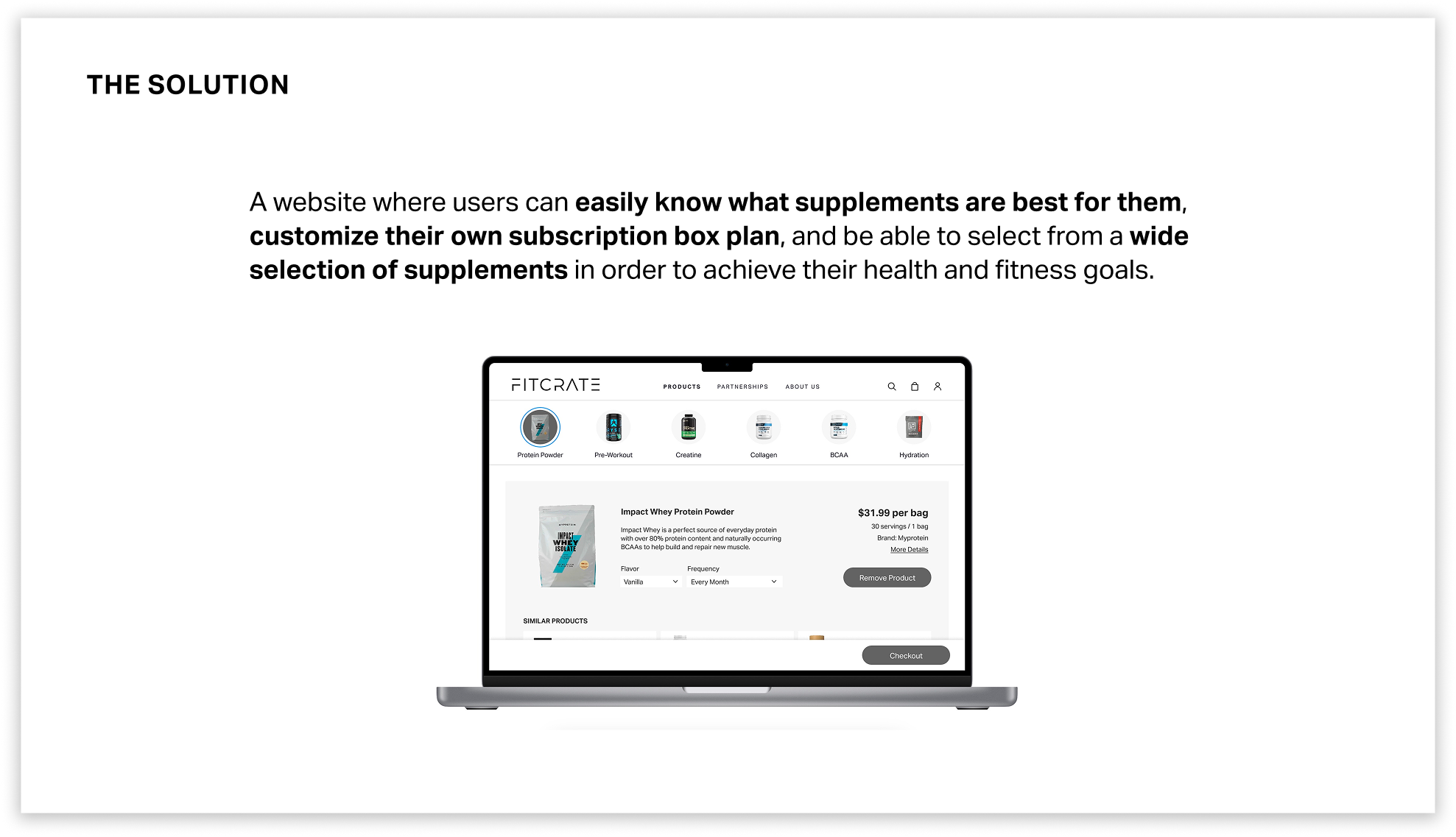
A website designed for beginner and intermediate fitness goers who want to know what supplements are best for them, personalize their products, and select from a wide variety of supplements.
What I learned:
Conducted competitive analysis across direct and indirect competitors
Developed an understanding of user flows and information architecture
Prototyped within a defined brand language and visual system.
METHODS & TOOLS
Figma
Ideation
Prototyping
User Flows
Directed Storytelling
Competitive Analysis
Site Maps
Wireframing
Visual Brand Language

Achieve a greater you.

CONTEXT
USER & MARKET RESEARCH
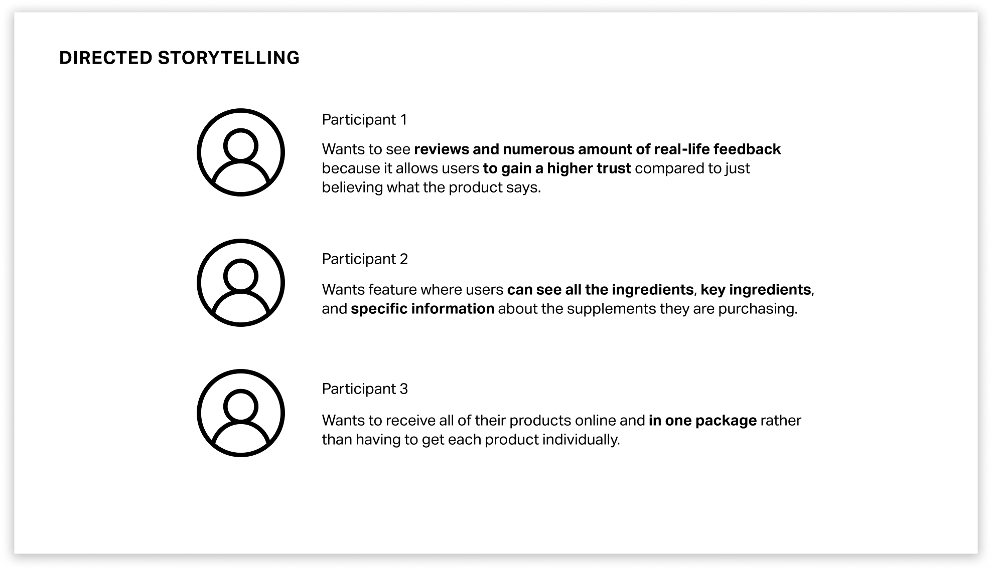
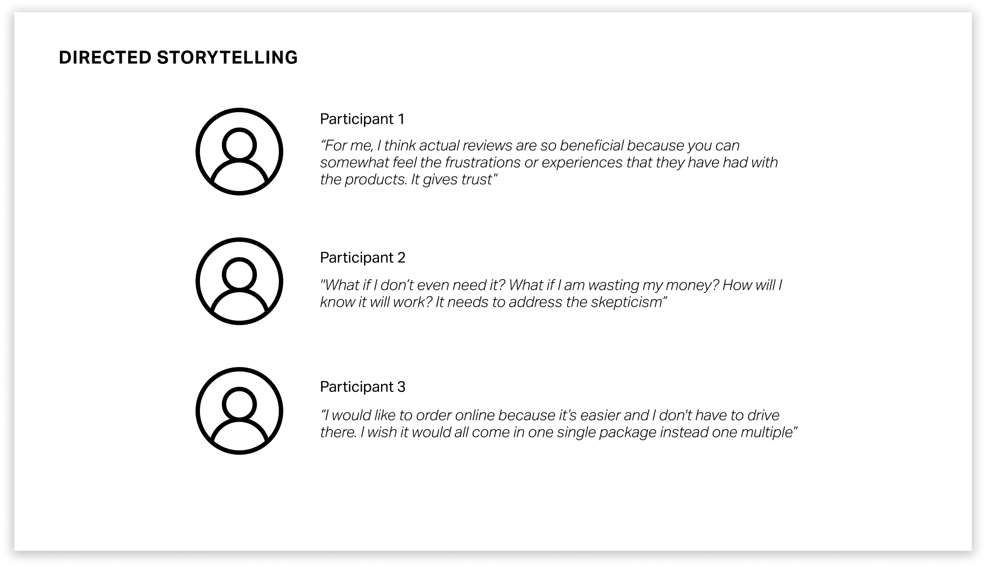
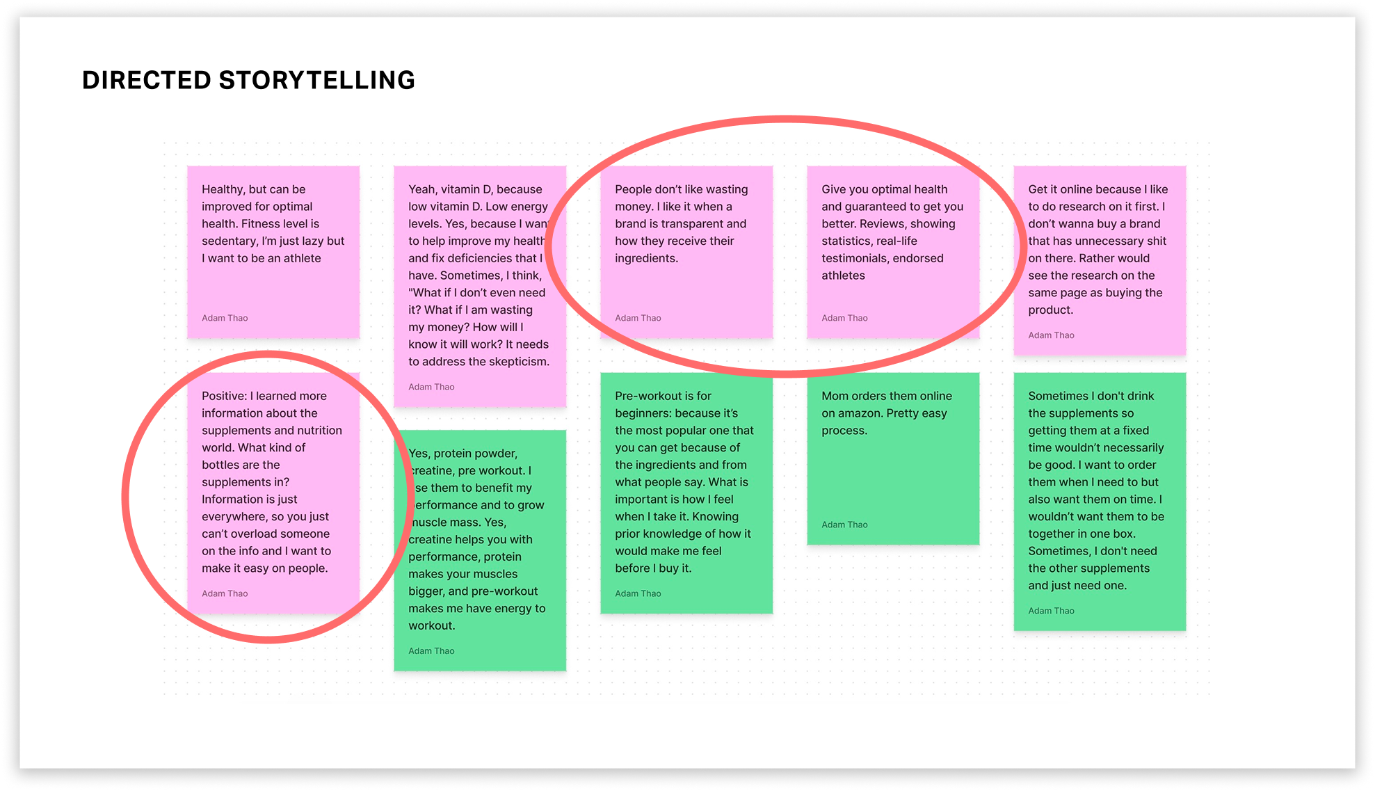
The first part of coming up with the solution (Fitcrate) was conducting user research. Directed storytelling through interviews with three participants allowed me to really understand the different pain points when it came to buying or using nutritional supplements.
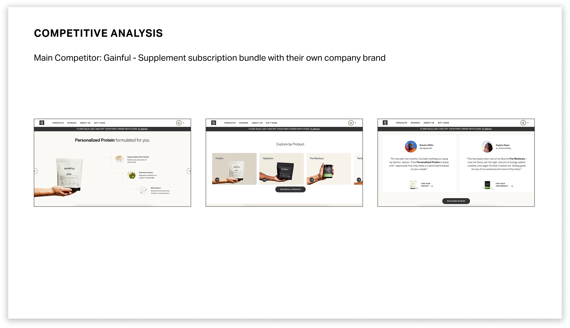
After user research, I conducted a competitive analysis to help me identify the strengths and weaknesses of the current competitors, which allowed me to identify opportunities to create a product that could exist in the current market space. There were six competitors: Gainful, Ritual, Cratejoy, Hungryroot, Pluto, and Bespoke Post. Gainful, a supplement subscription-based company, was the main competitor.
KEY INSIGHTS & CRITERIA
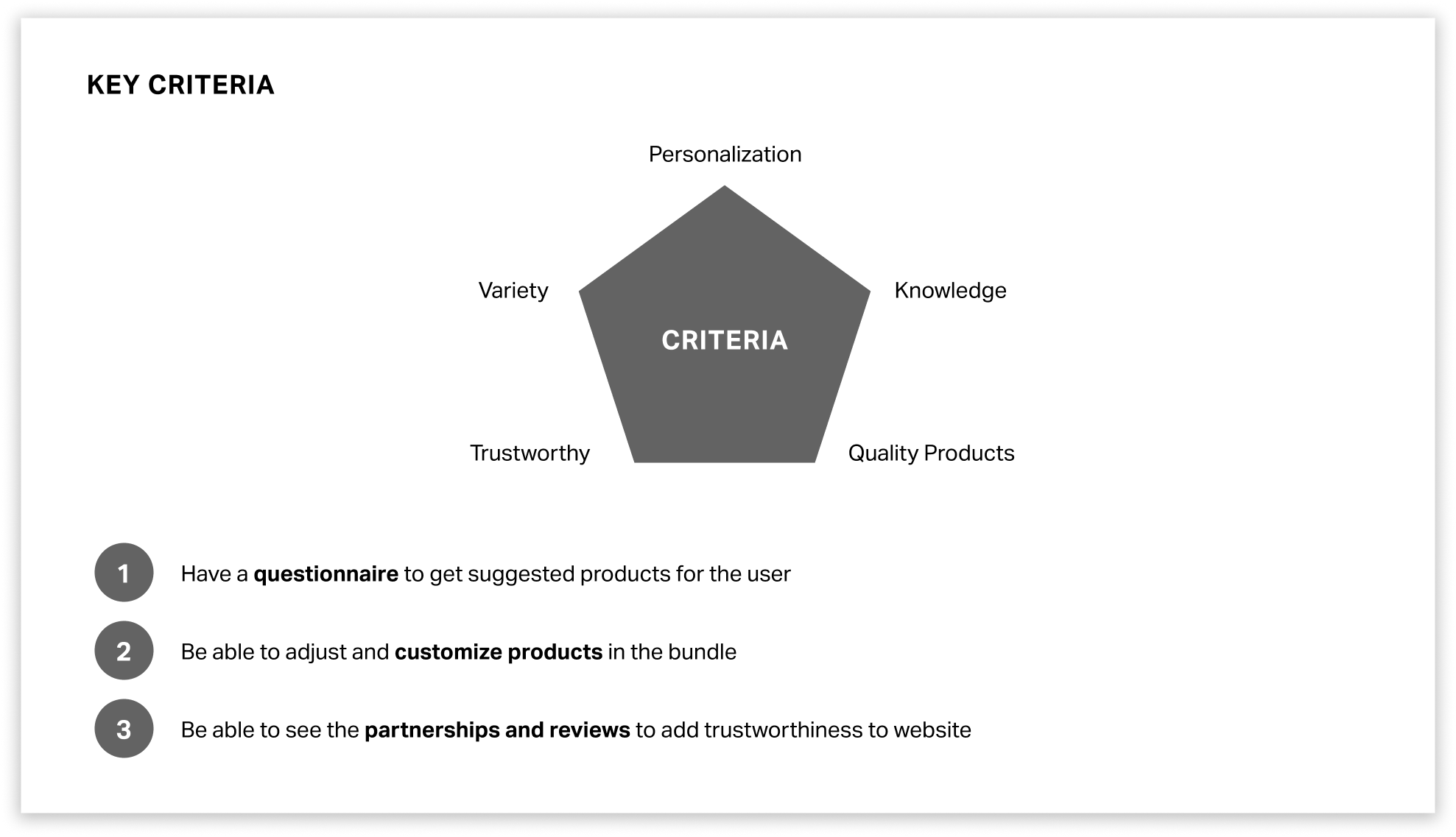
Through directed storytelling and analysis of competitor websites, I discovered that users want an easy way to find supplements catered to their needs, understand why the products are good for them, and want to be able to trust the information presented.
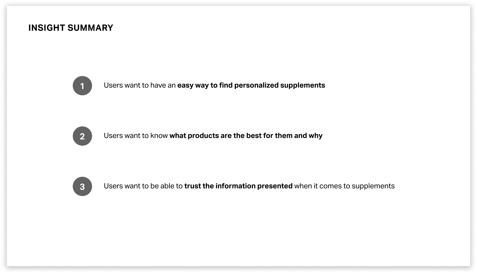
These insights led me to making sure that Fitcrate would have personalization, provide trustworthy and knowledgeable information, and offer a wide variety of quality products. These criteria would be represented in features of a questionnaire, product customization, and reviews and partnerships with different supplement brands and companies.
INFORMATION ARCHITECTURE
I started implementing the criteria in the design of my website. I ideated and came up with how each key feature would look like.
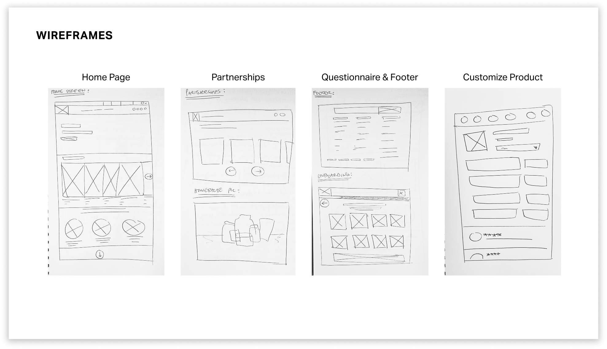
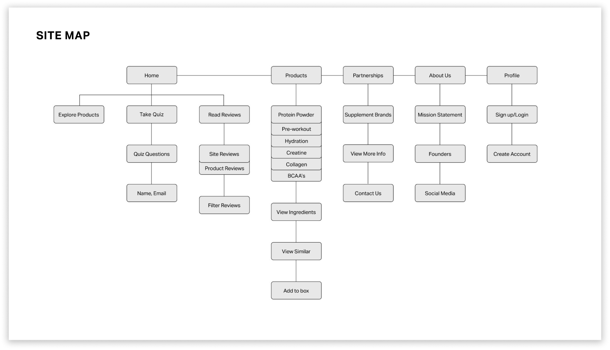
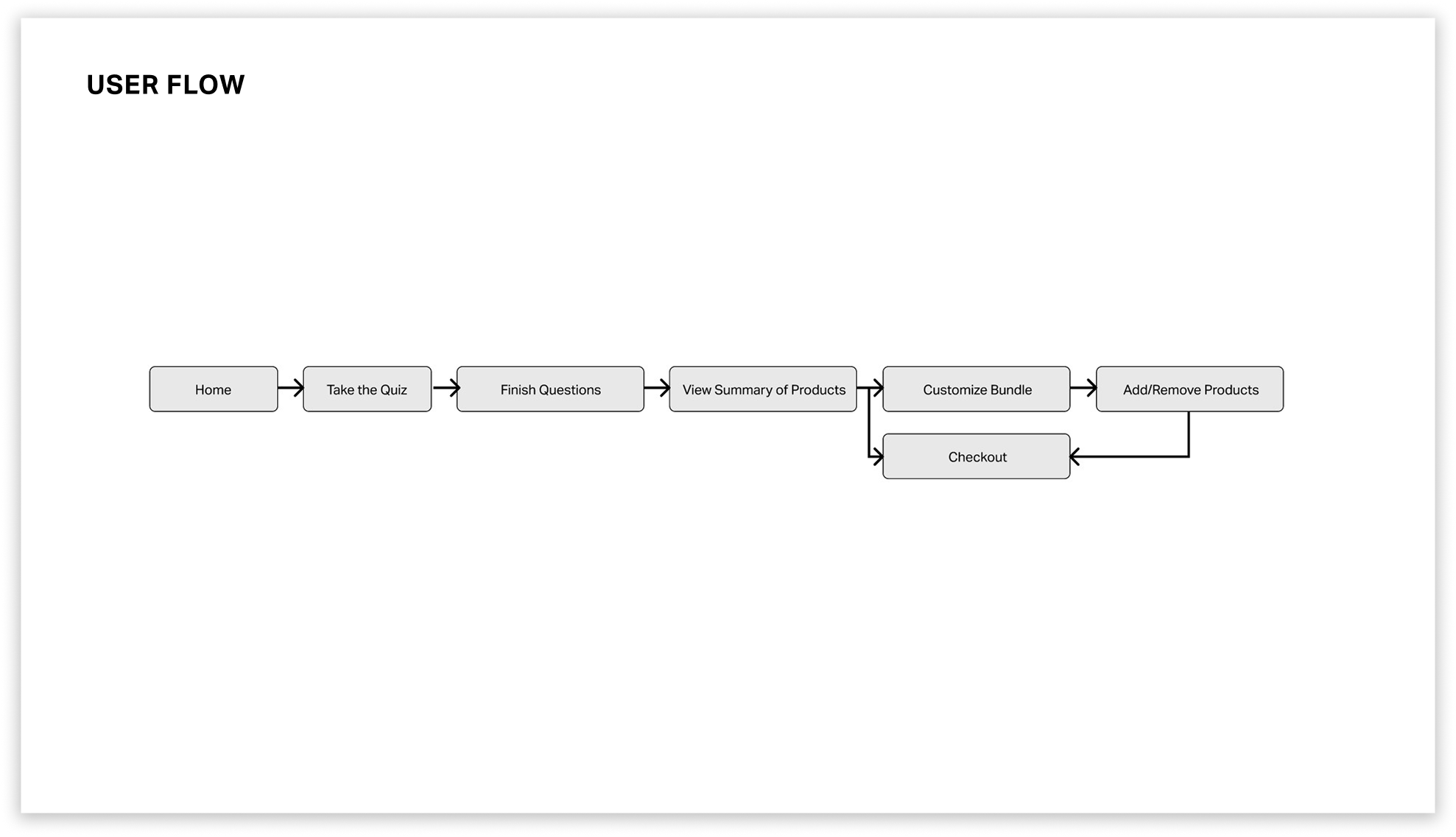
After sketching low-fidelity wireframes, I created a site map to see what the website would contain with its key features.
To solve this issue, I created a back button that would allow the user to easily know how to navigate back to the home page. This would allow users to easily identify the back button, as it is at the top of every page. Users can identify and click the back button, taking them back to the home page.
In addition, I created a user flow in to see how the website would function in the most common scenario as a beginner or intermediate user.
For the next finding, the Lack of Feedback, I found that users often thought they were required to upload more than one photo of their ID because there wasn’t any feedback letting the user know that the image of their ID had uploaded. In addition, the upload button was still present after uploading an image. This caused users to become frustrated and confused, thinking they had to upload multiple images.
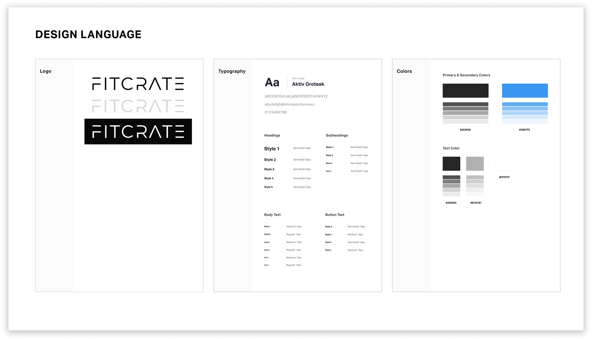
After wireframing, I created a style guide to have a better understanding of how the website’s aesthetic and typography would look like. I wanted to convey a serious, modern, and uplifting aesthetic for the website.
THREE MAIN FEATURES
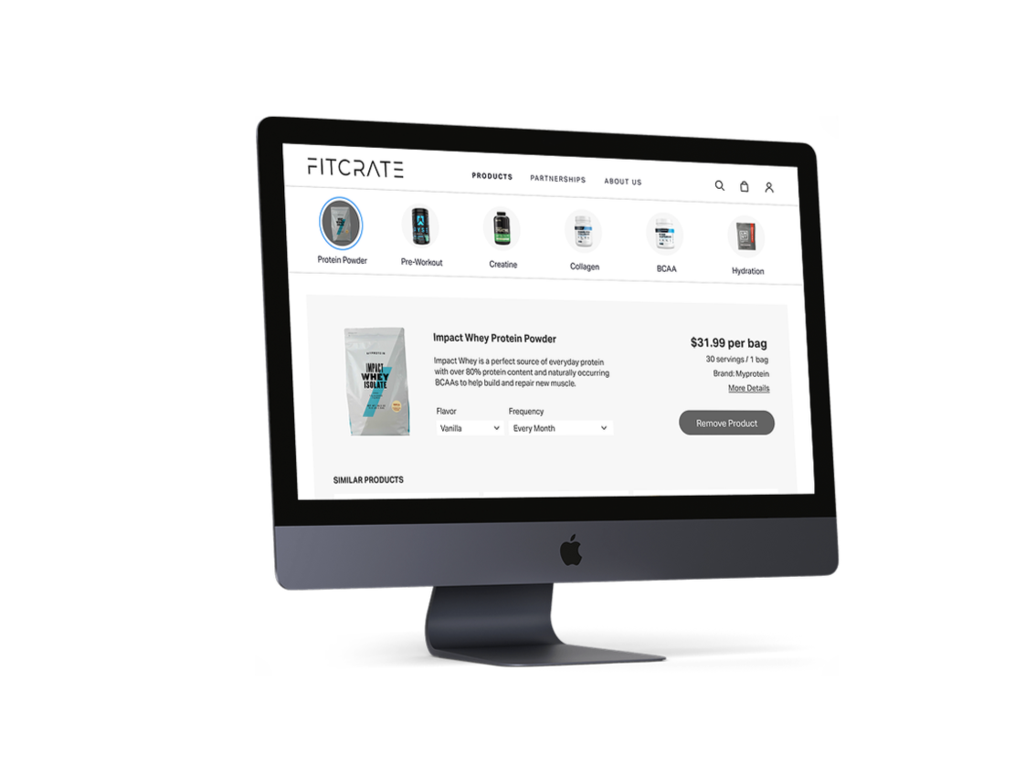
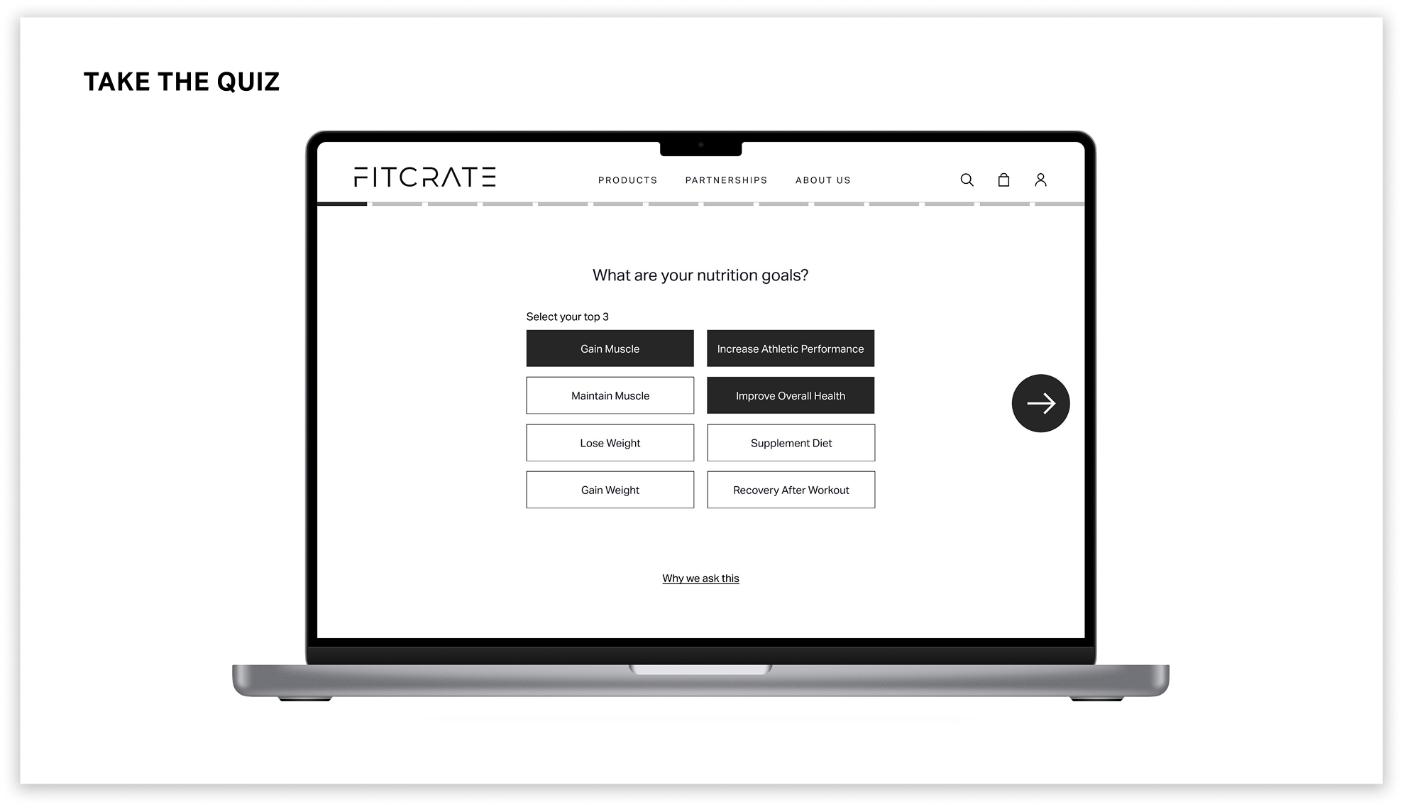
This feature enables users to take a quiz to determine which products are best suited for them. After finishing the quiz, the info is submitted, and the user receives a bundle of supplements relating to their answers. This feature is completely optional, but recommended for beginner and intermediate fitness goers. Users can skip the quiz to explore and create their own subscription bundle from a wide variety of products.
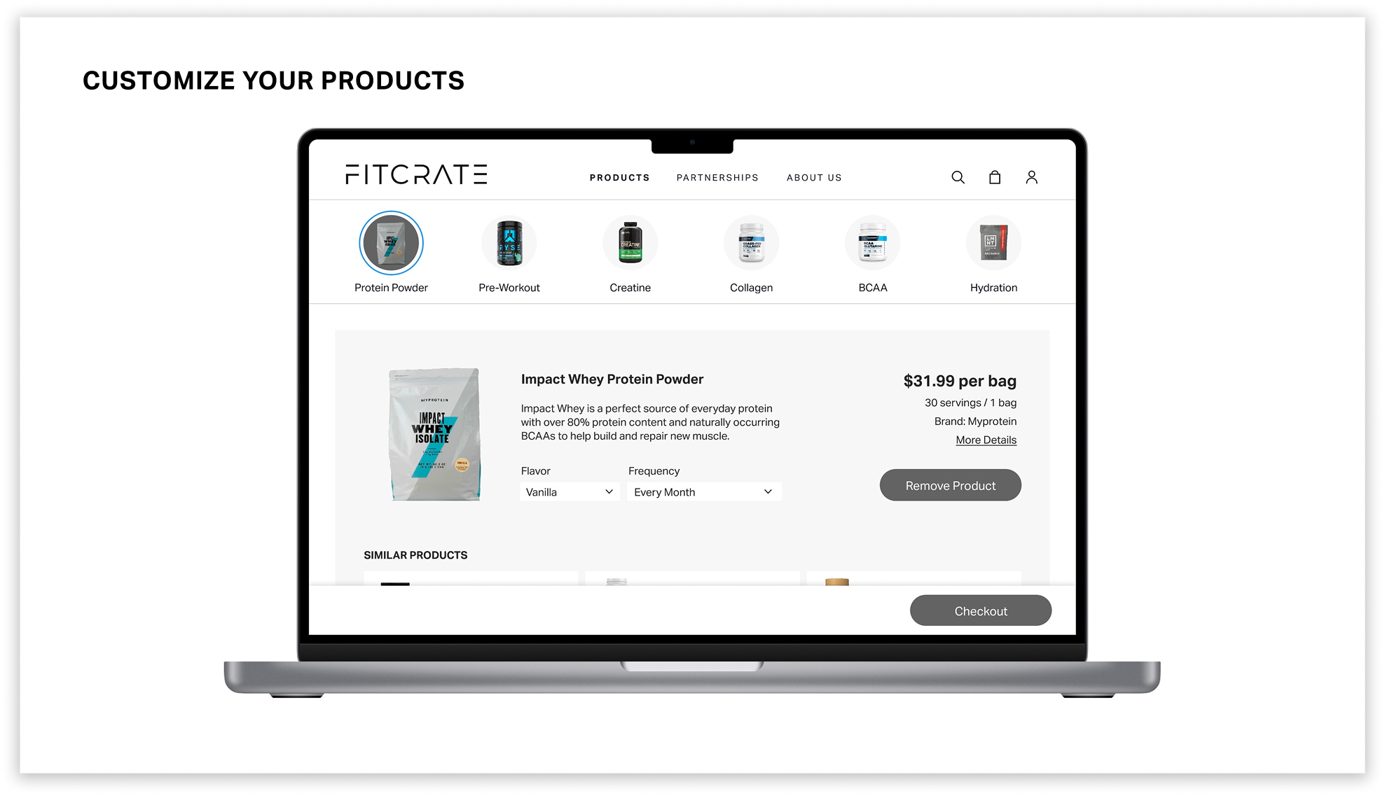
Users are able to look at the key ingredients of products and customize their bundle. Additionally, users can explore a wide range of products similar to their suggested ones. This provides the user with convenience and flexibility when selecting the right supplement.
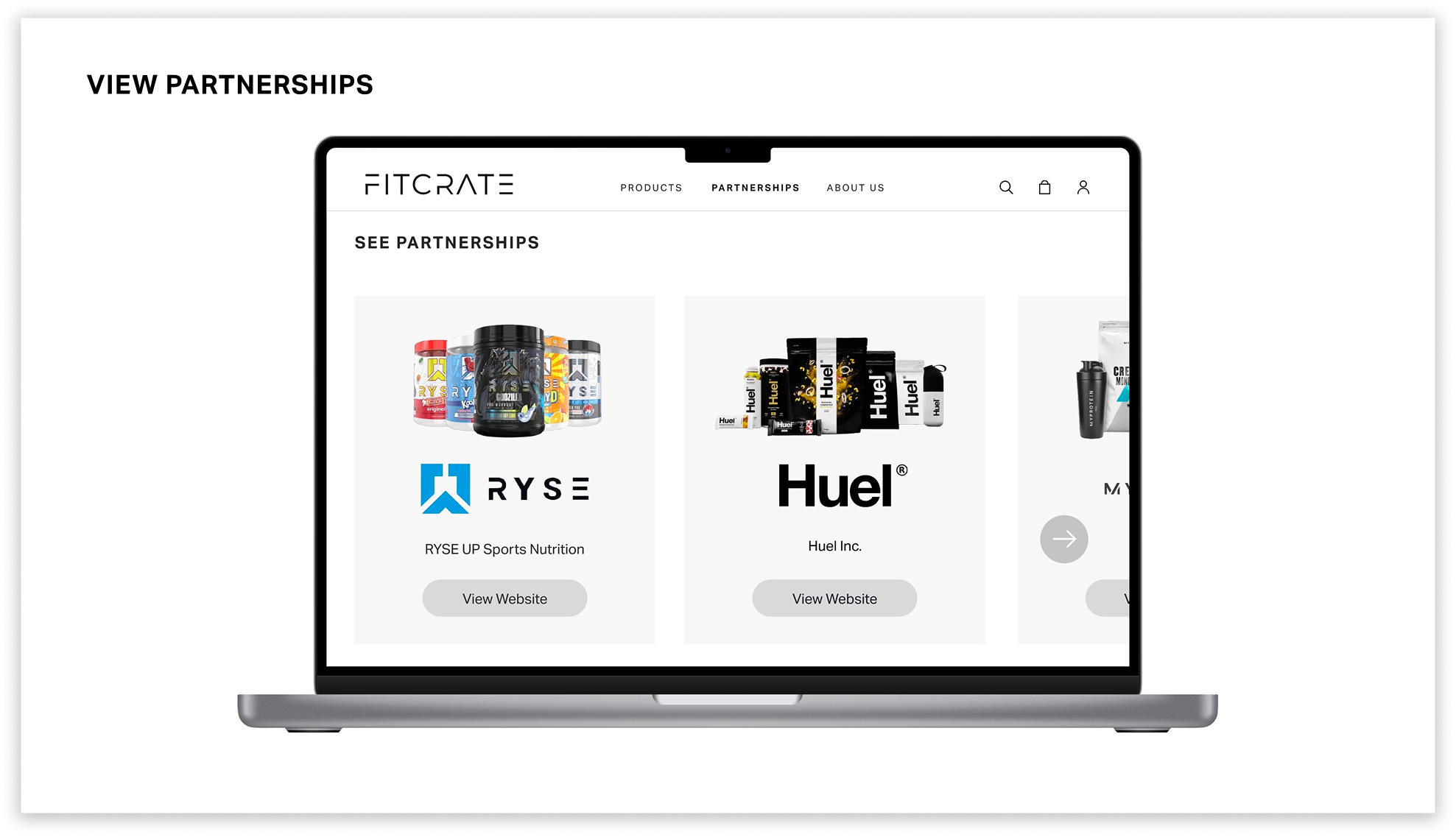
This page allows users to view the different partnerships that Fitcrate partners with to gain a higher level of trust in Fitcrate’s selection of products. The user can scroll through the carousel and view more information about each company.
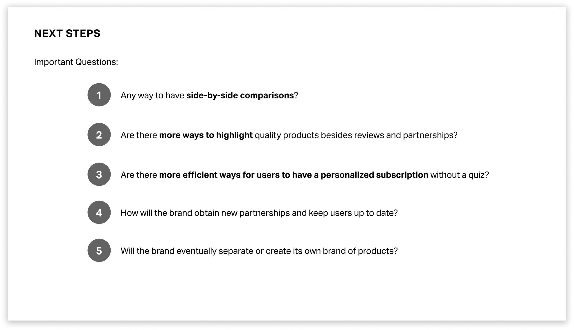
NEXT STEPS
Some things that I am excited to dig deeper into are finding more ways to compare the products that are listed. For example, maybe thinking about having a way to compare two products side-by-side, or maybe even looking into more ways of verification for high-quality products. Here are some of the important questions to ask when thinking about the next steps of this project.