

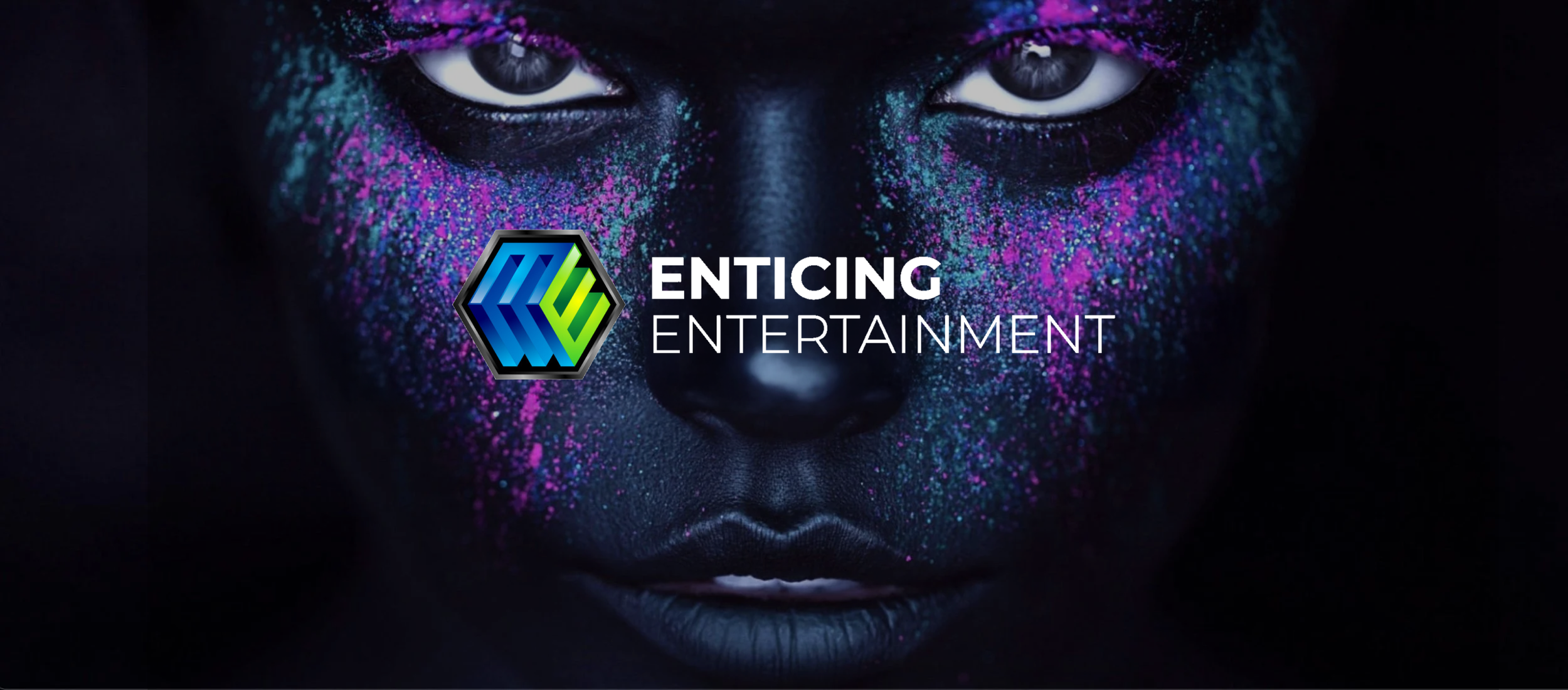
ENTICING ENTERTAINMENT
Prototype Improvements / Team Project / UX Research / 2023
This project intends to find key insights through contextual inquiry in order to prototype improvements for Enticing Entertainment’s event application.
METHODS & TOOLS
What I learned:
Worked closely with the client to help achieve their vision while recommending solutions that will make it better
Developed an understanding of how to host effective and efficient remote-moderated research sessions
Asking the right questions to guide research methods
Contextual Inquiry
Evaluative Research
Think-Aloud Protocol
Task Analysis
Design Ethnography
Moderated Research
Figma
Prototyping
Cognitive Walkthrough

Stand out. Wow your guests.

CONTEXT
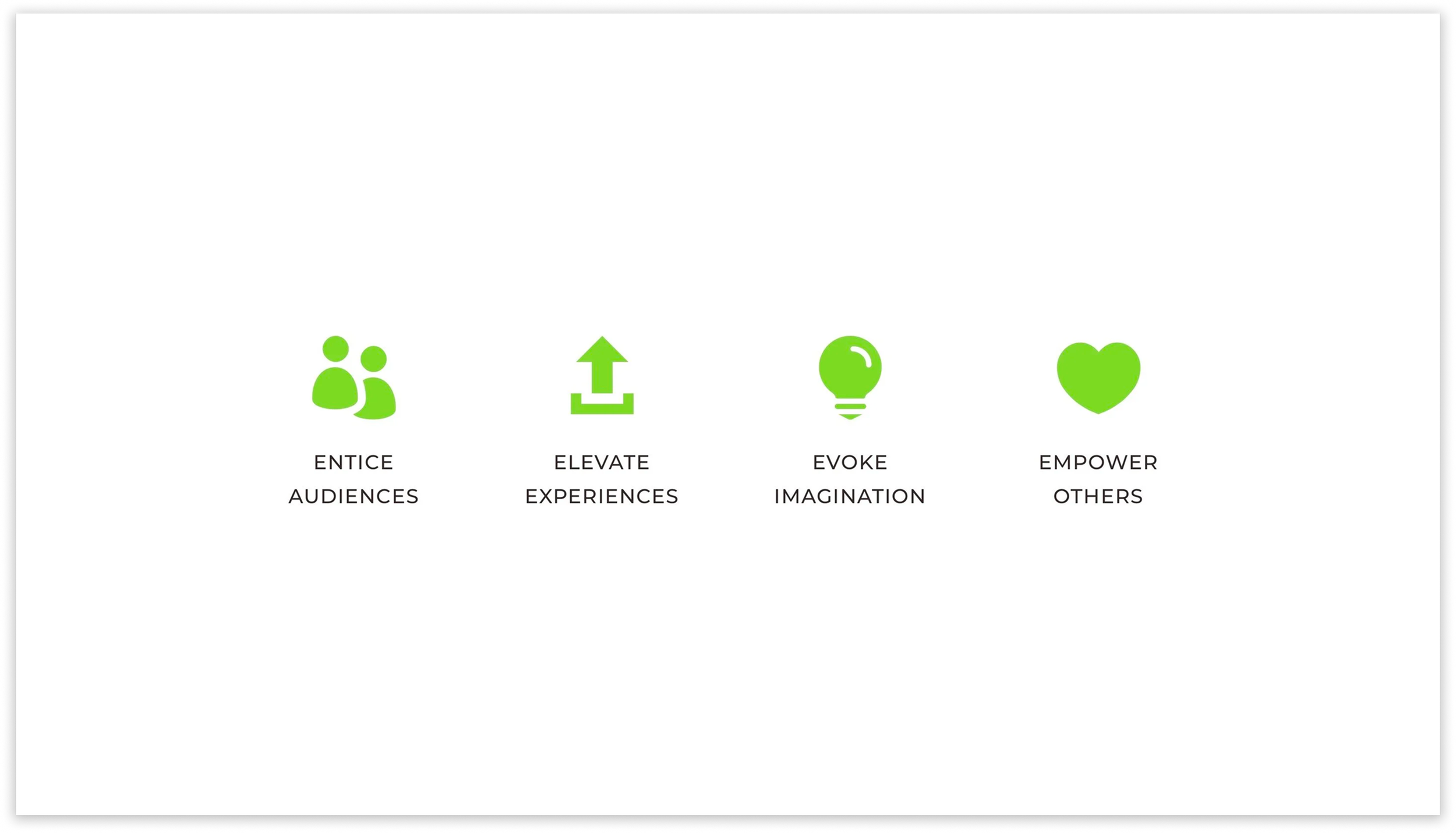
Enticing Entertainment (EE) aims to entice audiences, elevate experiences, evoke imagination, and empower others. EE works with event hosts and third-party event planners to plan events with a focus on performance arts to create unique and immersive event experiences.
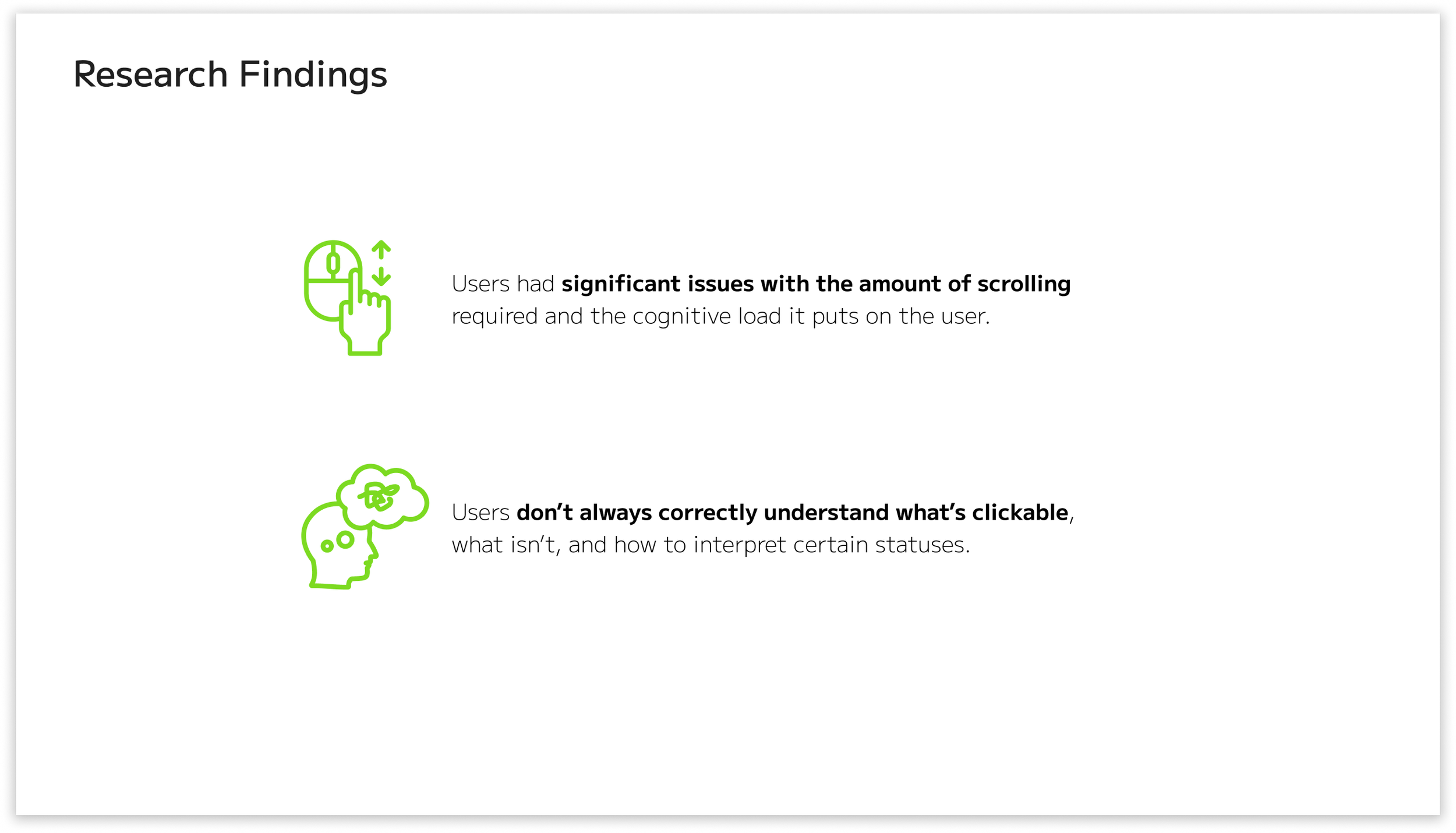
INITIAL RESEARCH FINDINGS
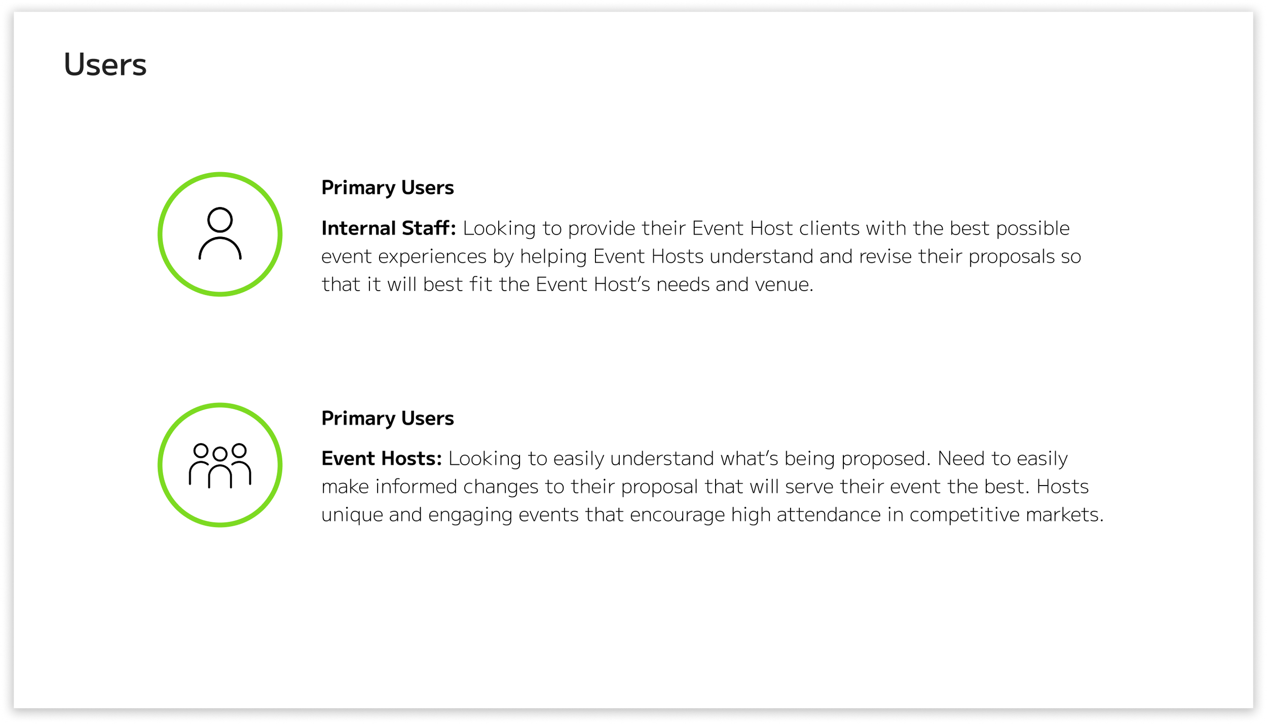
We determined the best course of action was to find what users needed to accomplish the event application. Our team navigated through EE’s event application and also reviewed the provided recordings on how to use the application. We accomplished all of the listed tasks, but it wasn’t without many faults. We found many key insights, but there were two that had the most impact on the application.
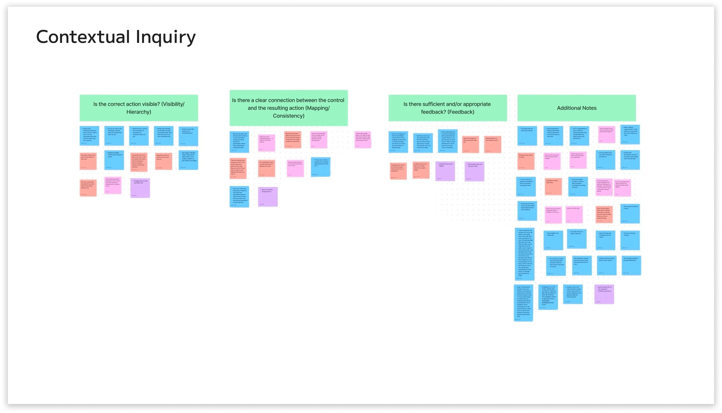
CONTEXTUAL INQUIRY
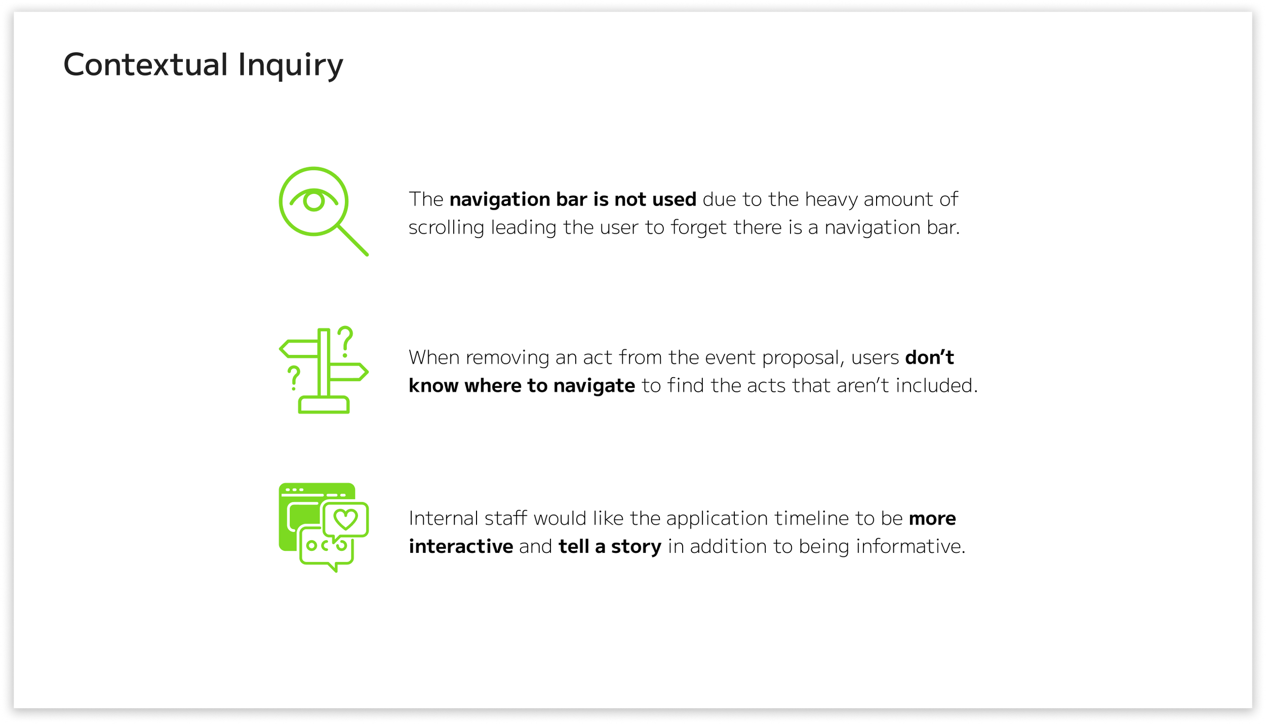
Our group conducted contextual inquiries with three total users, two of whom are internal staff. We conducted this method remotely on Zoom. We had one moderator, one tech lead, and two notetakers. We found three key insights in addition to the previous ones.
RECOMMENDATION 1
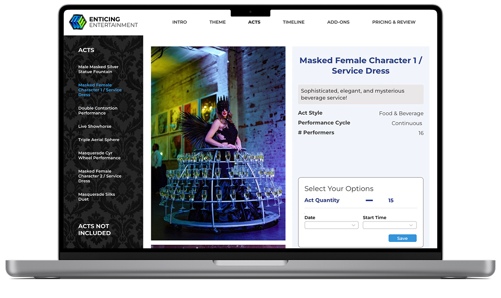
With the key findings, I decided to focus on the two criteria that were initially found, as well as during contextual inquiry: The heavy amount of scrolling and knowing what’s clickable when editing the acts. I also focused on other criteria, such as making sure the navigation bar is more visible to the user and making the overall application more aesthetically pleasing to users.
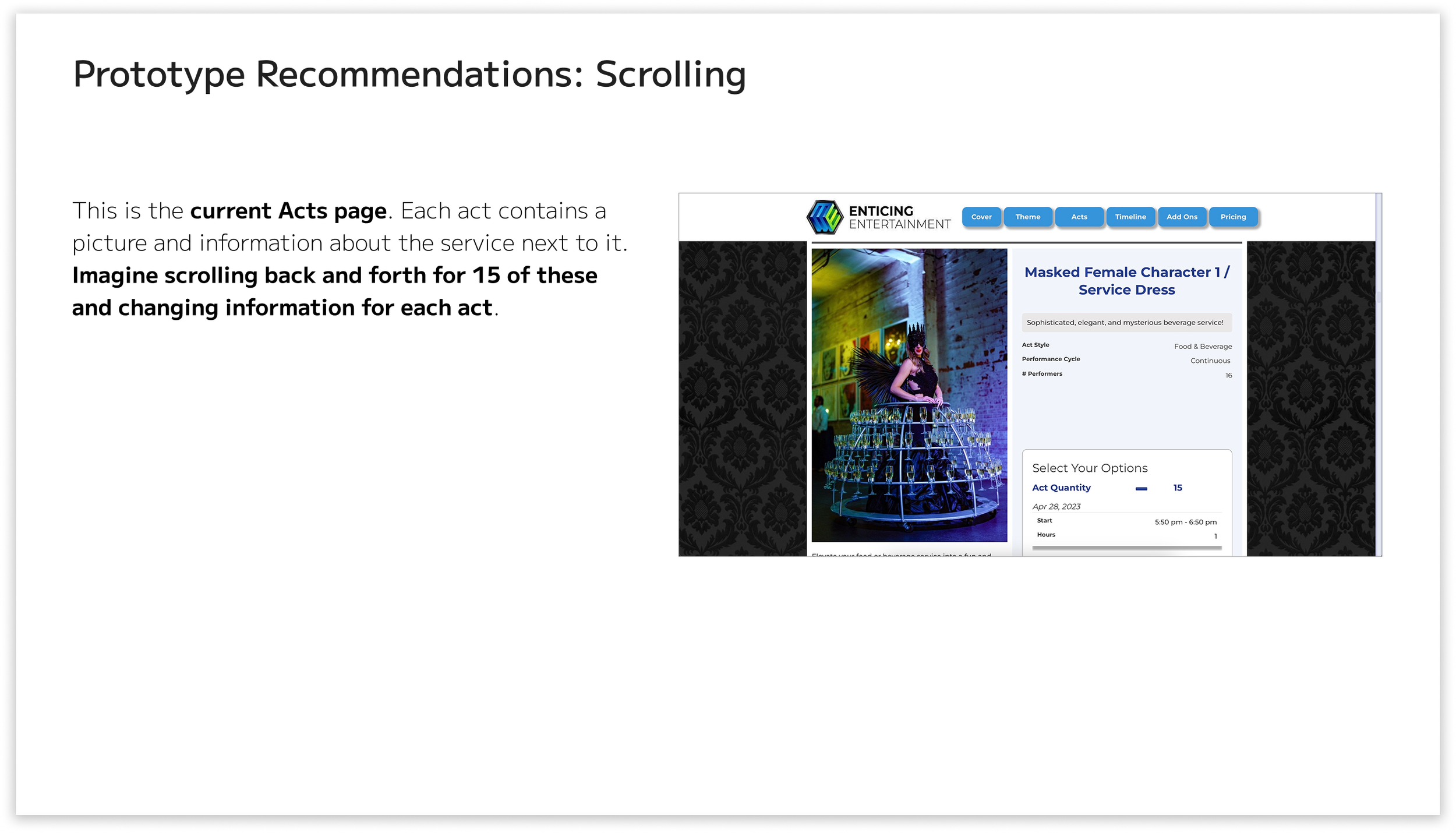
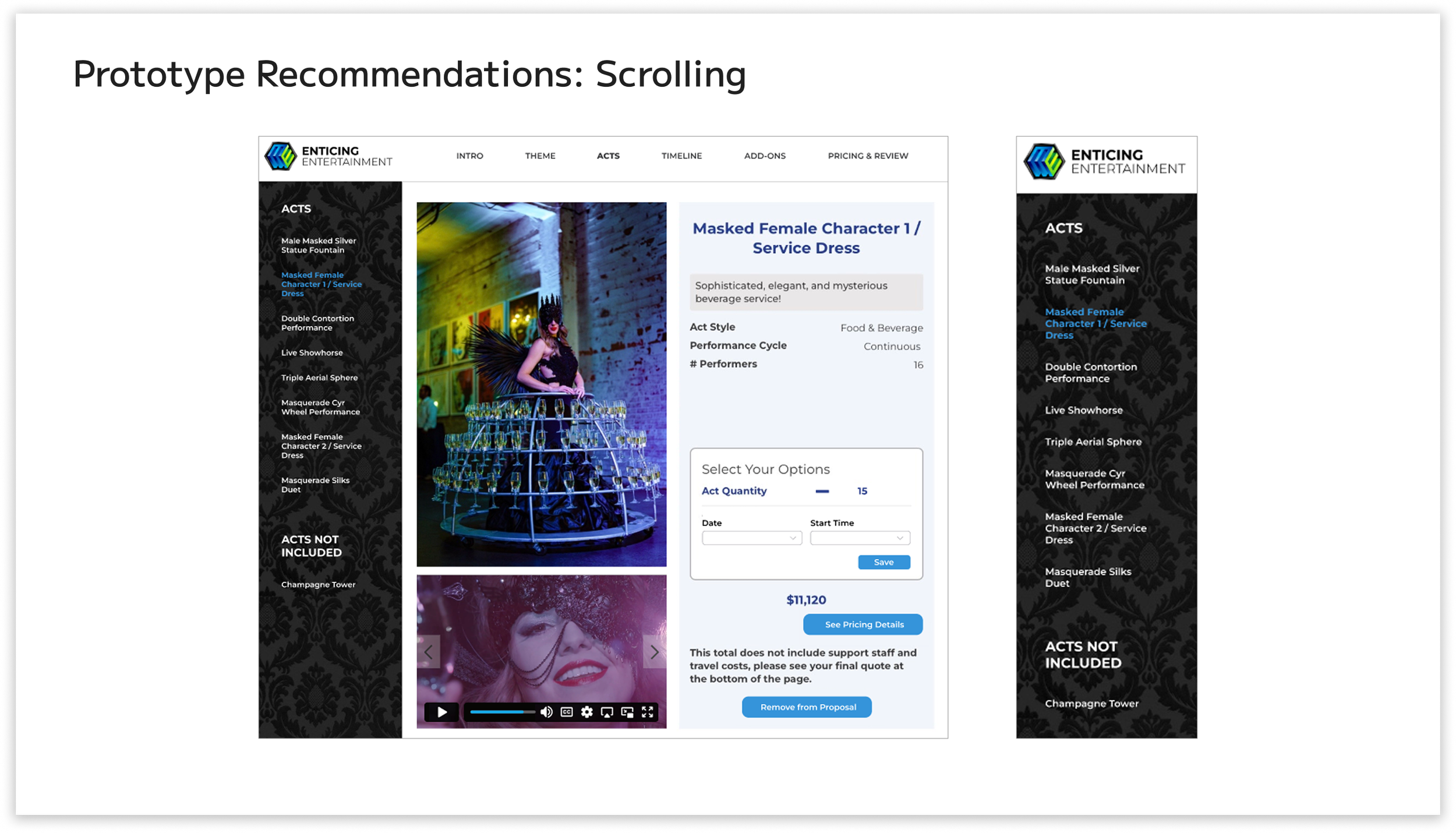
The heavy amount of scrolling was due to the numerous acts in the proposal. For this recommendation, I removed the scrolling interaction entirely, except for the need to scroll down to view the entire page of an act. Instead of scrolling to find each act, there are titles at the left of the page labeled “Acts” and “Acts Not Included”. Under those titles are the acts that are either included or excluded from the proposal.
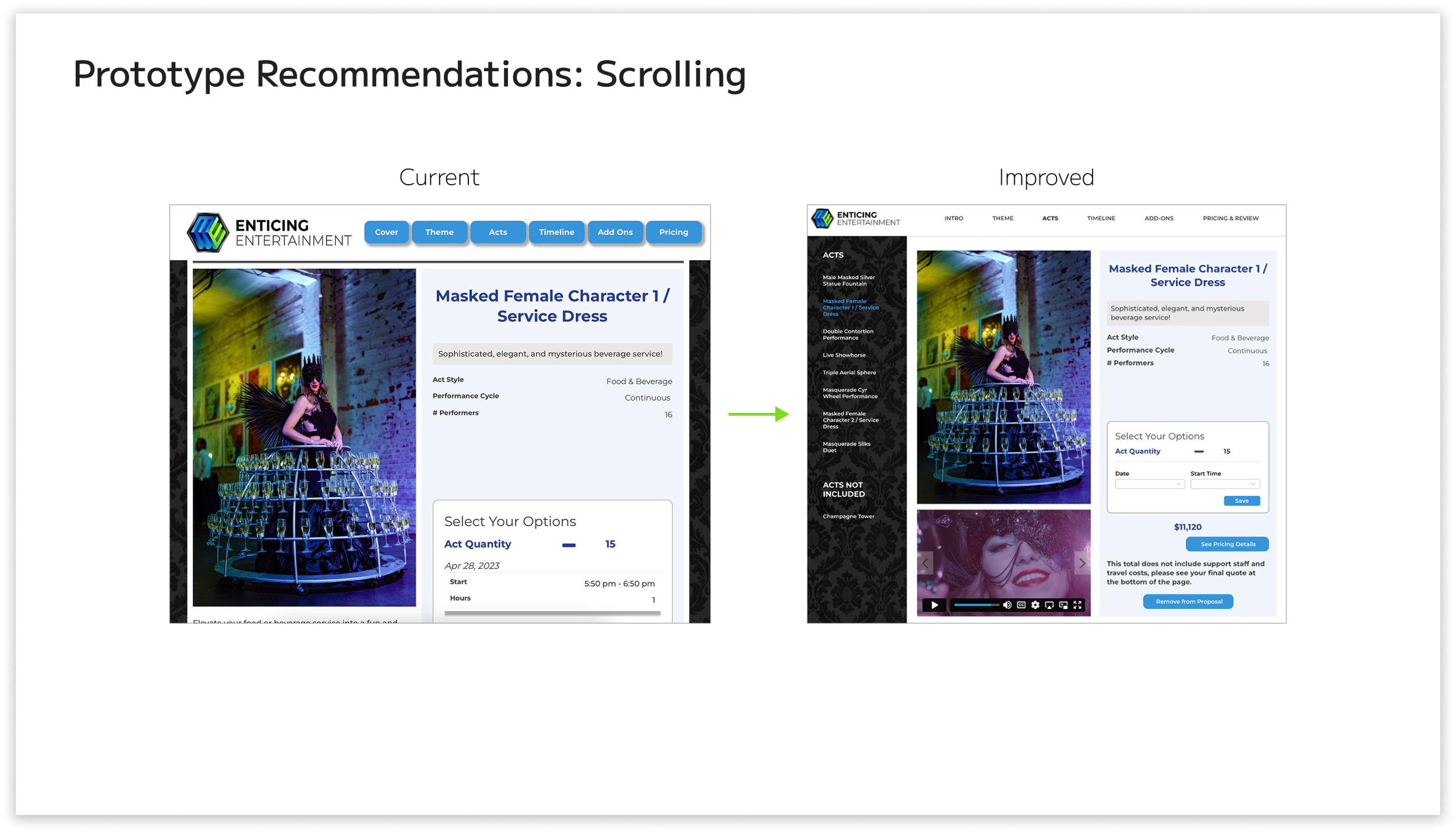
RECOMMENDATION 2
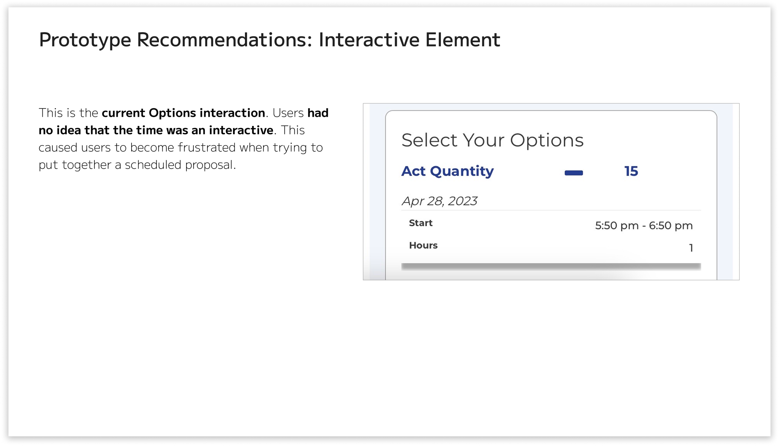
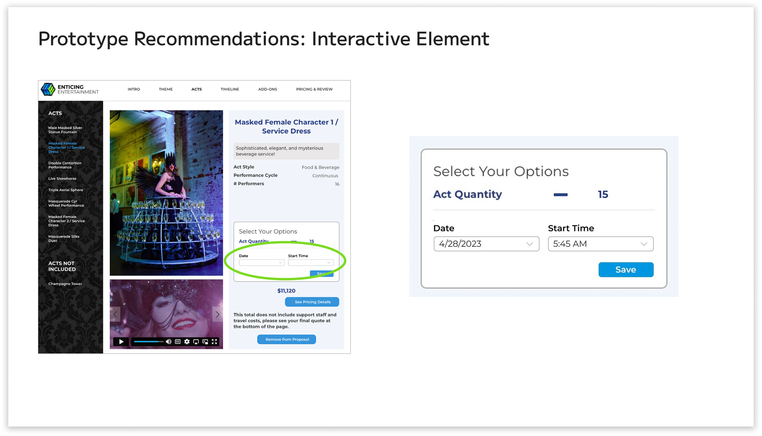
To make sure users know what’s clickable, I prototyped the “Date” and “Start Time” on the same page as the acts. Both the “Date” and “Start Time” have a drop-down menu, so users will automatically recognize that they can choose from a selection of options. The quantity of acts is also easily editable and represented by a big plus or minus sign. A save button is also prototyped on the same page.
RECOMMENDATION 3
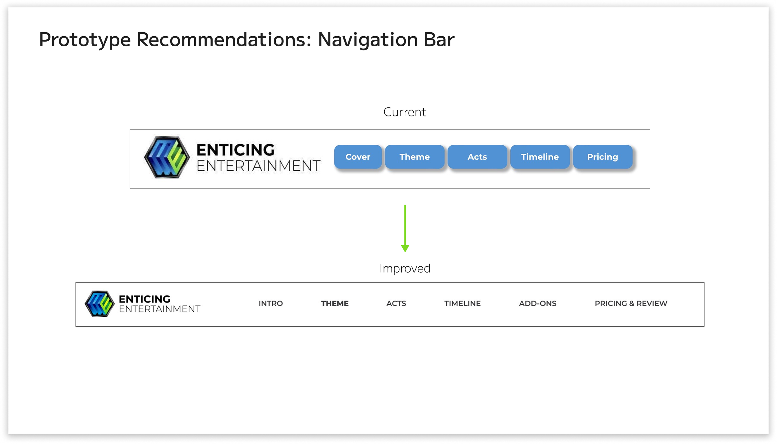
For the navigation bar, I removed the blue boxes around the text. The blue boxes around the text made it seem less visible to users, according to our contextual inquiries. I completely removed them. Just having black text behind the white navigation bar made it more visible. The navigation bar also incorporates a hover animation. I also moved the logo to the left to allow for “more room to breathe”.
A consideration for the next steps is having a confirmation menu when adding or removing acts in the proposal. I would also consider coming up with a different logo for the company because it seems more like a tech or software development company logo. I would also like to see the different theme options in the proposal rather than having to contact the staff to see what options they offer. Users mentioned that they want the timeline to have more storytelling to further engage their clients, so I would focus on the timeline page for my next steps.