

MINNESOTA HEALTH REGISTRY
Findings and Prototype Recommendations / UX/UI Design / 2023
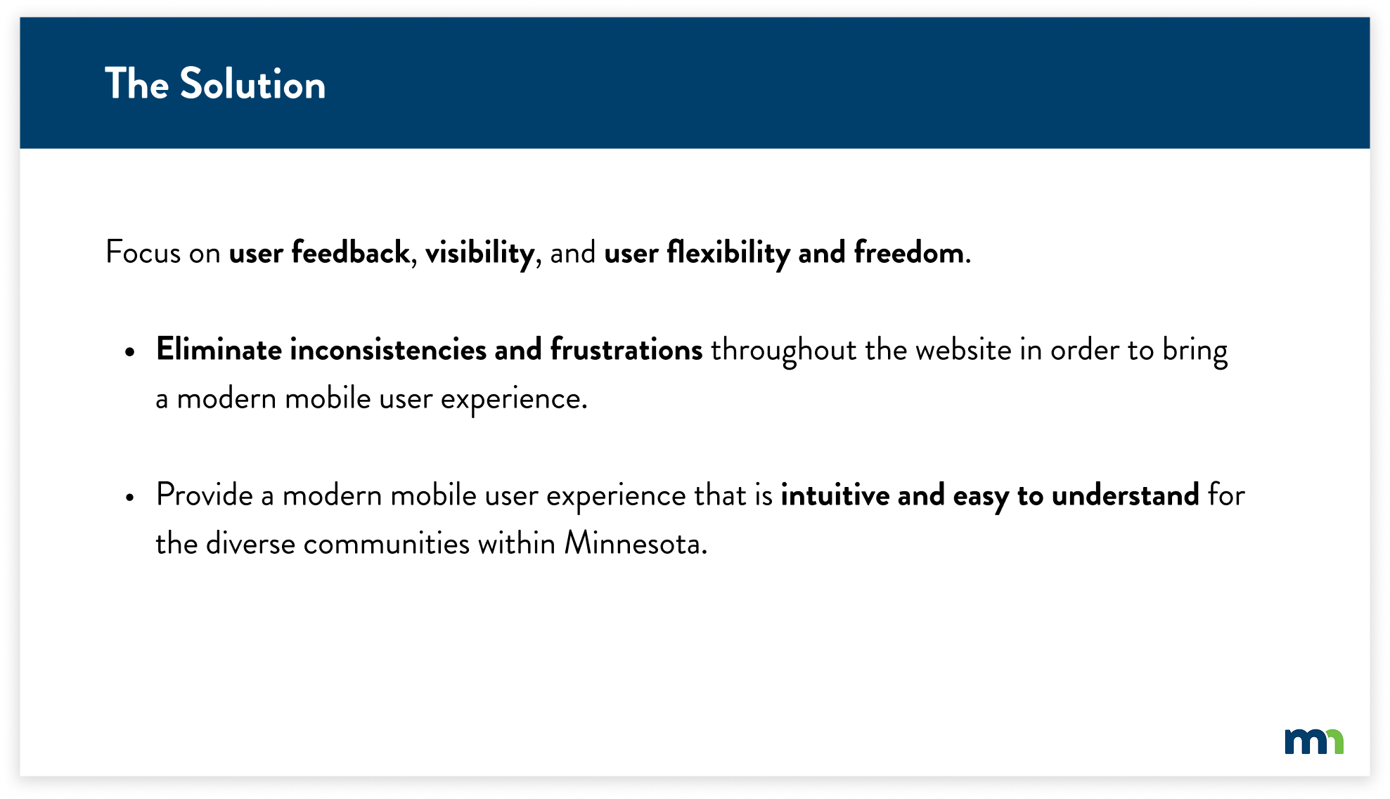
This case study intends to find key insights through research evaluations for the MN Department of Health Cannabis Registry. The goal is to create a revised and seamless experience on desktop and mobile with efficiency, consistency, and ease of understanding. Working with the State of Minnesota required navigating a range of structural and regulatory constraints throughout the process.
METHODS & TOOLS
What I learned:
Collaborated with state and government partners to design solutions that serve people while meeting strict guidelines.
Developed an understanding of which design methods were the most efficient to use for this research evaluation
Synthesized findings to guide design recommendations
Figma
Heuristic Analysis
Competitive Analysis
Prototyping
Usability Testing
Cognitive Walkthrough

Protect. Maintain. Improve.
MOBILE PROTOTYPE
DESKTOP PROTOTYPE

CONTEXT
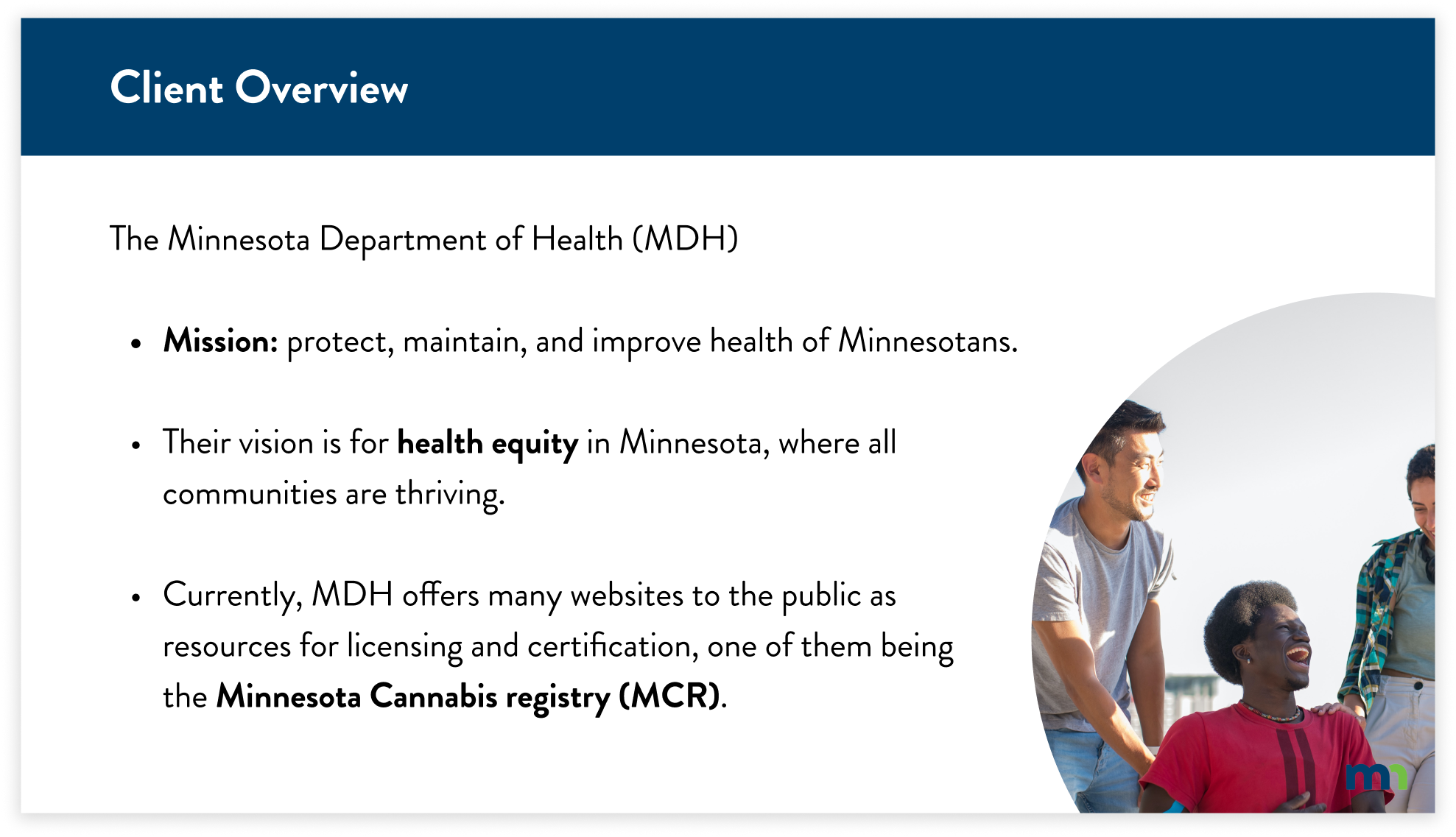
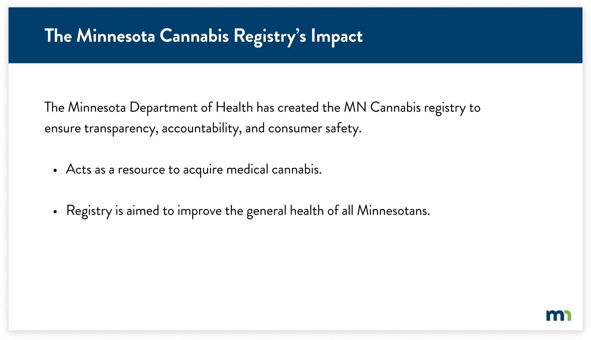
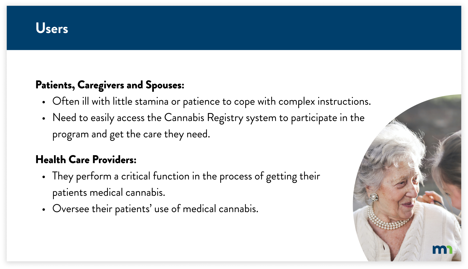
The Minnesota Department of Health’s (MDH) mission is to protect, maintain, and improve the health of all Minnesotans. Their vision is for health equity in Minnesota, where all communities are thriving. Currently, MDH offers many websites to the public as resources for licensing and certification, one of them being the Minnesota Cannabis registry (MCR).
RESEARCH & TESTING
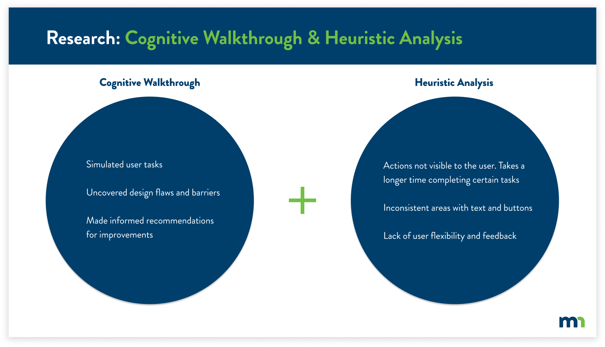
From the MNIT Cannabis Registry brief, I determined the best course of action was to find what users needed to accomplish the registry process. I navigated the registry through the process of a cognitive walkthrough and heuristic analysis.
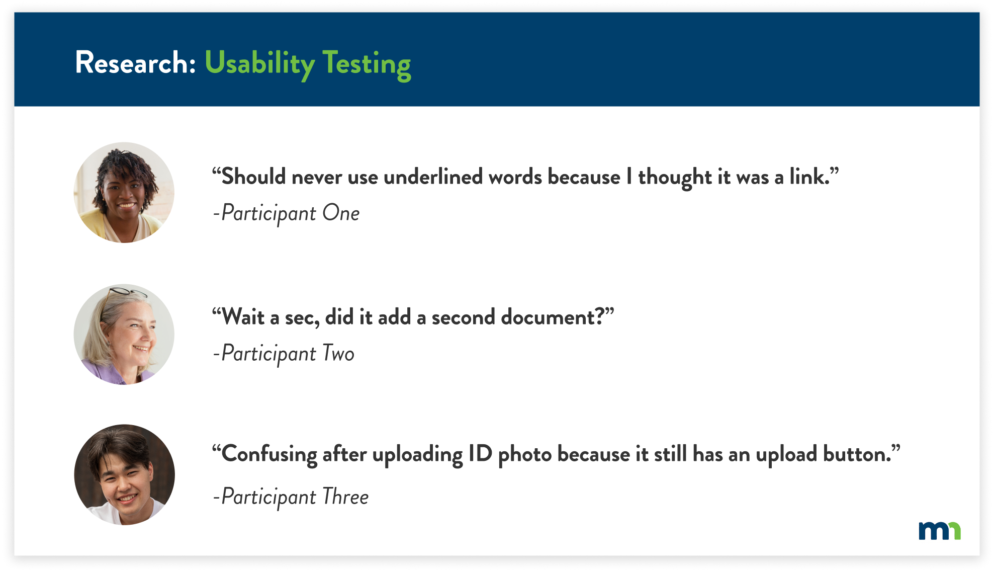
After completing the usability evaluations, I conducted usability tests with a total of five participants. I gained new insight that I hadn’t seen previously. The usability tests also justified the key findings from the previous research, further supporting the user’s pain points.
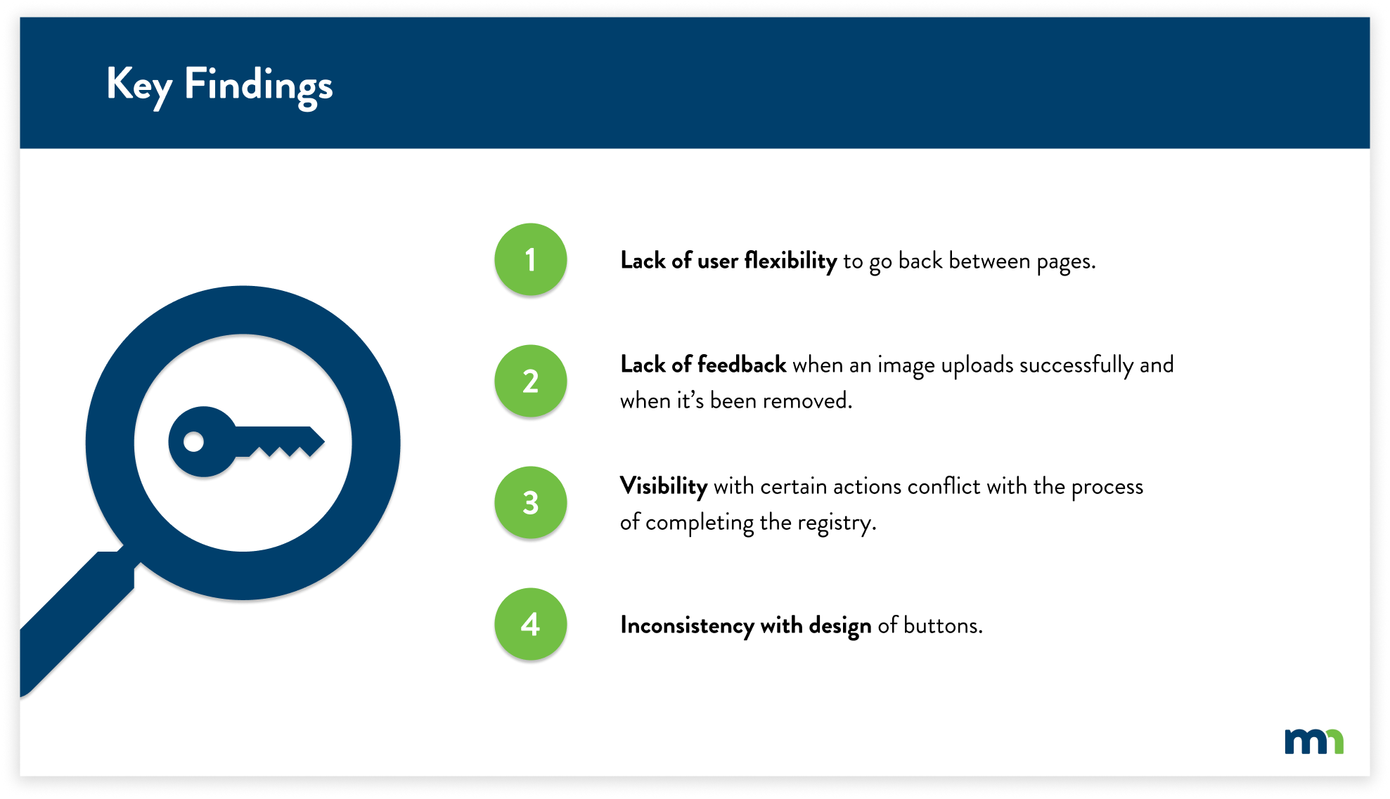
KEY FINDINGS
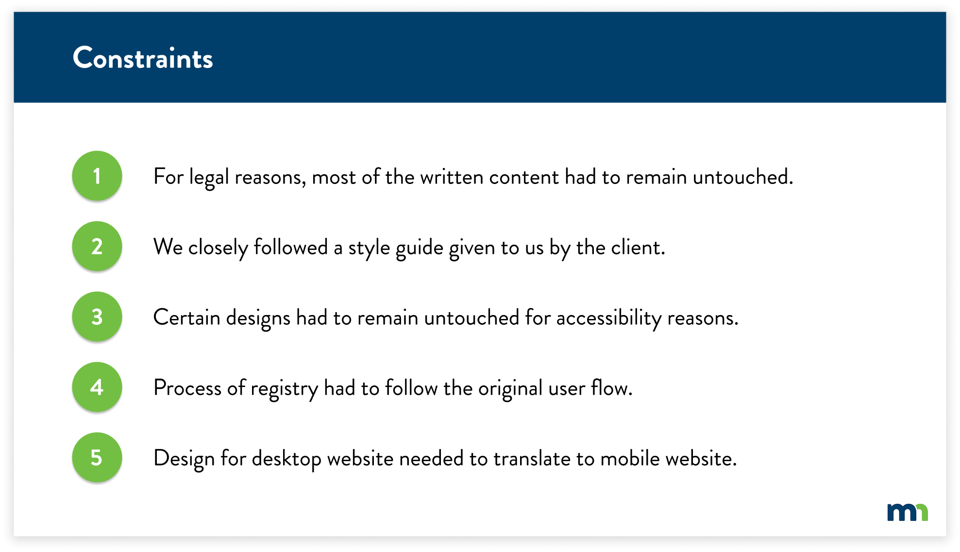
CONSTRAINTS
Working with the state of Minnesota, I had to follow certain guidelines for legal rules, accessibility requirements, and design direction. With the key findings in mind, I had to shift my solutions slightly due to these constraints.
RECOMMENDATIONS
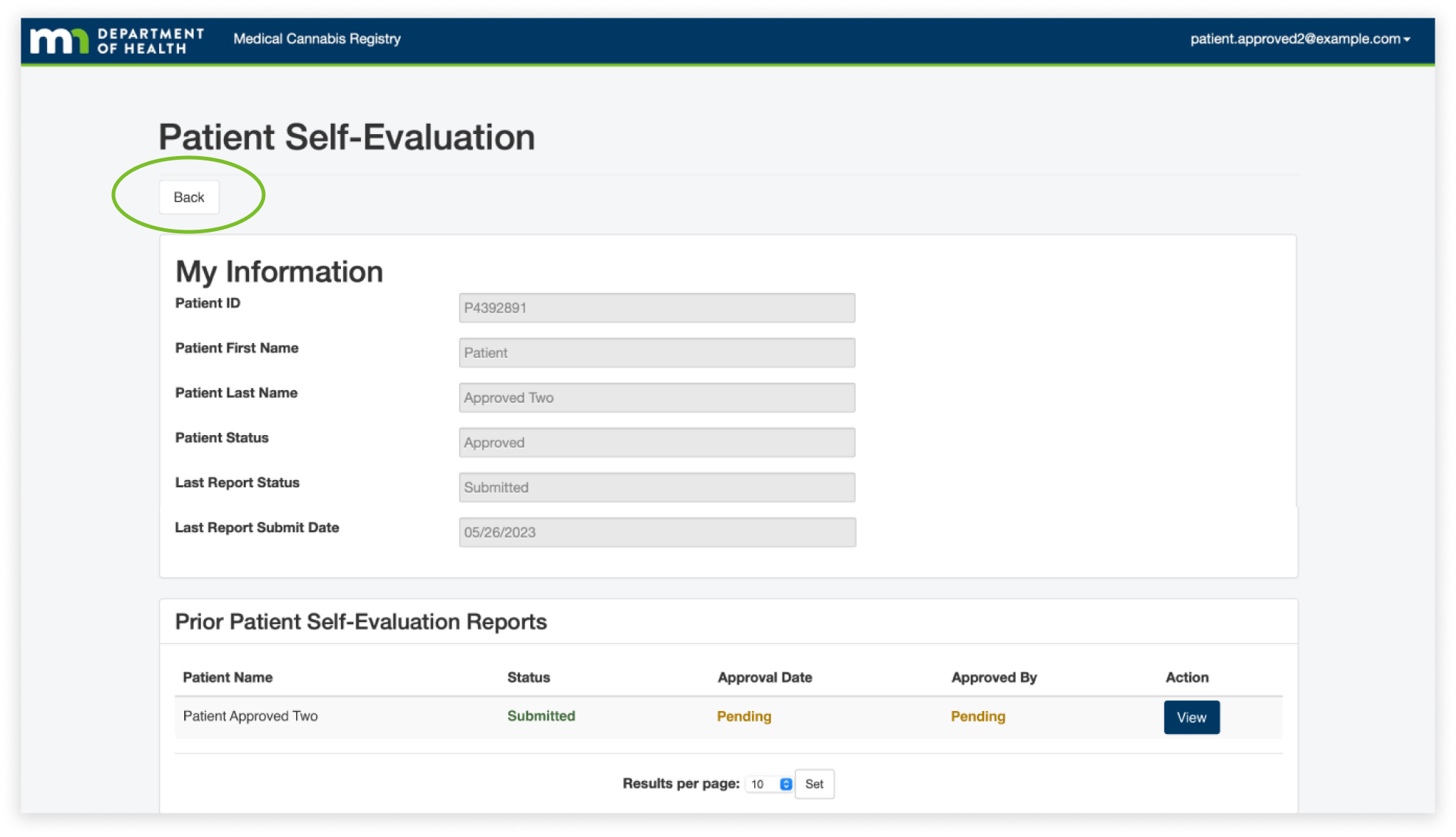
The first finding was the lack of user flexibility. Users often used the back button on their browser because they felt lost when navigating pages, especially on the patient self-evaluation page. We found that they often viewed the information and then paused due to confusion on how to get back to the home page. This caused them to use the back button on their browser because there was no visible back button.
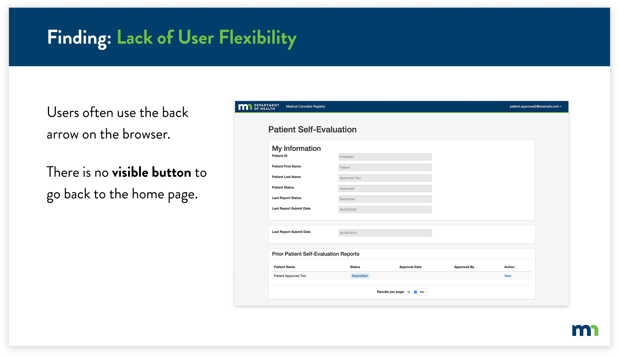
To solve this, I created a back button that would allow the user to easily know how to navigate back to the home page. This allows users to easily identify the back button, as it’s at the top of every page. Users can identify and click the button to take them back to the home page.
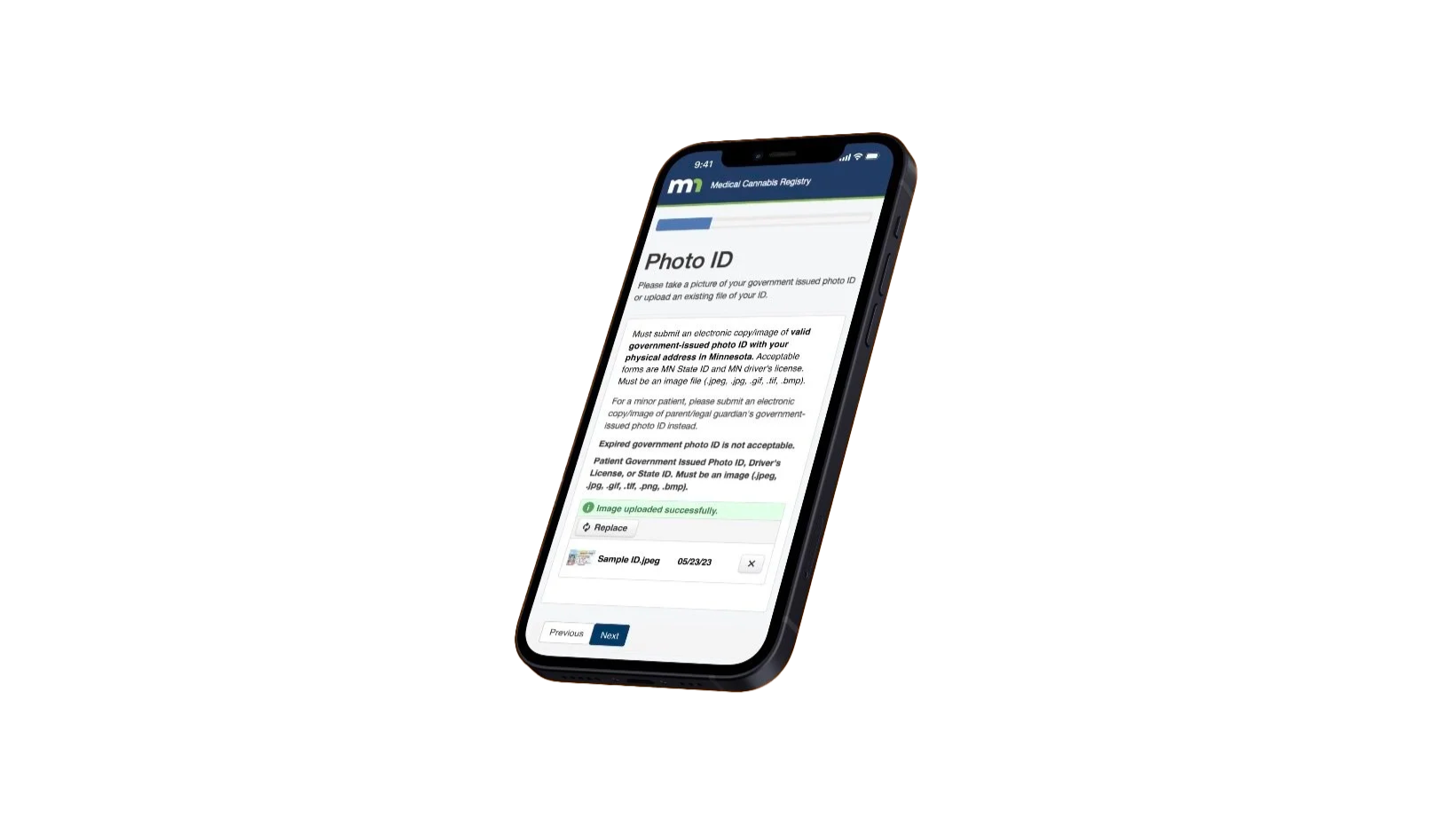
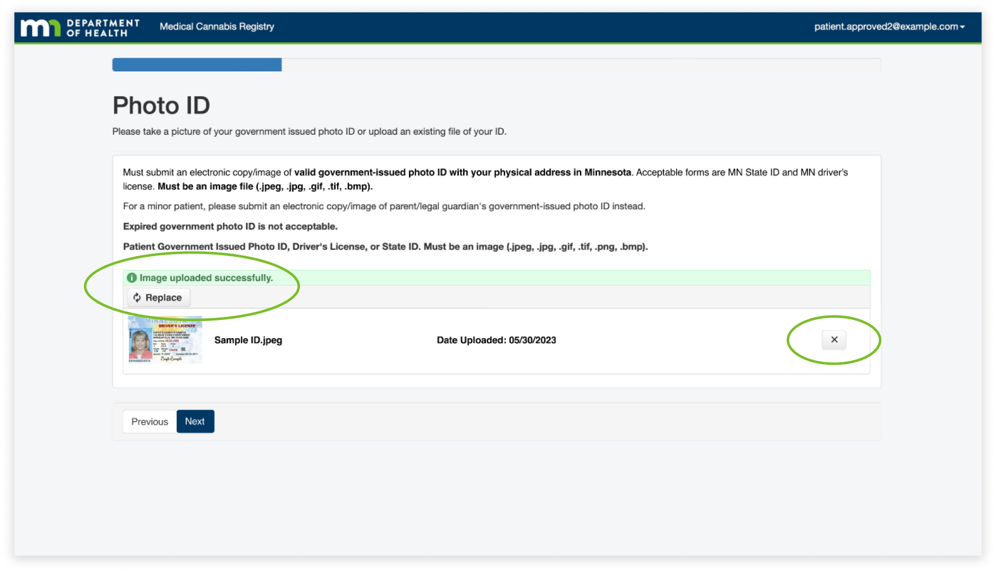
For the next finding, the Lack of Feedback, I found that users often thought they were required to upload more than one photo of their ID because there wasn’t any feedback letting the user know that the image of their ID had uploaded. In addition, the upload button was still present after uploading an image. This caused users to become frustrated and confused, thinking they had to upload multiple images.
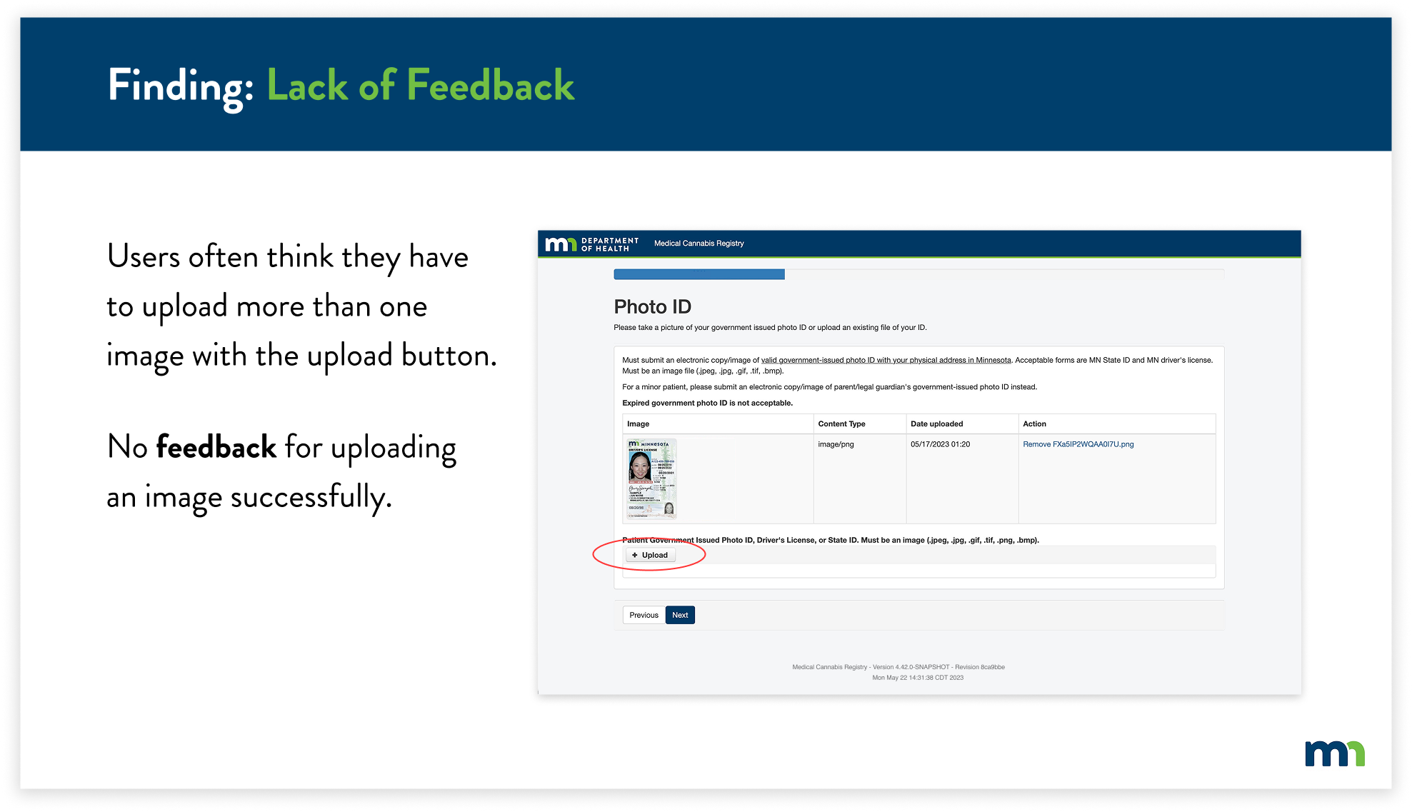
The solution was to change the upload button after uploading an image, and add confirmation to let the user know the action was successful. I reformatted the layout of the feature to match the overall simplicity of the website, while still containing the previous information.
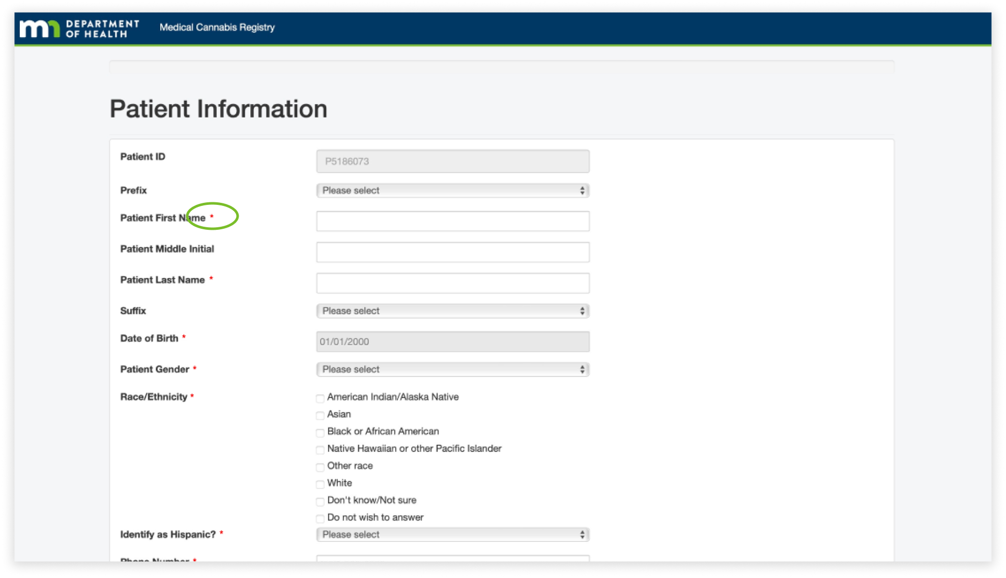
The next finding is visibility throughout the website. It was difficult to know what information was required to fill out, specifically because the asterisks blended in with the overall text of the page. This caused users to take extra time to fill out information on certain pages.
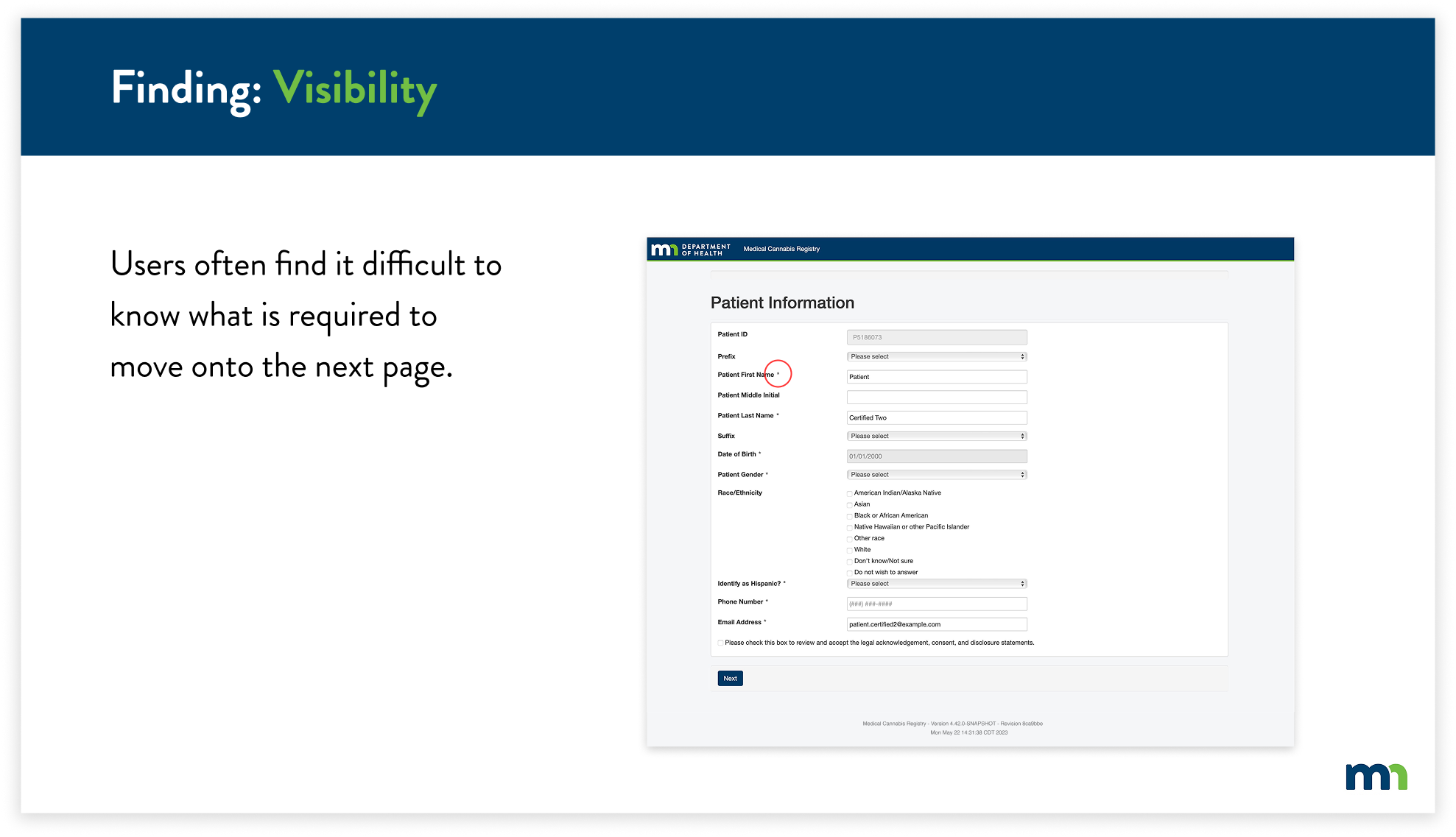
To combat this, I decided to change the color of all of the asterisks to red. This allows users to easily identify what required information they would have to input and helps them navigate through the registry more efficiently.
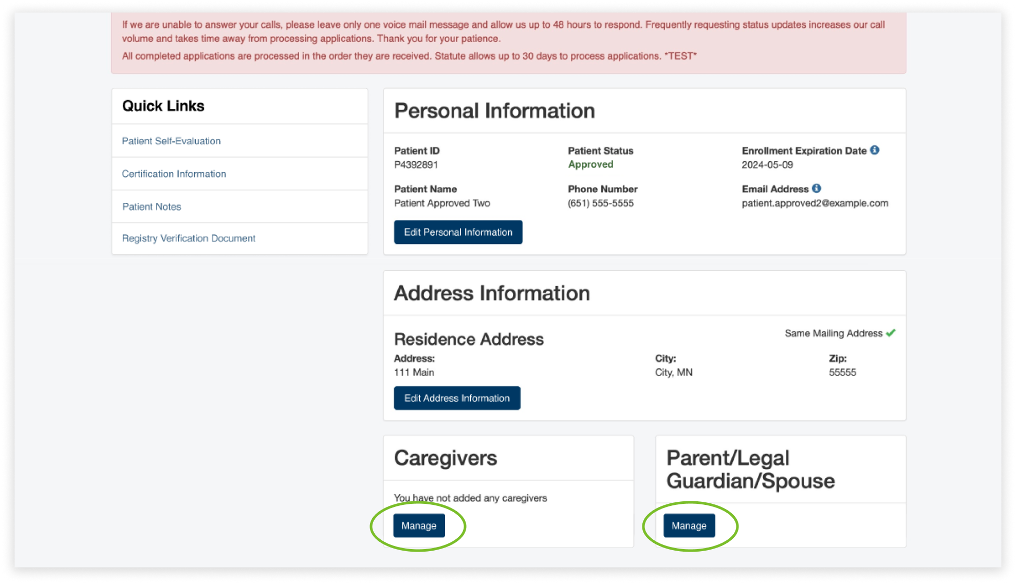
For the final finding, I found multiple inconsistencies with the design of the entire website, specifically with the design of the buttons. The buttons ranged from buttons with blue text (circled in red) to white and dark blue boxes with text. This caused the overall website to not feel cohesive and consistent to the user. Users had a difficult time knowing if buttons were clickable because they were not consistent with the existing buttons.
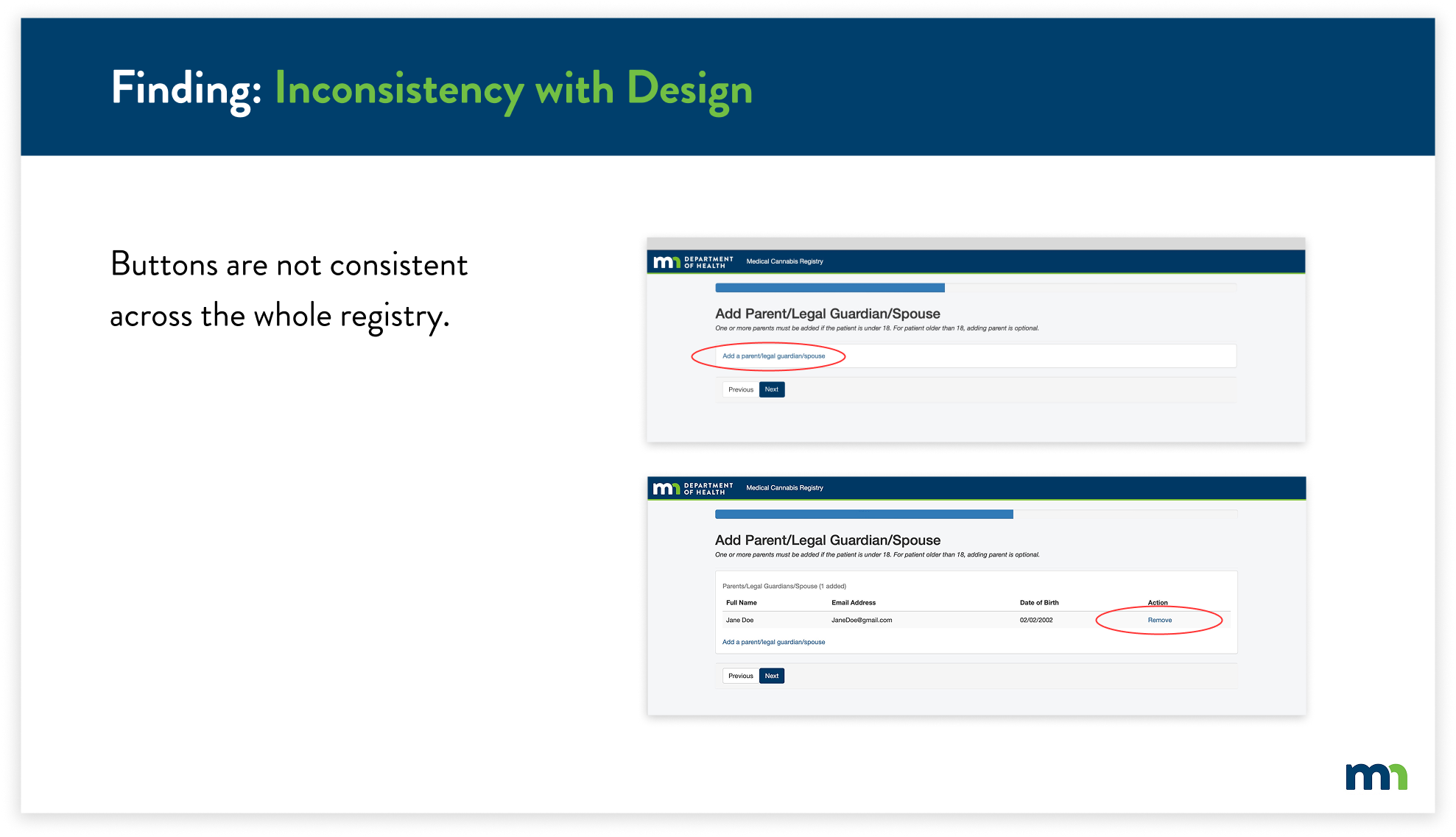
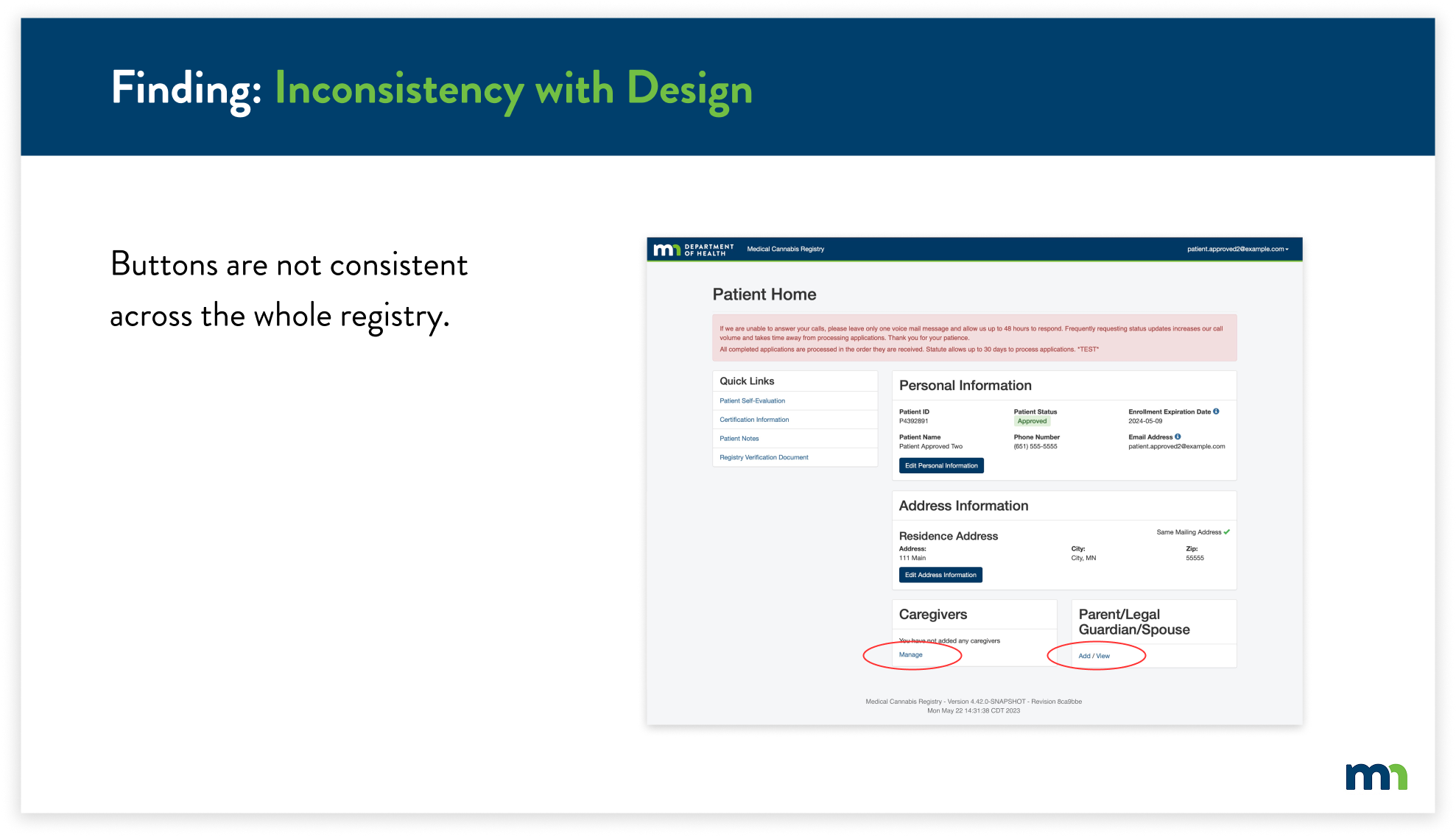
To solve this issue, I replaced the inconsistent blue text buttons with the already-existing buttons. Instead of having two buttons for adding a parent, legal guardian, or spouse, now users will easily know that they can edit their information by clicking on “Manage”.
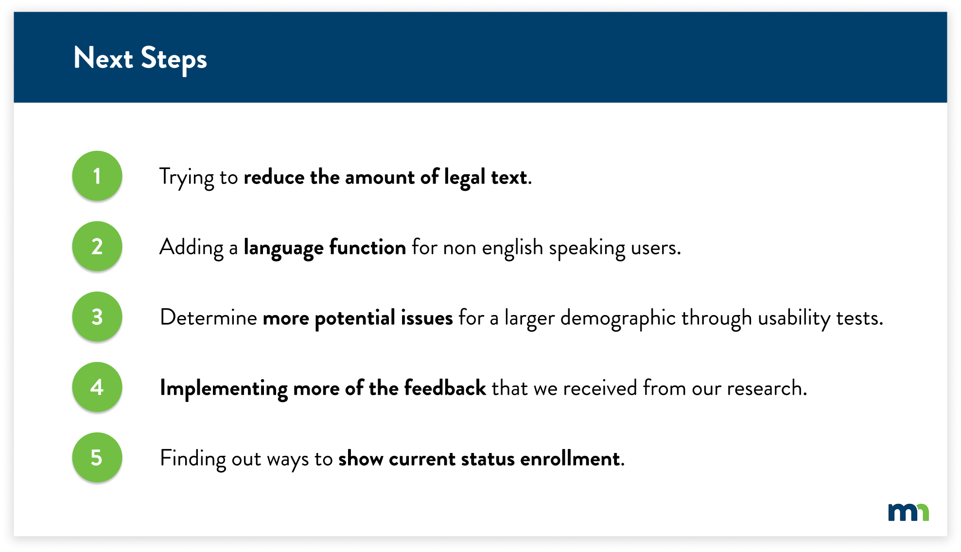
NEXT STEPS
Due to time constraints and key factors to focus on, we were not able to implement every solution based on our findings and research. We’ve considered these five main criteria to implement as we look into the next steps of this project.