

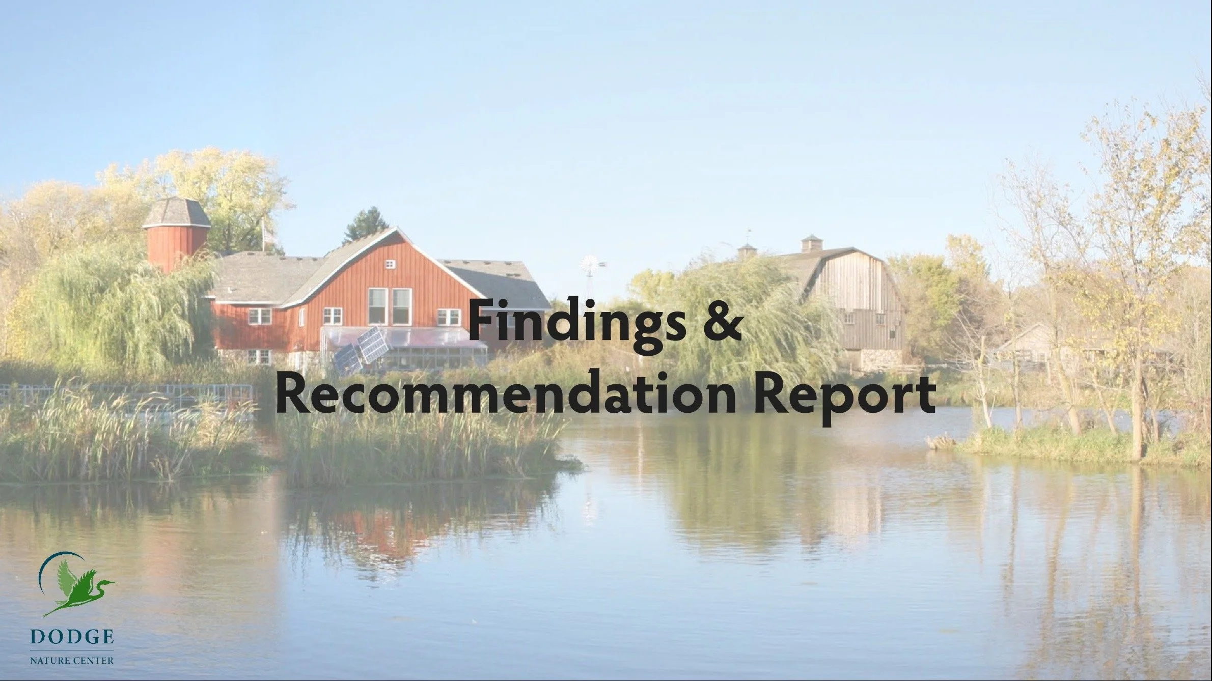
DODGE NATURE CENTER
Findings and Recommendation Report / 2023
The intent of this research report is to find key insights through usability testing in order to offer recommendations to improve the usability of the Dodge Nature Center website.
METHODS & TOOLS
Heuristic Analysis
Usability Testing
Think-Aloud Protocol
Prototyping
Evaluative Research
Remote-Moderated Research

Fulfill your connection with nature.
Our team determined that gathering collected data through the process of heuristic analysis was the best initial course of action. We found that navigation throughout the site was misleading. Clicking a button on a certain page would take you to the previous page, even if it seemed like it would take you to a new page. Our team, as users, also felt like the website did not represent a deep visual understanding of what Dodge actually offers at their facilities. This was due to a lack of real-life experiences shown on the website. After synthesizing our findings, we concluded that navigation and user flow were the main problems that the website had.
From the MNIT Cannabis Registry brief, I determined the best course of action was to find what users needed to accomplish the registry process. I navigated the registry through the process of a cognitive walkthrough and heuristic analysis.
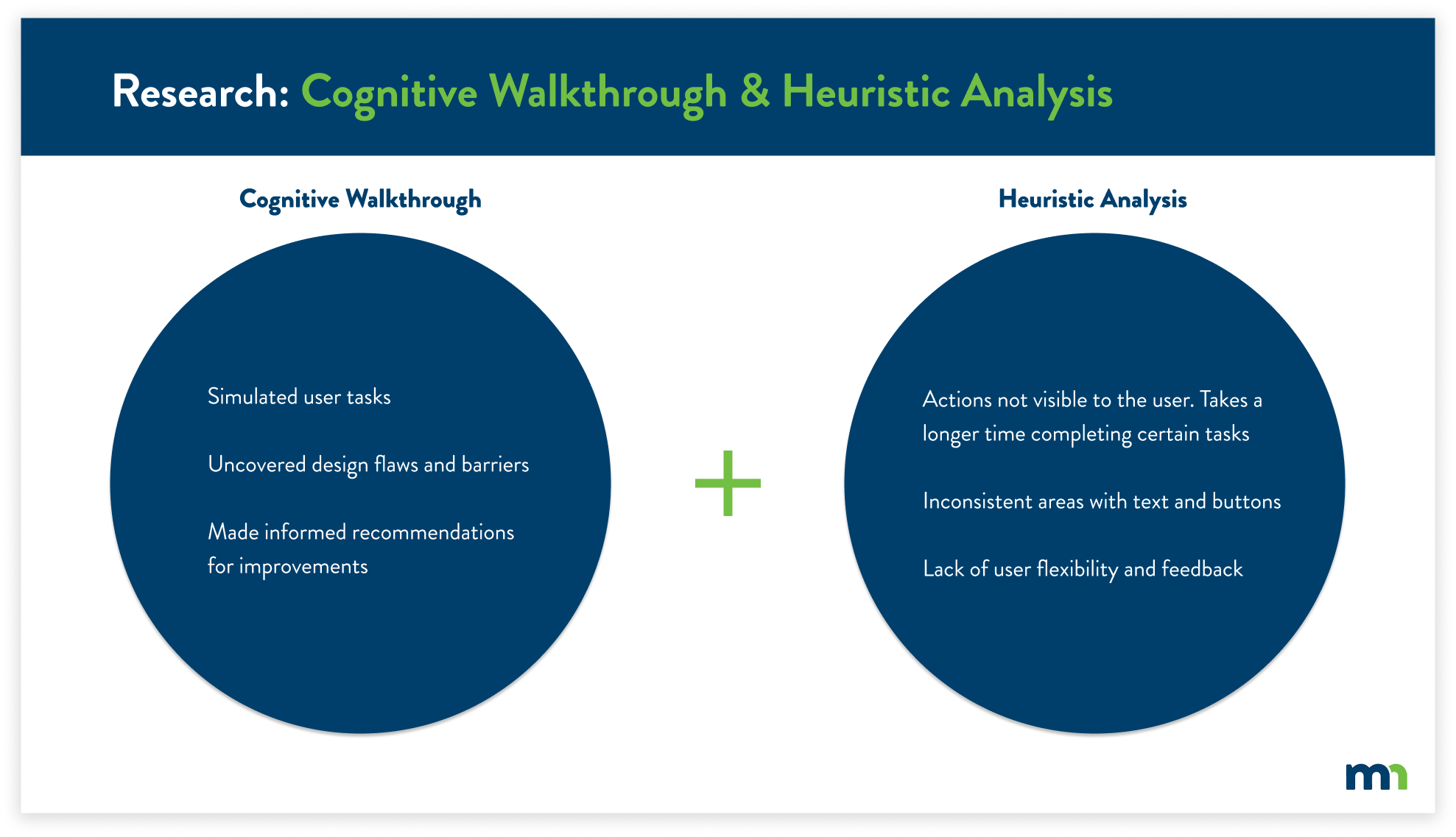
After completing the usability evaluations, I conducted usability tests with a total of five participants. This allowed me to gain new insights that I hadn’t seen previously. The usability tests also justified the key findings from the previous research, further supporting the user’s pain points.
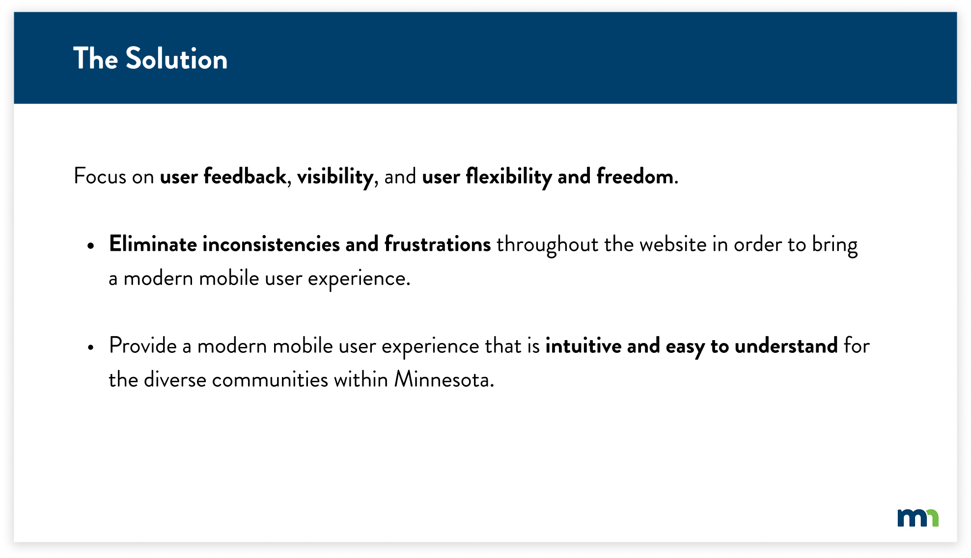
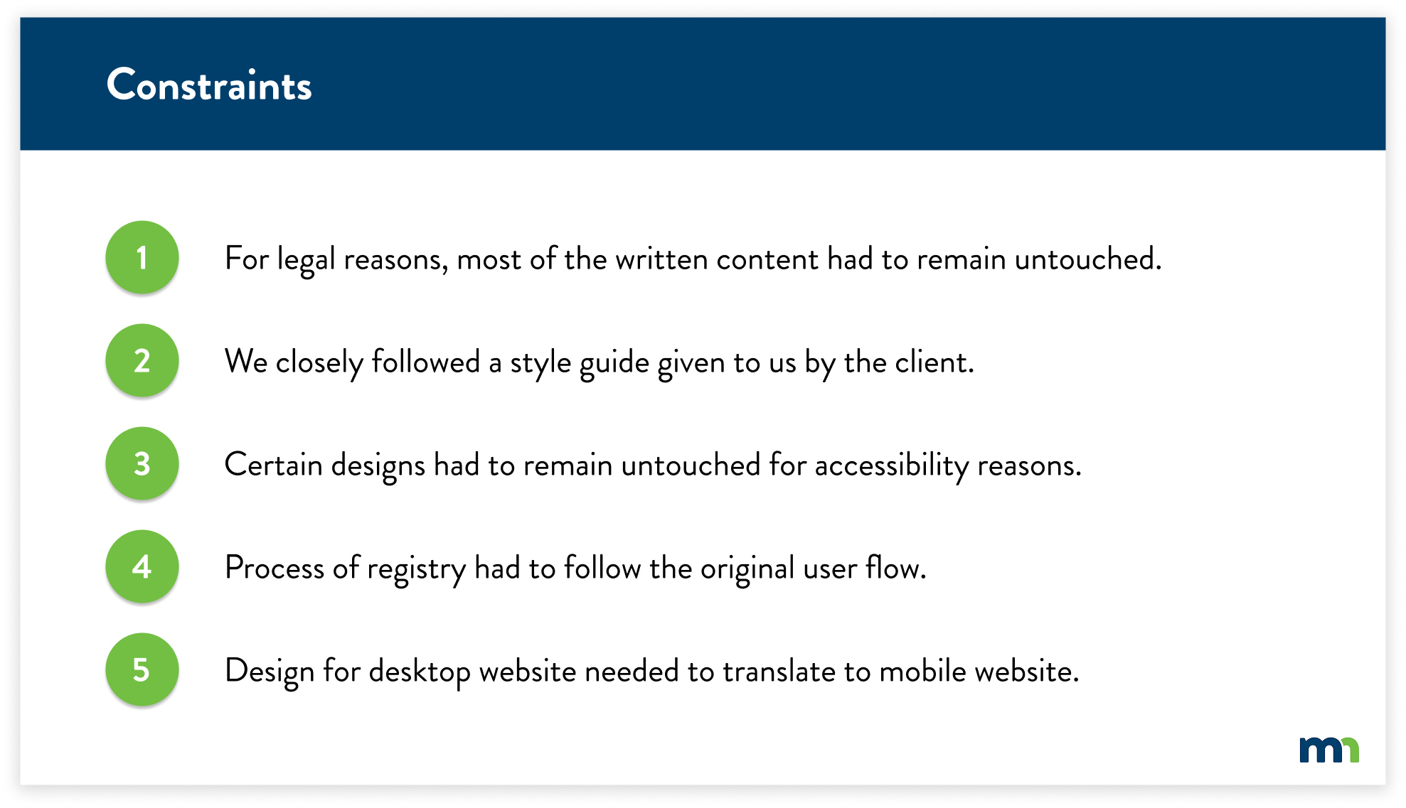
Working with the state of Minnesota, I had to follow certain guidelines for legal rules, accessibility requirements, and design direction. With the key findings in mind, I had to shift my solutions slightly due to these constraints.
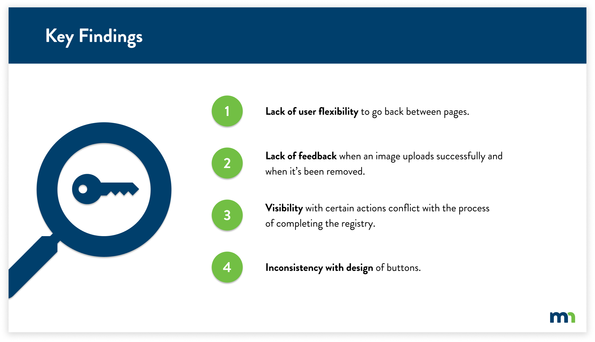
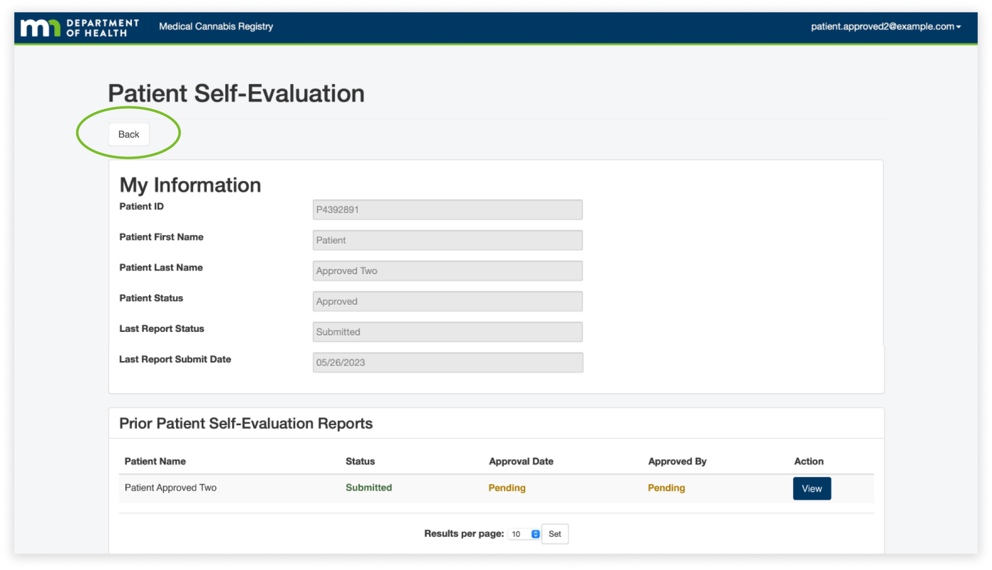
For the first finding, the lack of user flexibility, we found that users often used the back button in their browser because they felt lost when it came to navigating pages, especially on the patient self-evaluation page. We found that they often viewed the information and then paused due to confusion on how to get back to the home page. This caused them to use the back button of their browser because there aren't any visible buttons guiding the user back to the home page.
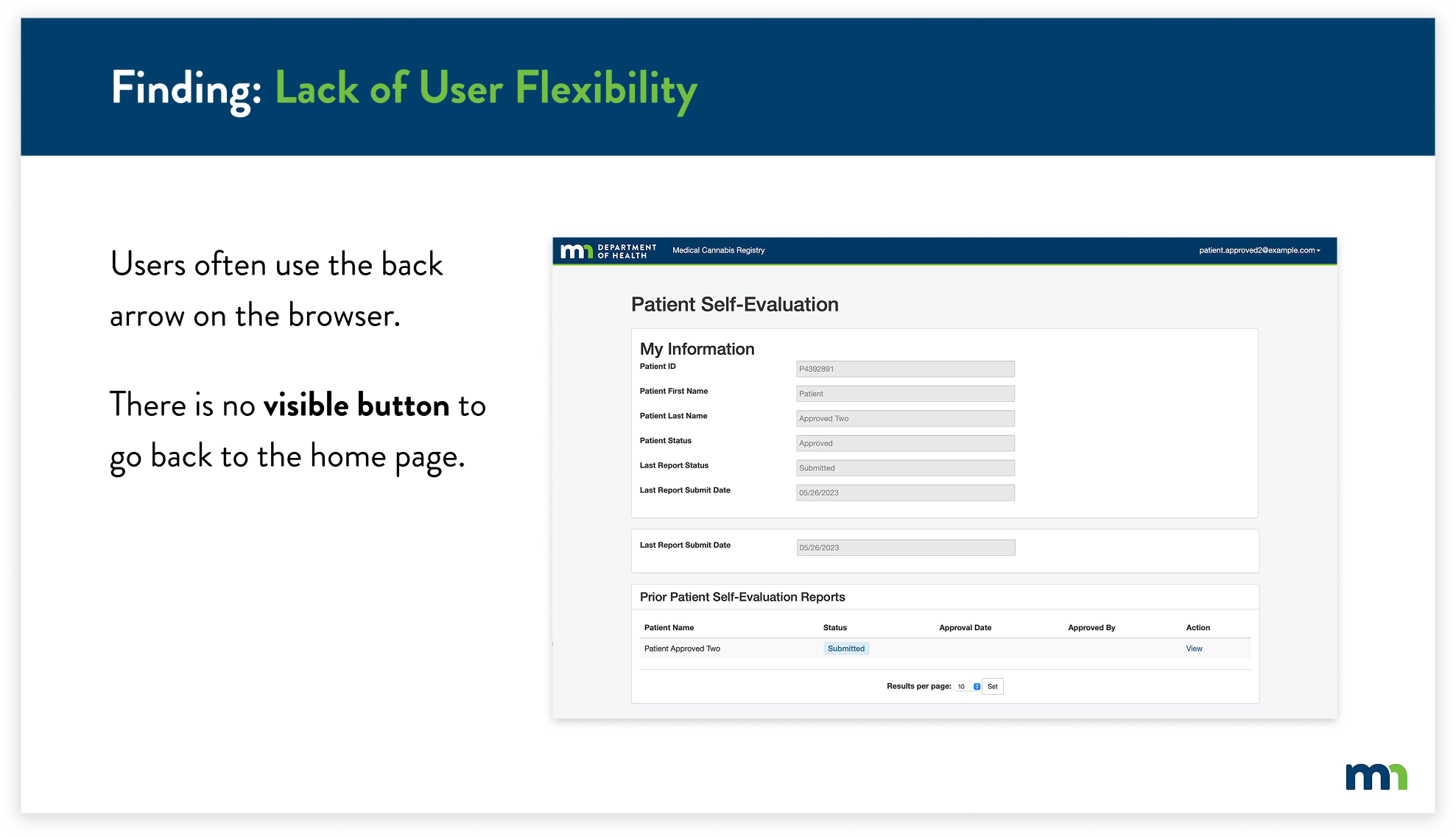
To solve this issue, I created a back button that would allow the user to easily know how to navigate back to the home page. This would allow users to easily identify the back button, as it is at the top of every page. Users can identify and click the back button, taking them back to the home page.
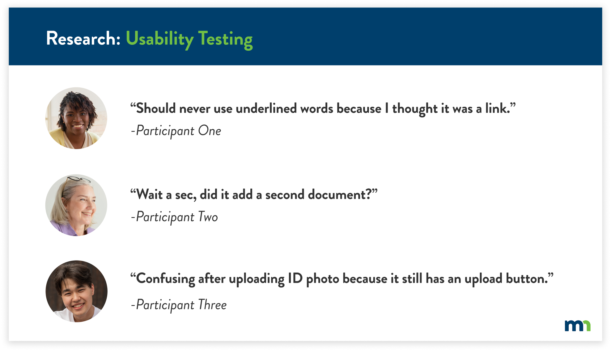
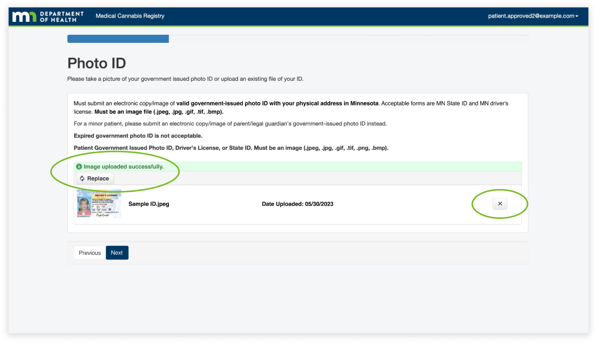
For the next finding, the Lack of Feedback, I found that users often thought they were required to upload more than one photo of their ID because there wasn’t any feedback letting the user know that the image of their ID had uploaded. In addition, the upload button was still present after uploading an image. This caused users to become frustrated and confused, thinking they had to upload multiple images.
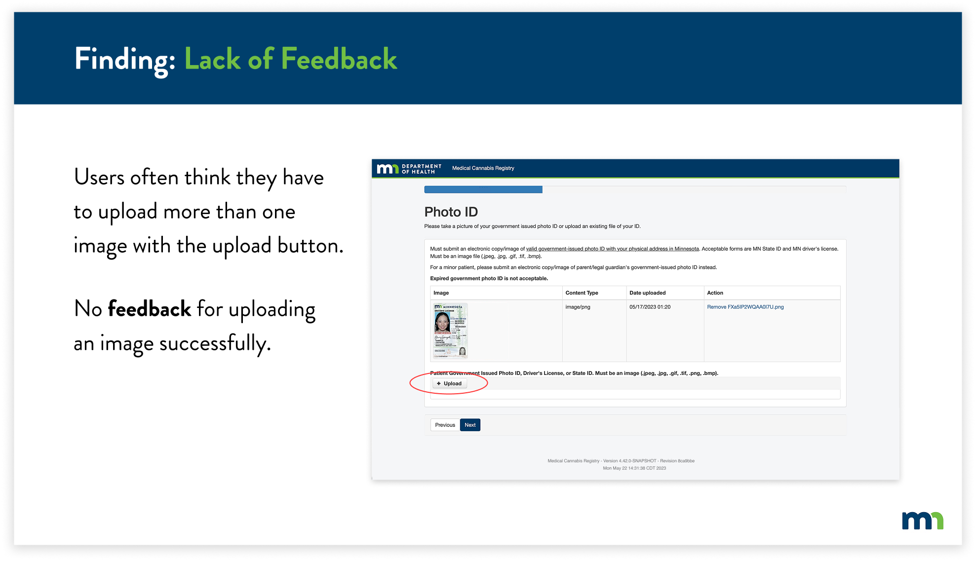
The solution was to change the upload button after uploading an image, and add confirmation to let the user know they’ve uploaded an image successfully. I also reformatted the layout of the feature to match the overall simplicity of the website, while still containing the previous information.
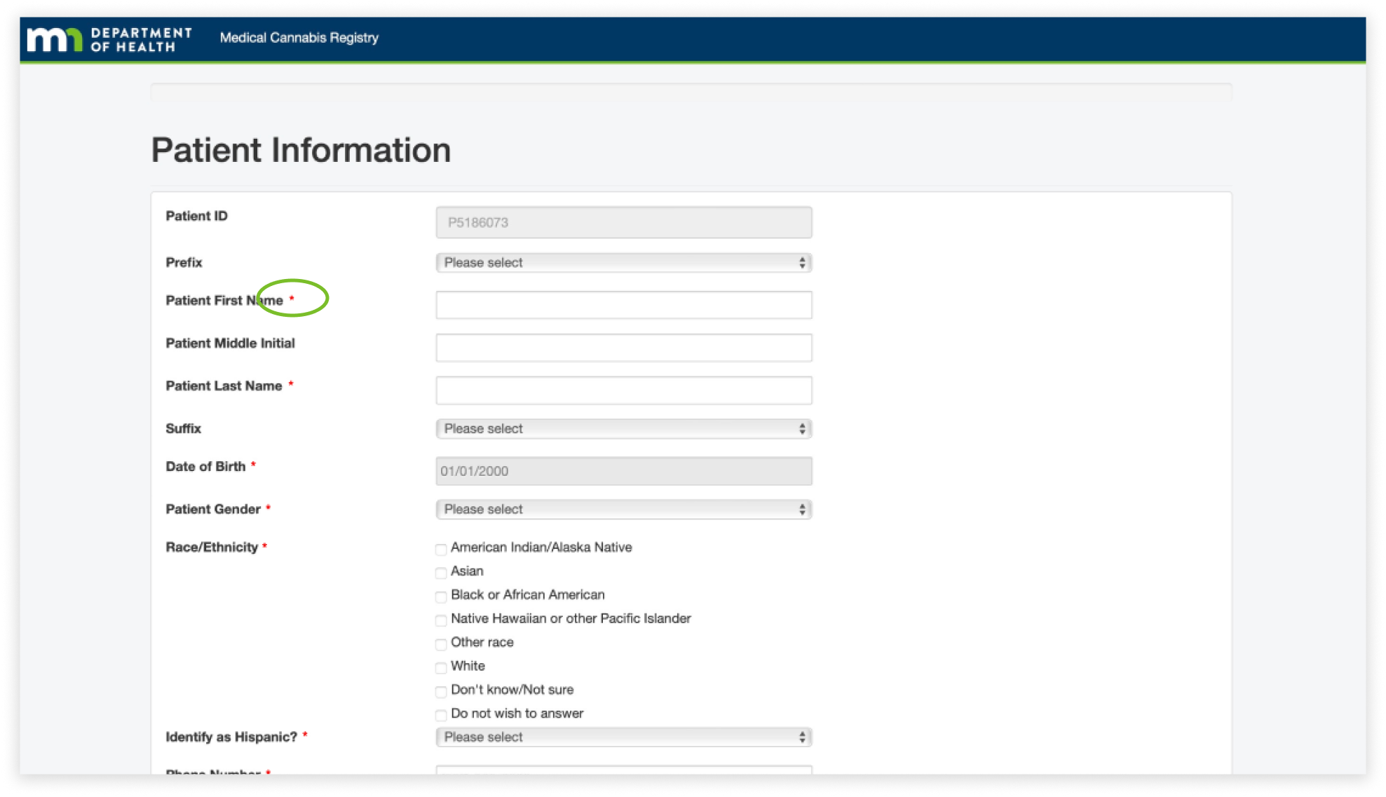
The next finding is visibility throughout the website. I found that it was difficult to know what information was required to fill out, specifically because the asterisks blended in with the overall text of the page. This caused users to take extra time to fill out information on certain pages.
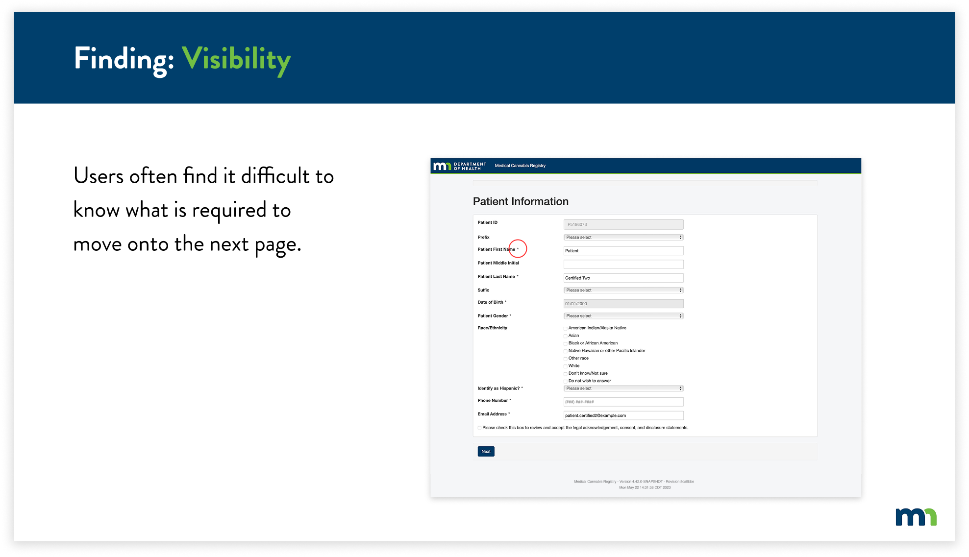
To combat this, I decided to change the color of all of the asterisks to red. This allows users to easily identify what required information they would have to input and helps them navigate through the registry more efficiently.
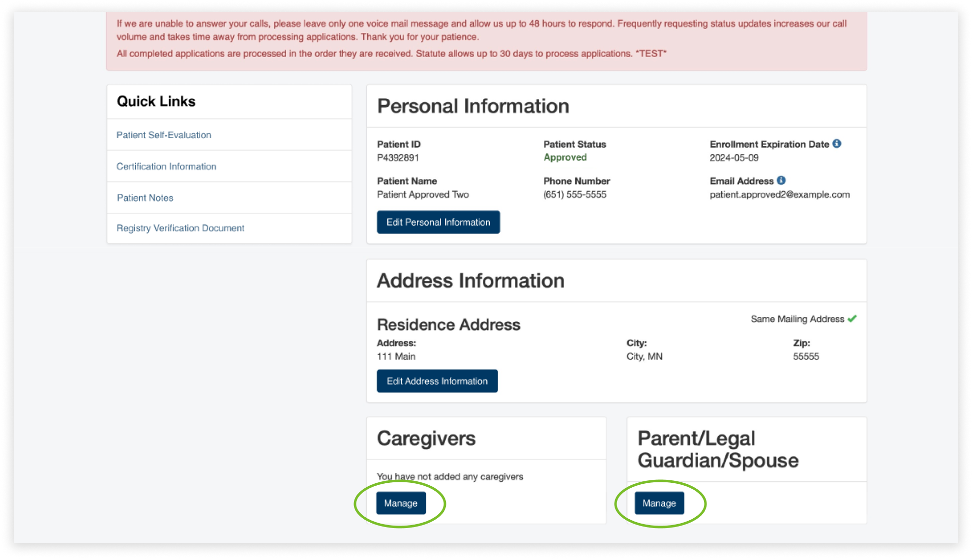
For the final finding, I found multiple inconsistencies with the design of the entire website, specifically with the design of the buttons. The buttons ranged from buttons with blue text (circled in red) to white and dark blue boxes with text. This caused the overall website to not feel cohesive and consistent to the user. Users had a difficult time knowing if buttons were clickable because they were not consistent with the existing buttons.
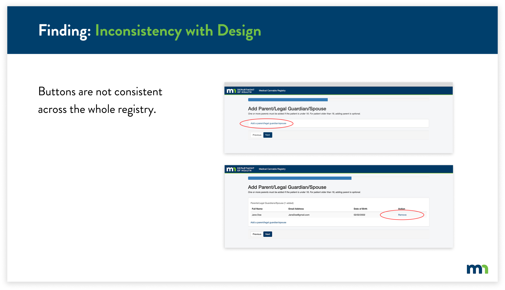
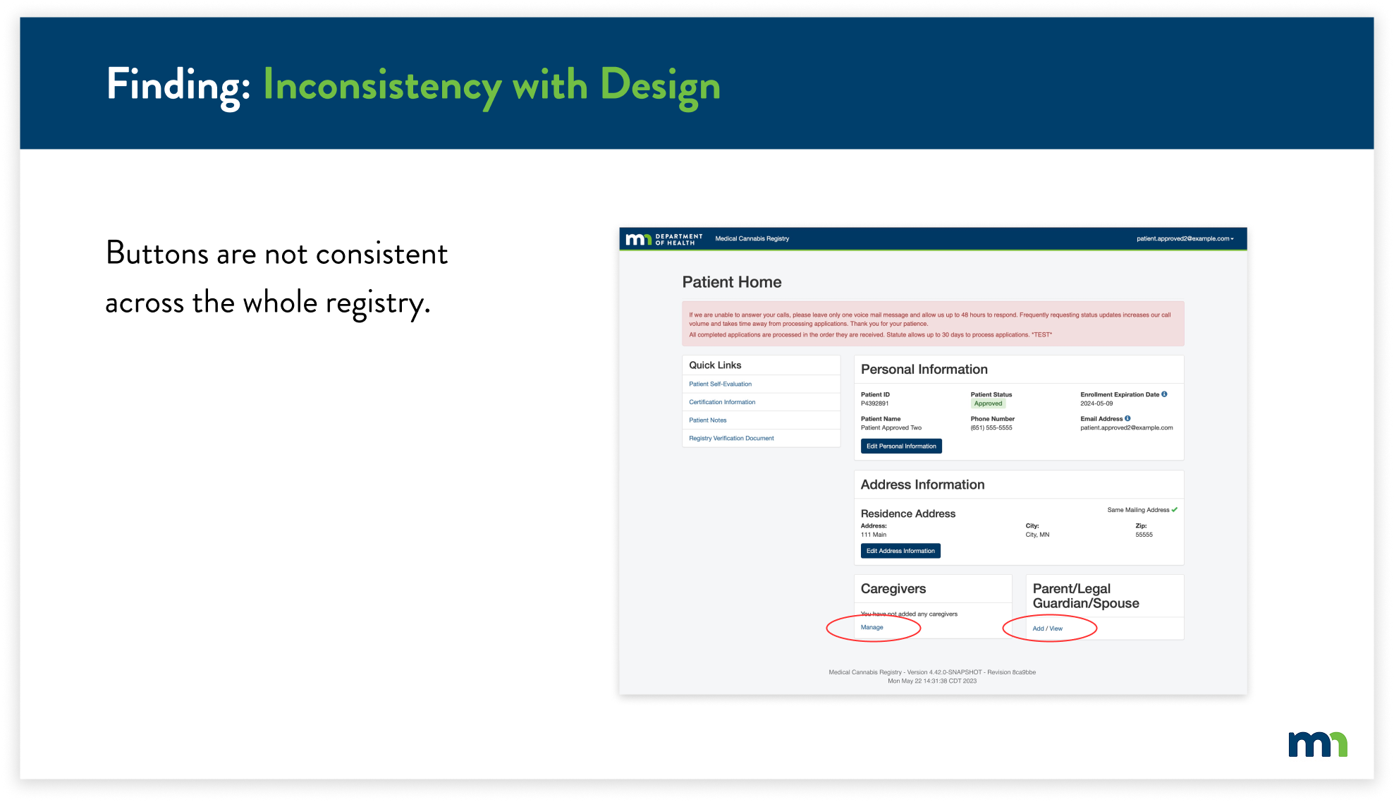
To solve this issue, I replaced the inconsistent blue text buttons with the already-existing buttons. Instead of having two buttons for adding a parent, legal guardian, or spouse, now users will easily know that they can edit their information by clicking on “Manage”.
Due to time constraints and key factors to focus on, we were not able to implement every solution based on our findings and research. We’ve considered these five main criteria to implement as we look into the next steps of this project.
Client
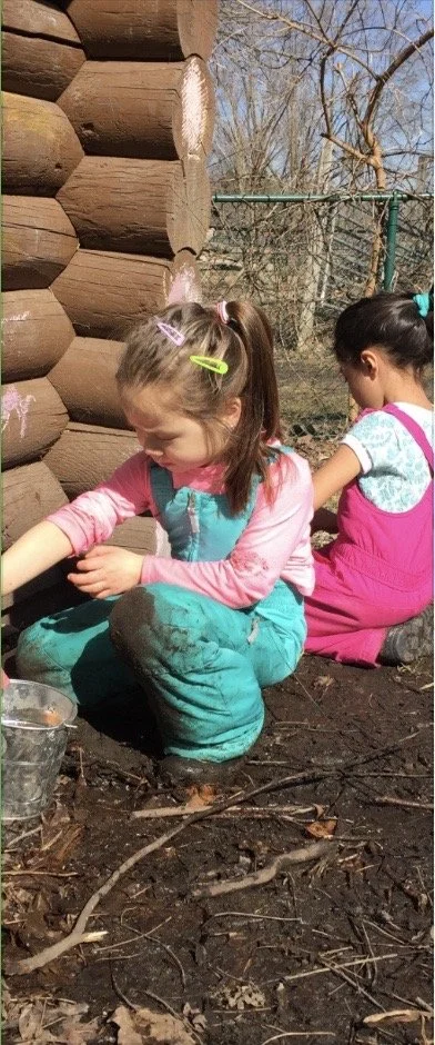
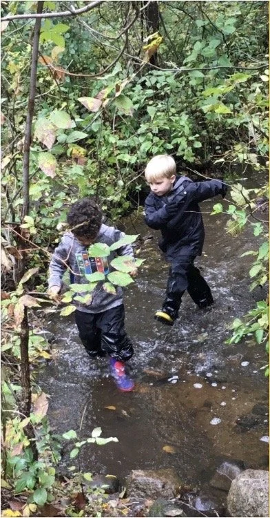
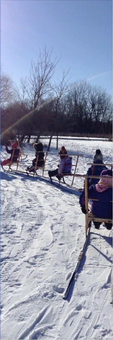
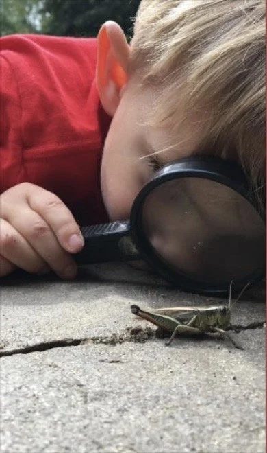
Dodge Nature Center & Preschool is a nonprofit organization that offers nature-based educational programs for people of all ages. Dodge operates on 460+ acres of nature preserve, across four separate properties within the cities of West St. Paul, Mendota Heights, and Cottage Grove. The center provides environmental and agricultural experiences for thousands of people every year through school and public programs, community events, and a nature preschool that is recognized nationally.
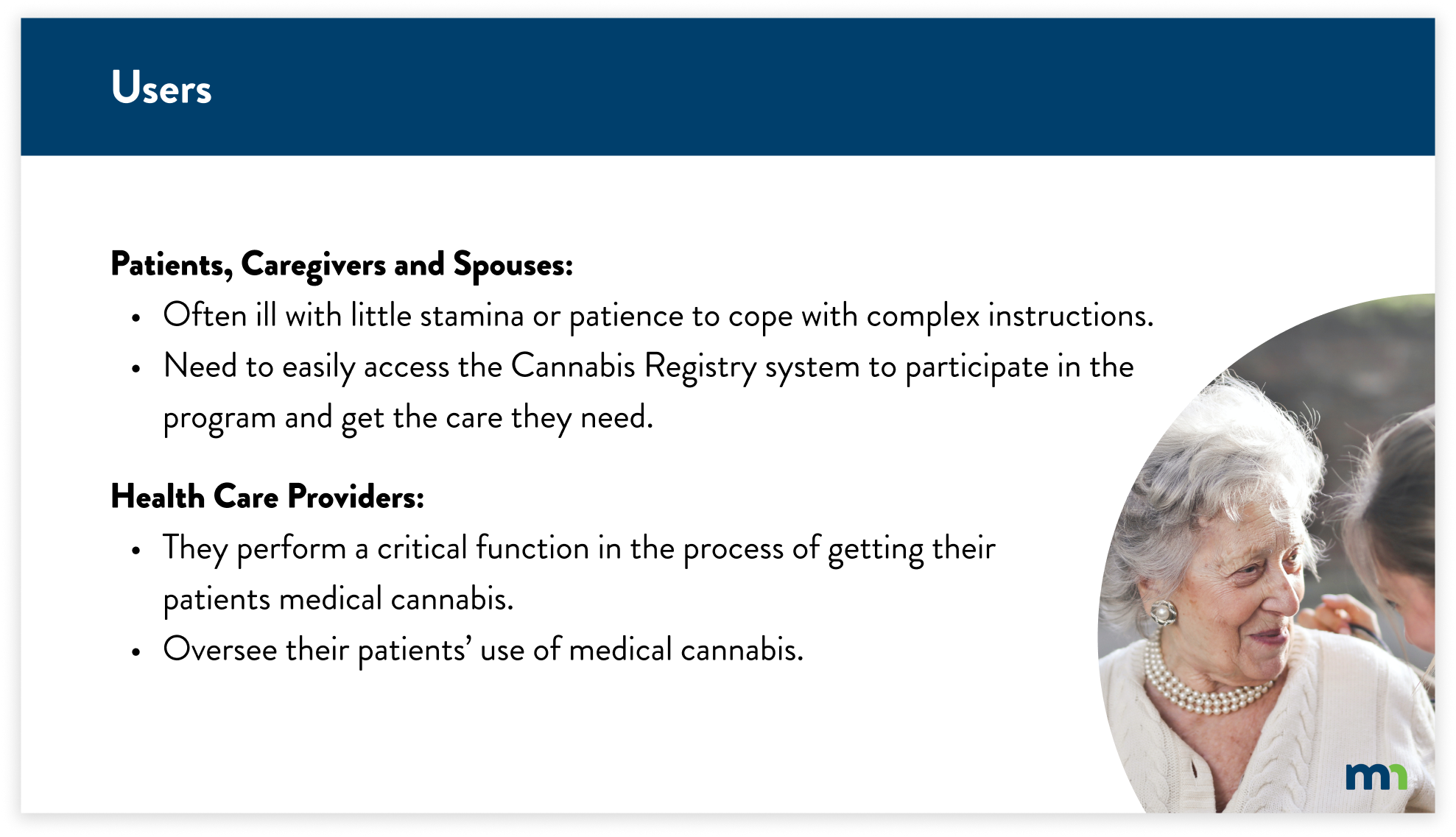
Users
Parents: Looking for educational programs for their children and youth-friendly activities that are related to nature; interested in enrolling their children in a nature-focused preschool; looking for a party venue
Pre-K and K-12 Educators: Looking for field trip locations and nature-related outreach programming
Secondary Users
Individuals: Passionate about nature and looking for new places to explore, and access nature-based programming for themselves, possibly even volunteering some time back to Dodge (e.g. photographers, and hikers)
Donors: Looking to support worthy organizations that promote environmental stewardship and education.
Initial Research Findings
From the Dodge Nature Center brief, our team determined that gathering collected data through the process of heuristic analysis was the best course of action. We found that navigation throughout certain parts of the site was very misleading. Clicking a button on a certain page would take you to the previous page even if it seemed as if it were to take you to a new page. Our team, as users, also felt like the website did not offer a deep visual understanding of what Dodge actually offers at their facilities because there was a lack of real-life experiences shown on the website. After synthesizing our findings, we concluded that navigation and user flow were the main problems that the website had.
Usability Testing
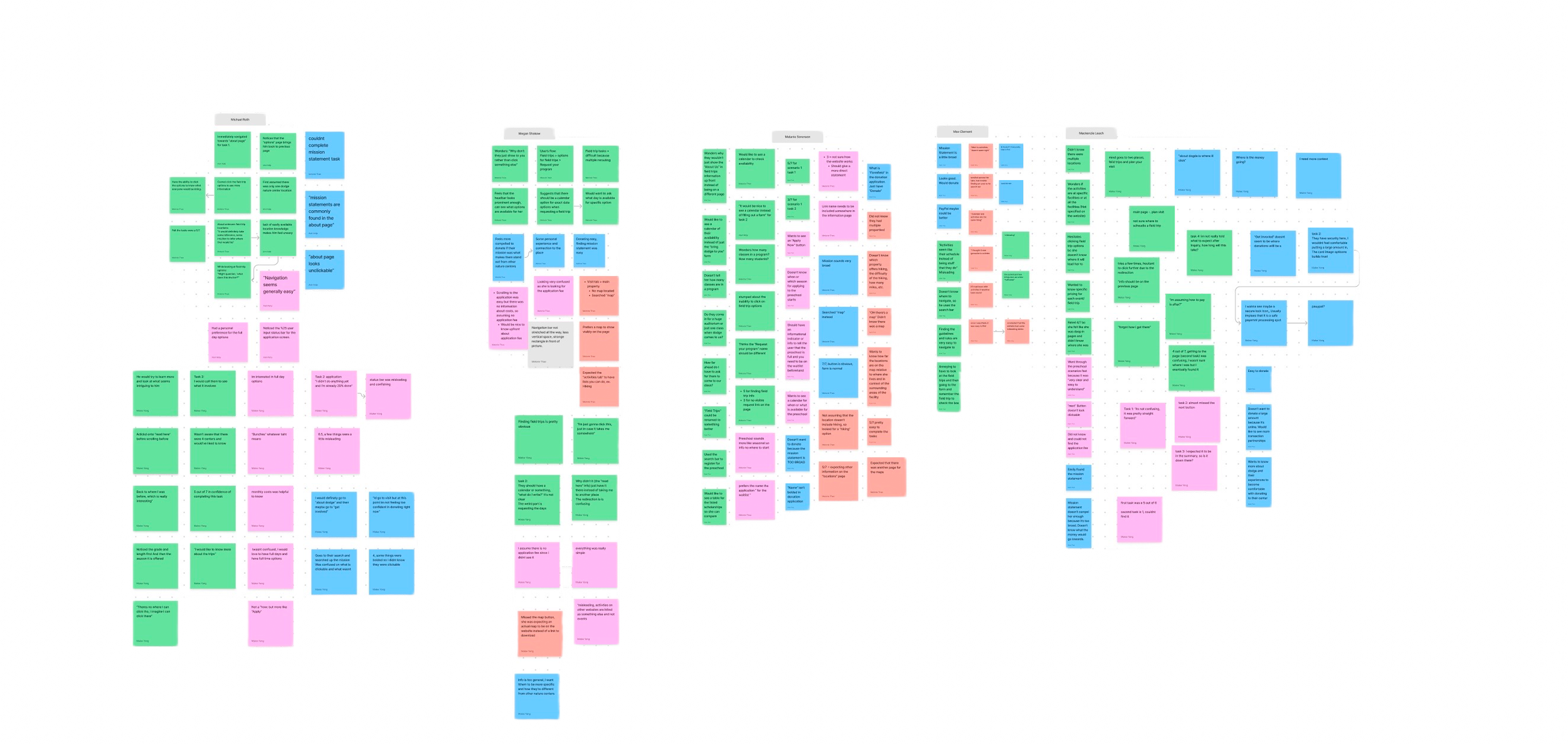
After our initial research and findings, our team conducted usability tests. We had a total of five participants. Four out of five participants were users that Dodge wanted as a target audience: Parents, educators. Prior to usability testing, our team wrote a script with four scenarios. Each scenario had 2-4 tasks each along with follow-up questions. The scenarios were based on what Dodge’s target user groups were: Parents, educators, donors, and individuals. The tasks were inspired from the key tasks Dodge had listed in their brief: Field trip programming, finding relevant information for preschool, camp options, registering, donating money, and finding property maps for hiking. We also asked quantitative follow-up questions such as “On a scale from one to seven, how easy was it to complete this task?” This would allow our team to have a better understanding of how the user felt rather than having the questions be just a yes or no question. Our team conducted the tests on Zoom with each session being a total of 30 minutes.
Usability Test Findings
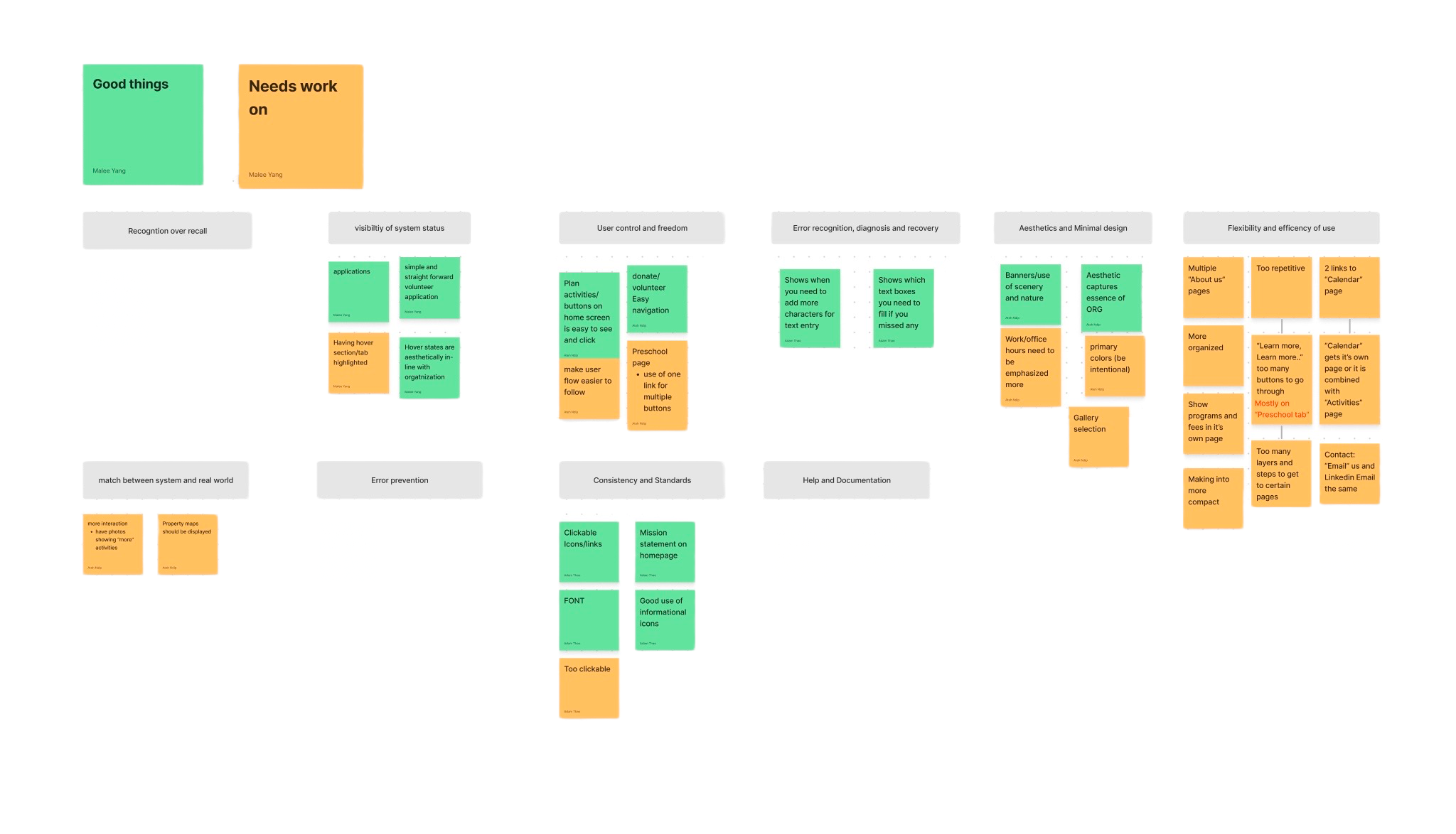
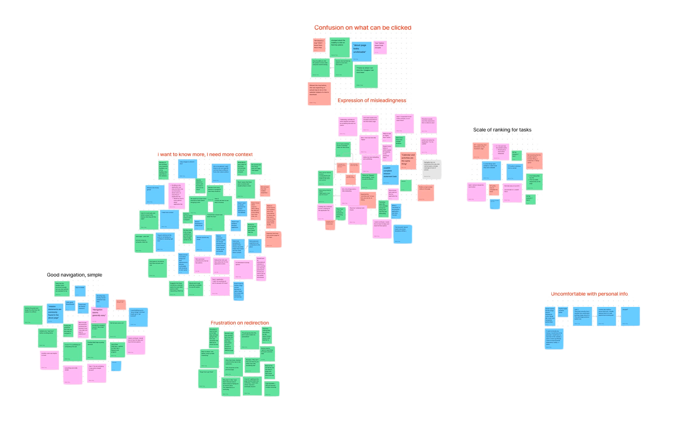
After conducting the usability tests, our team gathered all of our notes into a FigJam. Through affinity diagramming, we synthesized the notes by each participant and scenario. With this information, we individually were required to choose five key findings that we thought were the most impacting. I chose these five findings:
1
2
3
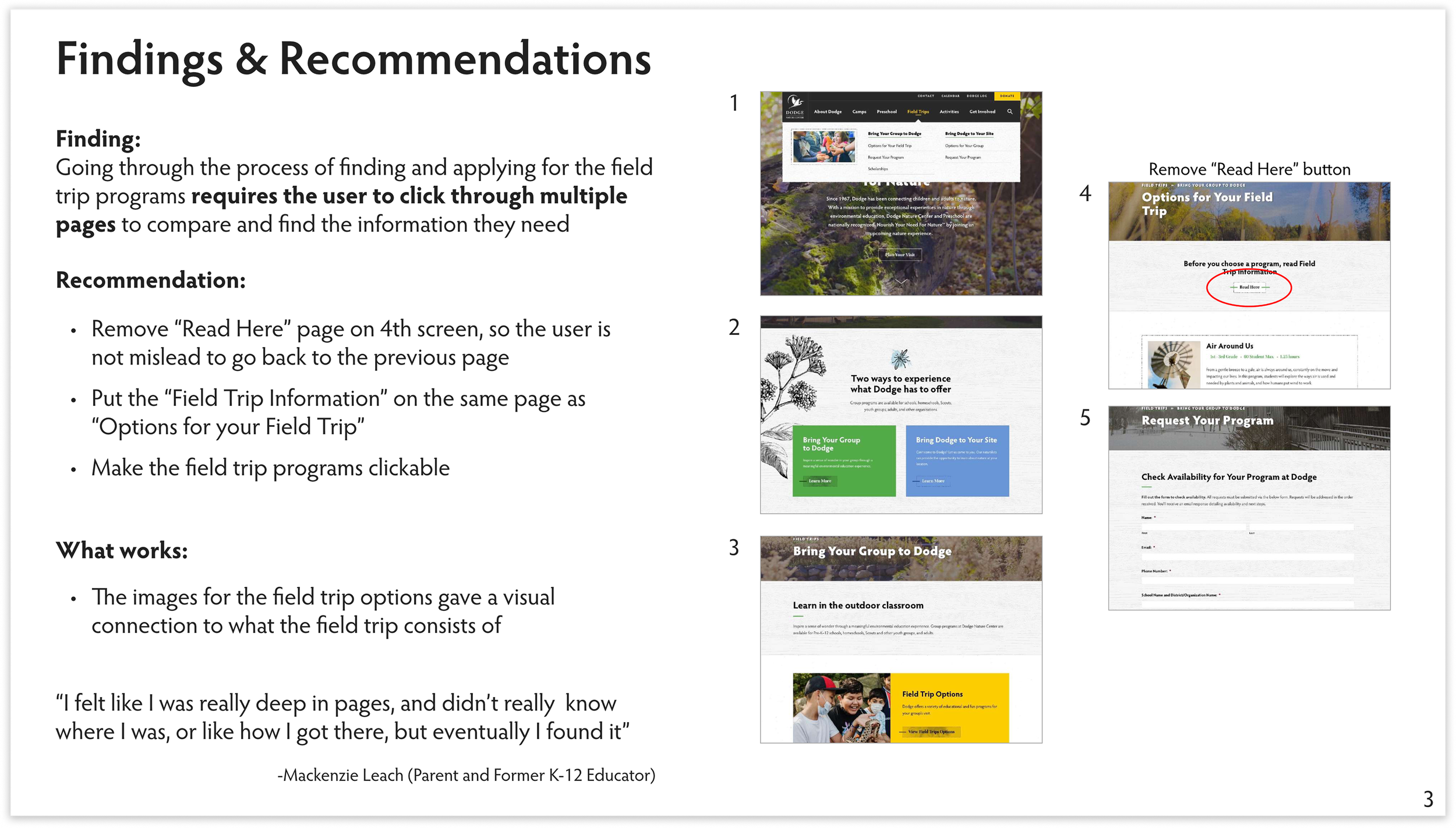
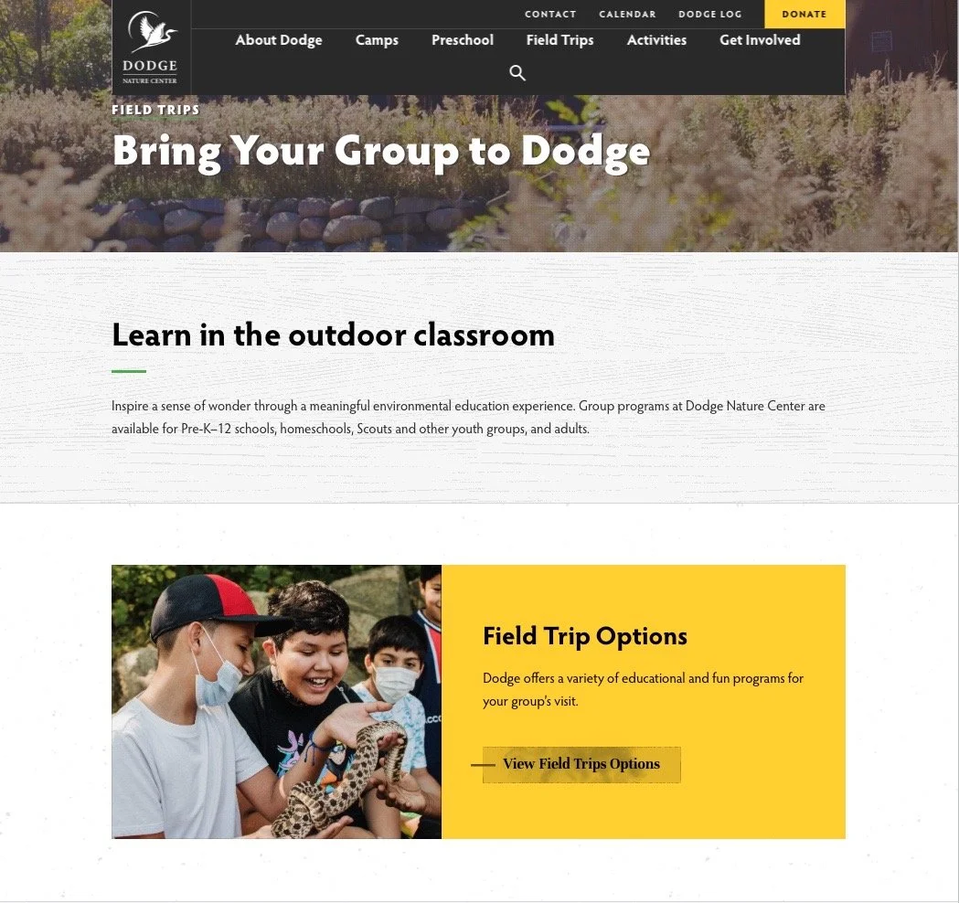
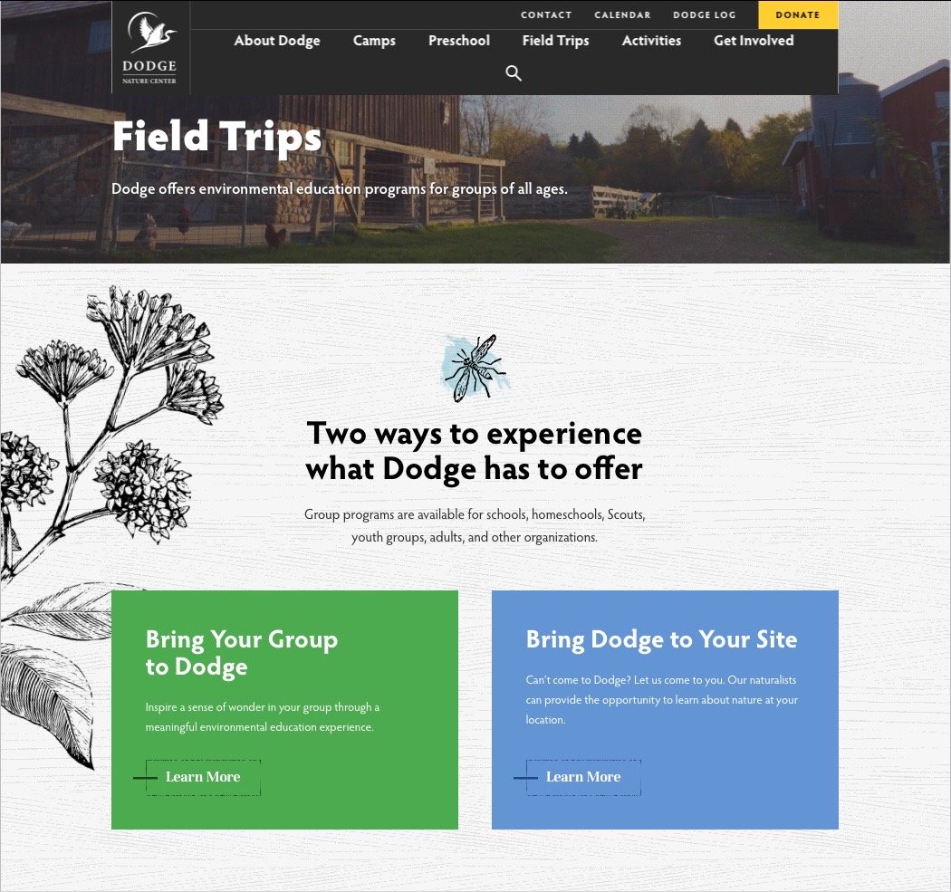
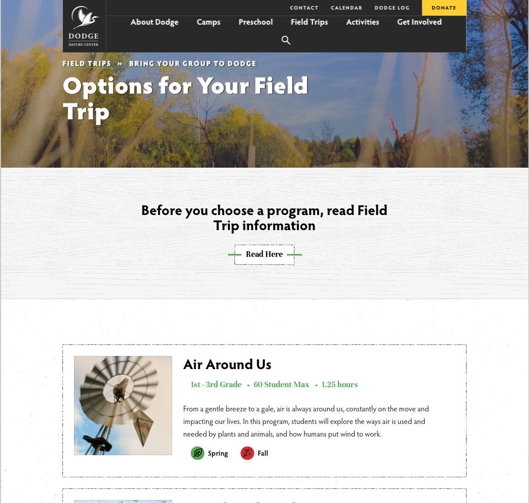
Going through the process of finding and applying for the field trip programs requires the user to click through multiple pages to compare and find the information they need.
Users often have a hard time locating the property maps because there is not enough contextual information.
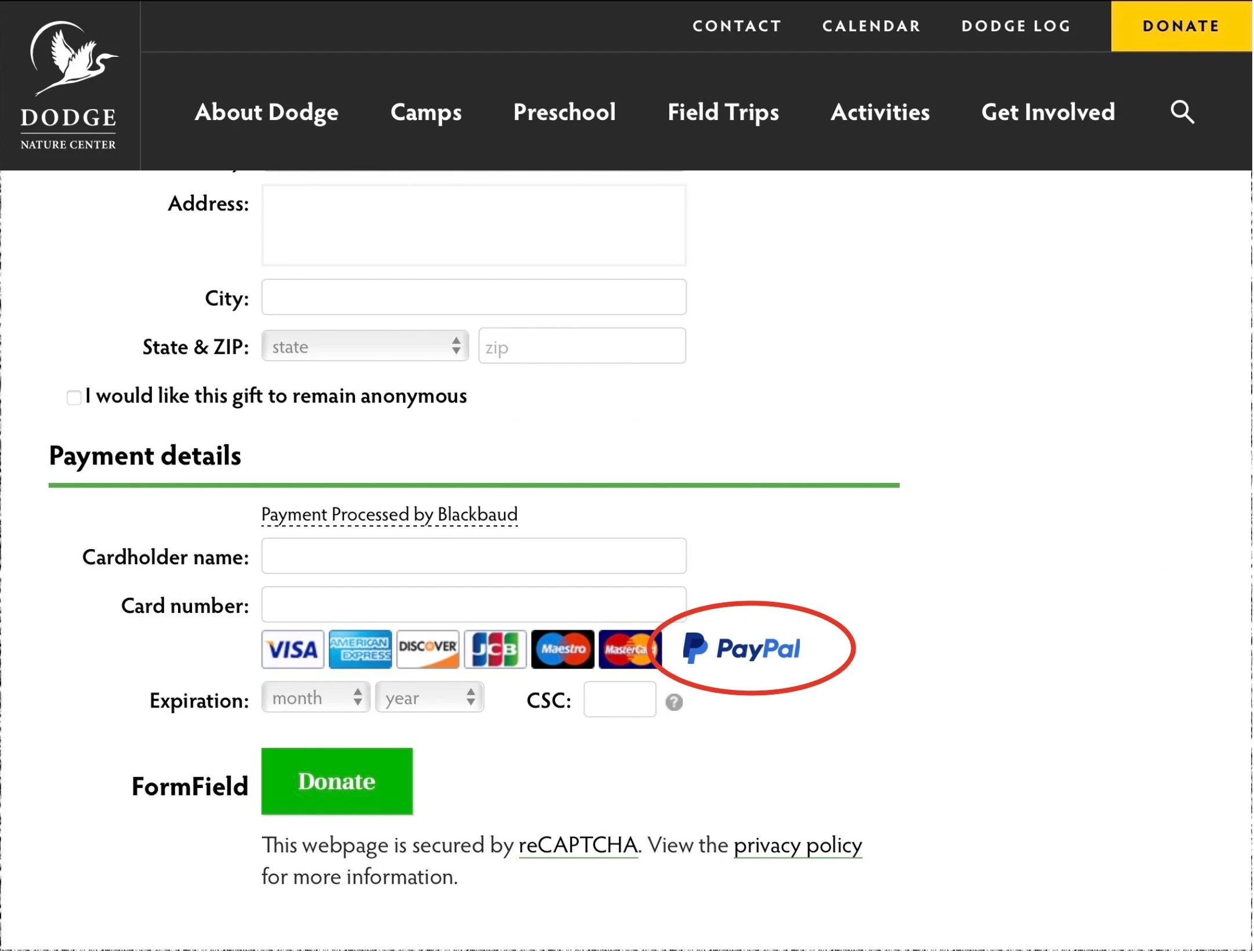
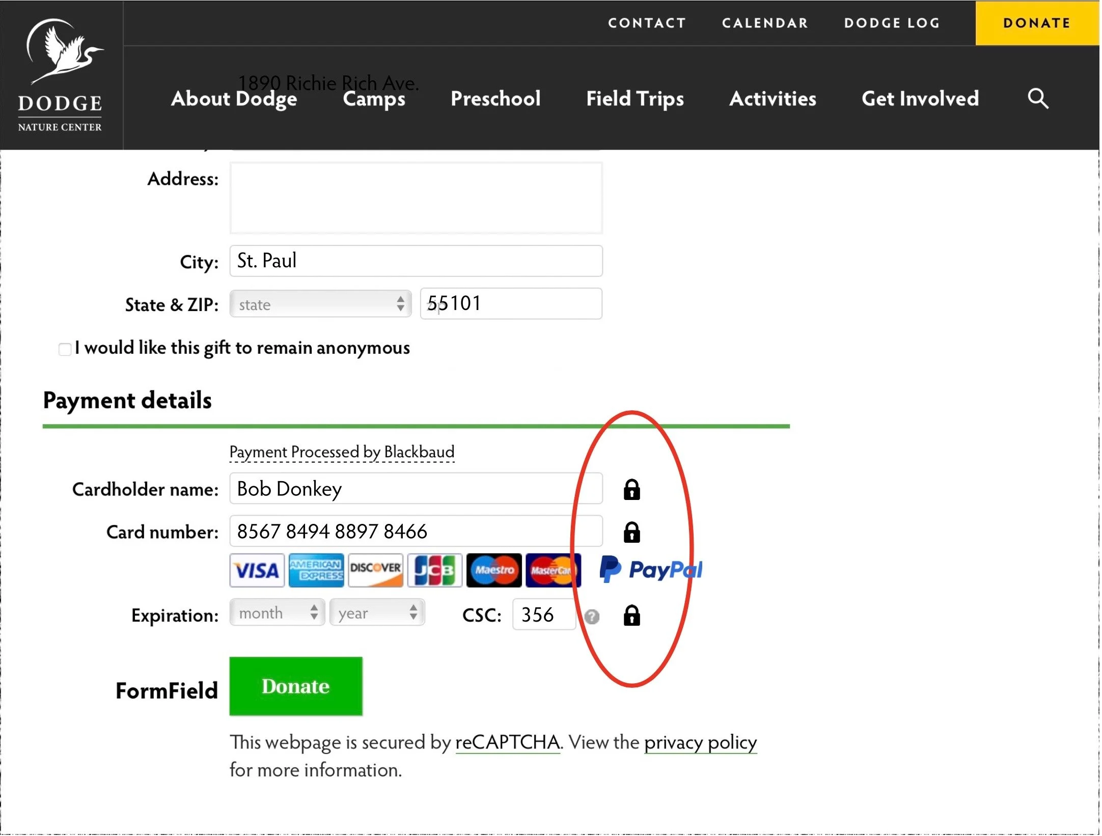
Users are often not comfortable putting personal information, especially when it comes to the donation page.
4
5
The website tells, but does not show, visually, a personal experience in what Dodge Nature Center has to offer
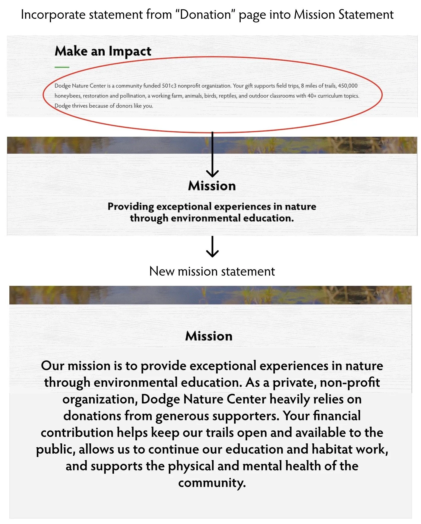
Users were not compelled enough by Dodge’s mission statement to donate a large amount of funding.
Recommendations
With the key findings puzzled out, I came up with 2-3 different recommendations along with visual annotations and prototypes for each finding. In addition, I also added information about what worked in these different findings:
1
3
5
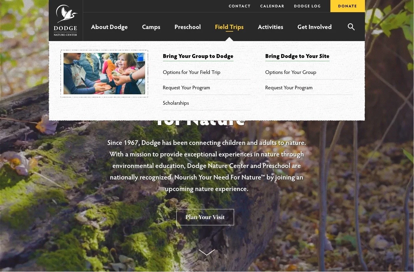
Clicking through multiple pages:
Remove “Read Here” page on 4th screen, so the user is not mislead to go back to the previous page
Put the “Field Trip Information” on the same page as “Options for your Field Trip”
Make the field trip programs clickable
Not comfortable putting personal information:
Have information listed that explains the personal information will be protected before applying
Have a secure or lock icon to help users visually connect the context that their information is protected
Not compelled enough by Dodge’s mission statement :
Tailor the mission statement to what the nonprofit company specifically wants the user to experience
Provide additional information in the mission statement about where they will invest the donation money
Provide additional information about what Dodge’s specific cause is geared towards users and nature
2
4
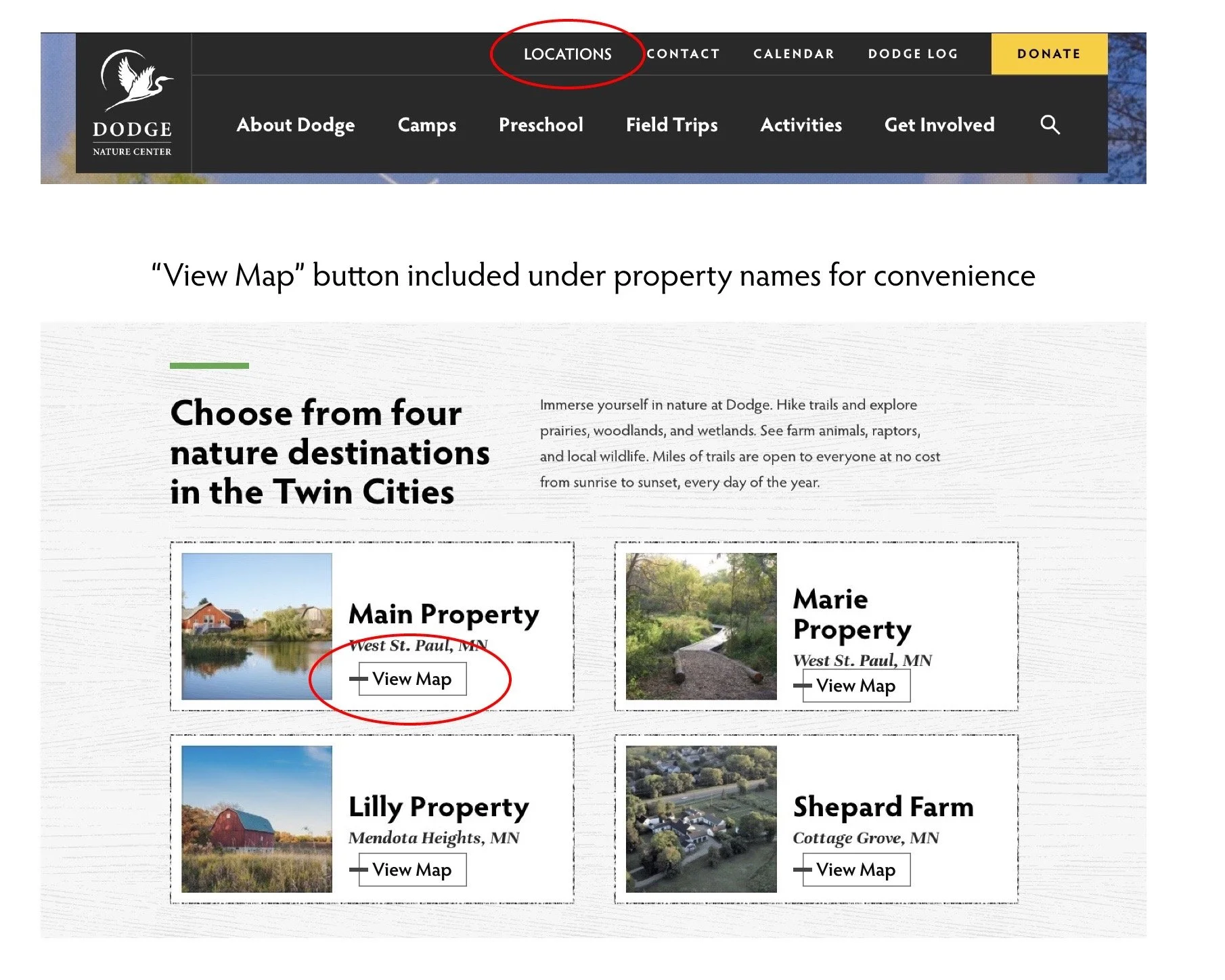
Hard time locating property maps:
Have a tab in the navigation bar that is titled “Properties” or “Locations” to let the user easily identify the locations
Put an option to view or download a map under each property name
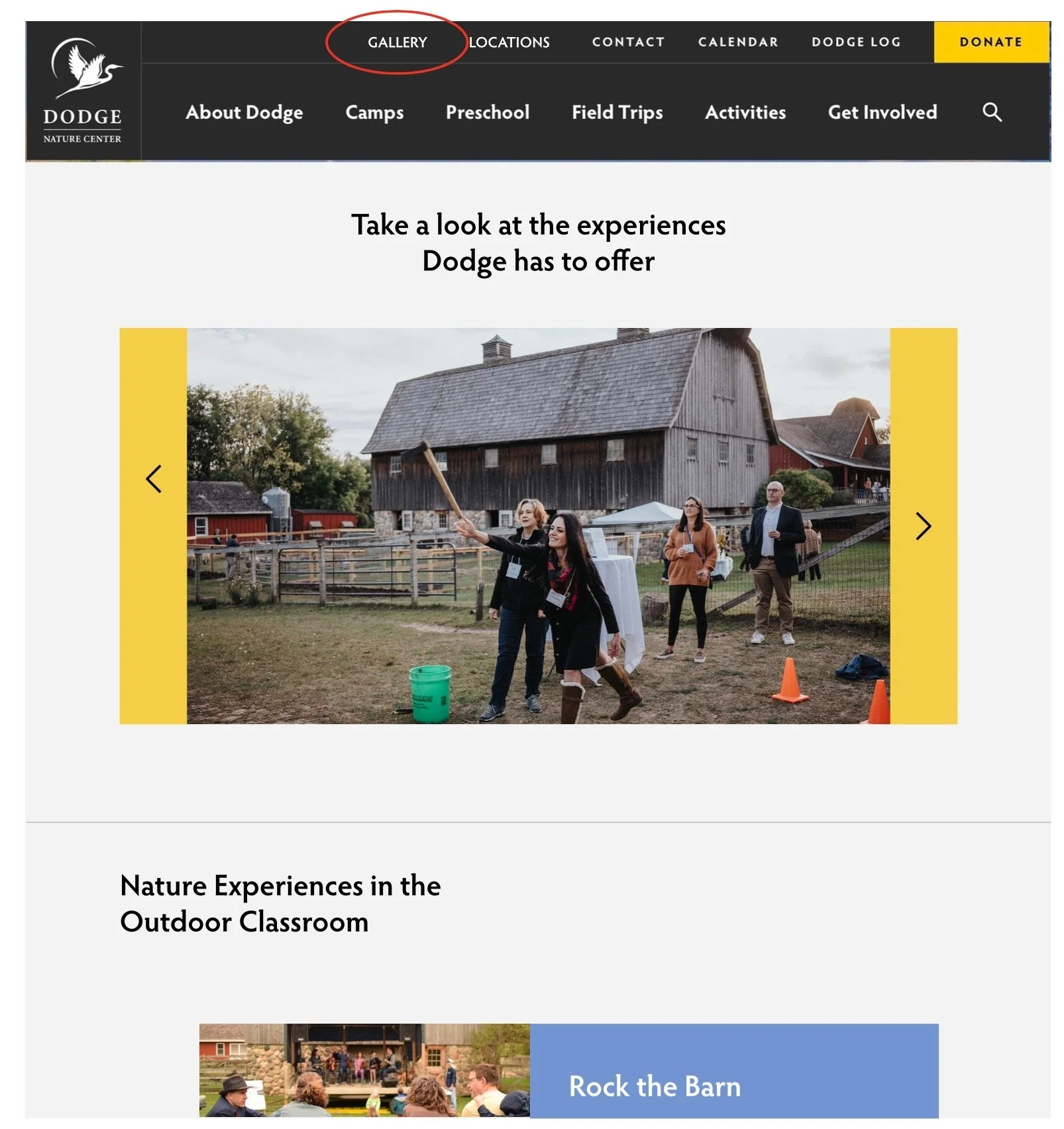
Tells, but does not show, visually, a personal experience:
Include a page in the navigation bar titled “Gallery” for users to look into the experiences of Dodge. The gallery will contain photos of some real-life experiences at Dodge to help users have a better look into what Dodge offers.
Next Steps
The next steps for the research report I would like to continue adding more recommendations in addition to the already listed ones. Important questions that I would ask relating to the next steps are: Are there better ways to improve the website other than the recommendations listed? What if the recommendations are only catered towards those five participants? Could those recommendations not be needed if more participants had done usability testing? For this project, I would also think about actually implementing the changes into a working prototype to see if the recommendations would ultimately improve the website as a whole.