

A mobile app designed for groups and families who want a user-friendly and convenient food delivery service with the ability to have shared accounts between users.
Overview
The intent of this project is to create an app advocated by user and market research, focusing on the question of how might we make food delivery apps more meaningful?
Methods & Tools
Figma
User flows
Wireframing
Prototyping
Affinity Diagramming
Comparative/Competitive Audit
Directed Storytelling/Interviews
The Problem
Currently, the majority of food delivery apps only support individual users and are often are overwhelming, especially when it comes to group use. Groups and families want a user-friendly and convenient food delivery service with the ability to have shared accounts between users in order to easily navigate each member's dietary needs.
The Solution
A food delivery app consisting of concise information, appetizing food photography, and the ability to easily switch between multiple profiles. This will give users a user-friendly interface and allow for a convenient food delivery service for multiple users on a singular account.
Directed Storytelling
After conducting market research, two participants who have used food delivery services were interviewed. The directed storytelling findings were synthesized by using a method of affinity diagramming and sorted into two categories: pain points and opportunities.

“I want to be able to use same account but have my own profile where all my info is and can easily switch to husbands account if needed”
Participant 1
Wants feature where one credit card pays for everything on a family account, but can have access to any account in order to accrue points as a family and friend group
Participant 2
Felt clunky and cluttered using current food delivery apps. Hard to navigate and contains an overwhelming amount of information and choices to select from
“I felt very flustered using a lot of the apps, but I had to make do with what I had”
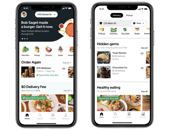
Competitive Analysis
I started by looking at the existing food delivery apps in order to understand how their interface and features tailored to user needs. I found that the majority of the app's interfaces were all very similar and overwhelming.
Key Findings
1
2
3
Food delivery apps do not need to be solely changed, but instead needed to be added upon.
Users want more personalized selections instead of having tons of arbitrary options to choose from
The current market of food delivery apps are not user-friendly and quite hard to navigate
Sketches
Starting the design process, I had to choose between focusing on fidelity or prototyping for the app. I chose to focus on fidelity, so the app could convey a detailed picture of how it would look like as a final product. First, I sketched three very rough wireframes of ideas that represented solutions for the users: A home screen tailored to the user, a screen for shared accounts and onboarding questions.
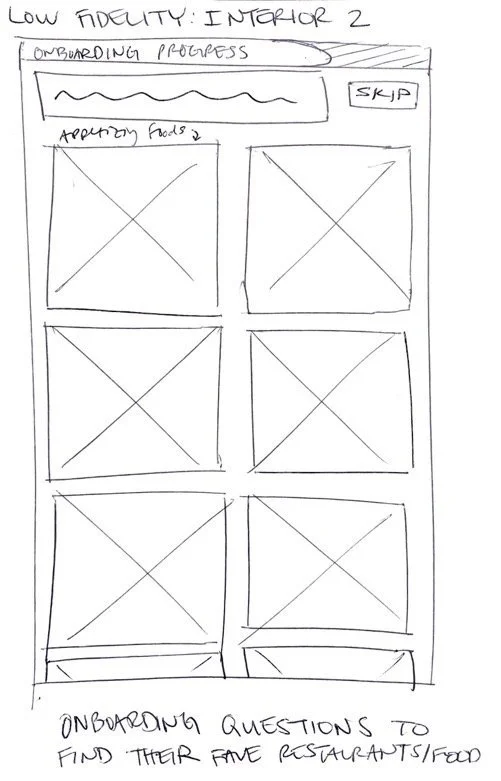
Onboarding
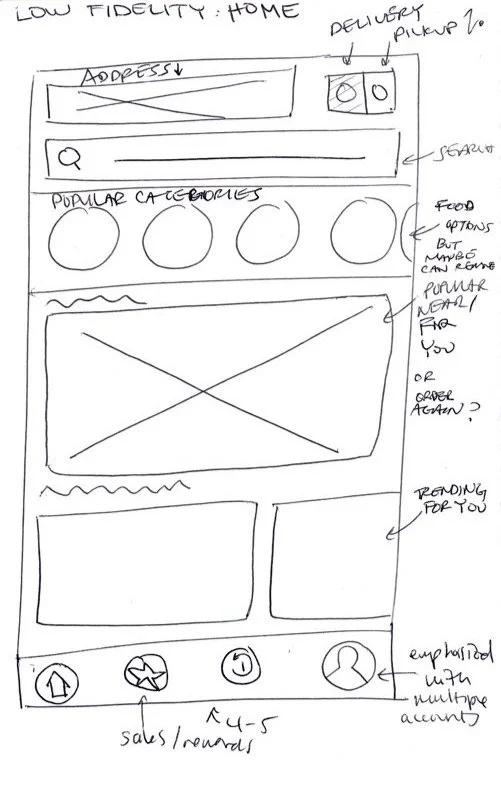
Home Page
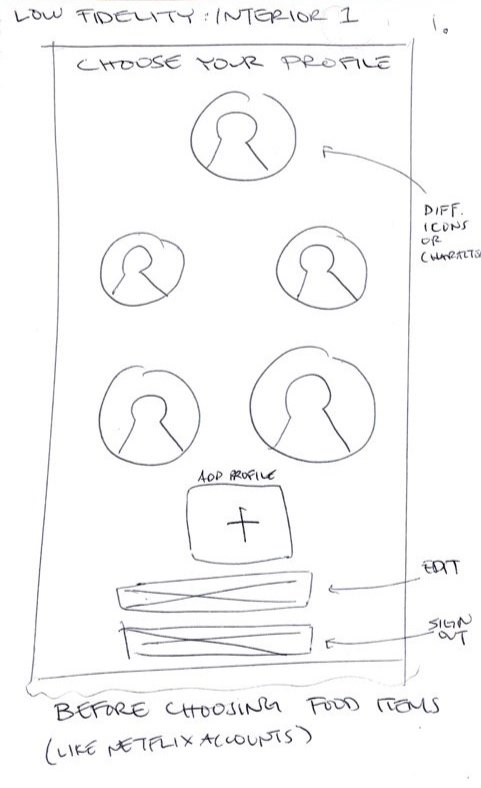
Manage Accounts
User Flow
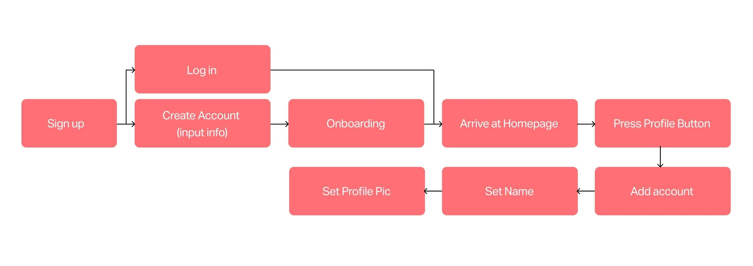
After sketching low-fidelity wireframes, I created a user flow in Figma to see how my app would navigate and function with these features. I decided to drop my sketches into Figma as well since they would be the foundation of my wireframes.
Prototype
For the tailored home screen, I designed a “trending” and “your top restaurants” title to make sure the user doesn’t have unnecessary information. Designing the onboarding questions goes right along with the tailored home screen. In order to have a home screen tailored to the user, the app is designed so that the user can take the onboarding questions to have an overall more personalized experience.
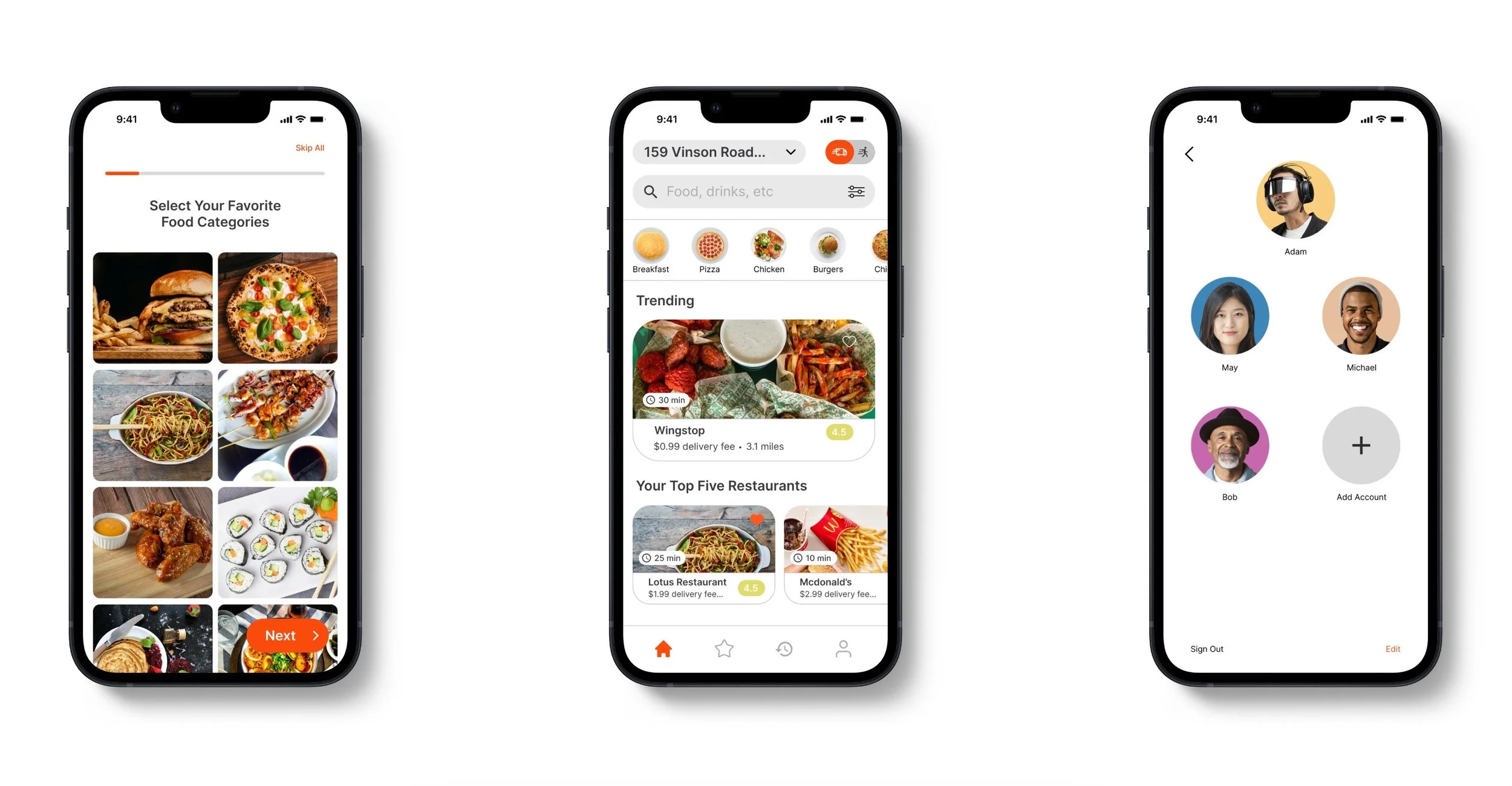
Onboarding
Home Page
Manage Accounts
Next Steps
The most important unknowns remaining are: Will there be any other benefits to the shared accounts? Is there a way to have accounts that are tailored to younger users? I would also like to add a feature where a main account can access the other accounts' dietary needs, so it could benefit users by making certain tasks more convenient. I would also think about putting a new button in the navigation bar where it manages the accounts, so the feature can be more emphasized.


"It's like Netflix, but with food"
-Anonymous Participant