


MN HEALTH REGISTRY
Findings and Prototype Recommendations / 2023
This case study intends to find key insights through research to prototype improvements for the MN Department of Health Cannabis Registry. The prototype goal is to create a true mobile experience similar to the desktop experience, with efficiency, consistency, and ease of understanding.
METHODS & TOOLS
Figma
Kano Analysis
Heuristic Analysis
Competitive Analysis
Prototyping
Usability Testing
Cognitive Walkthrough

Protect. Maintain. Improve.
Client Overview
The Minnesota Department of Health’s (MDH) mission is to protect, maintain, and improve the health of all Minnesotans. Their vision is for health equity in Minnesota, where all communities are thriving. Currently, MDH offers many websites to the public as resources for licensing and certification, one of them being the Minnesota Cannabis registry (MCR).

The Problem
The Cannabis registry has multiple areas of improvement. Currently the website is responsive, but lacks a true mobile-friendly user experience. This can prohibit users to complete their registration efficiently due to:
Inconsistent patterns of design and layout
The difficulty of understanding each task the user has to accomplish
The Solution
Focusing on user feedback, visibility, and user flexibility and freedom,
we hope to:
Eliminate inconsistencies and frustrations throughout the website in order to bring a modern mobile user experience.
Provide a modern mobile user experience that is intuitive and easy to understand for the diverse communities within Minnesota.


Primary Users
Patients, Caregivers and Spouses:
Often quite ill with little stamina or patience to cope with complex instructions.
Need to easily access the Cannabis Registry system to participate in the program and get the care they need.
Health Care Providers:
Trying to give their patients access to medical cannabis and oversee their patients’ use.
They perform a critical function in the process of getting their patients medical cannabis.
Cognitive Walkthrough
From the MNIT Cannabis Registry brief, we determined the best course of action was to find what users needed to accomplish the registry process. Our team navigated the registry through the process of a cognitive walkthrough. Through the cognitive walkthrough we:
Simulated User Tasks
Uncovered design flaws and barriers
Made informed recommendations for improvements
Heuristic Analysis
After conducting the cognitive walkthrough, our team carried out a heuristic analysis to help support our findings through design principles. With this, we found:
Certain actions are not very visible to the user. This causes them to take a longer time completing certain tasks
A lot of inconsistent areas with text and buttons
User flexibility and freedom (redo, undo, go back)
Users don’t get feedback and become confused on whether they completed the task correctly or incorrectly
Usability Tests
After completing a cognitive walkthrough and heuristic analysis, our team conducted usability tests with a total of five participants. This allowed us to gain new insights that we haven’t seen previously. Conducting usability tests also vouched for the key findings from both the cognitive walkthrough and heuristic analysis further supporting our research findings.

“Should never use underlined words because I thought it was a link.”
- Participant One
“Wait a sec, did it add a second document?”
- Participant Two
“Confusing after uploading ID photo because it still has an upload button.”
- Participant Three
Key Findings
These research findings led us to create four overall key findings that would give a clear direction for what we needed to solve:
1
2
3
4
Lack of user flexibility to go back between pages.
Lack of feedback when an image uploads successfully and is removed.
Visibility with certain actions conflict with the registry process.
Inconsistency with design of buttons.
Constraints
Working with the state of Minnesota, we had to follow certain guidelines for legal rules, accessibility requirements, and design direction. With our key findings in mind, we had to shift our solutions slightly due to these constraints:
1
3
4
5
For legal reasons, most of the written content had to remain untouched.
Certain designs had to remain untouched for accessibility reasons.
We closely followed a style guide given to us by the client.
Process of registry had to follow the original user flow.
Design for desktop website needed to translate to mobile website.
2
Finding: Lack of User Flexibility
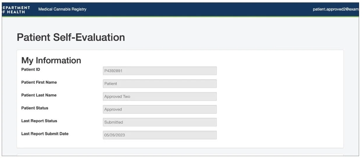
For the first finding, the lack of user flexibility, we found that users often used the back button in their browser because they felt lost when it came to navigating pages, especially on the patient self-evaluation page. We found that they often viewed the information and then paused due to confusion on how to get back to the home page. This caused them to use the back button of their browser because there aren't any visible buttons guiding the user back to the home page.
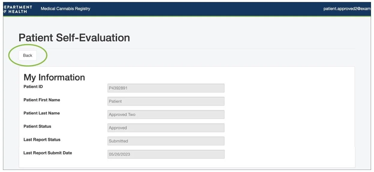
Recommendation: Lack of User Flexibility
To solve this issue, we created a back button that would allow the user to easily know how to navigate back to the home page. This would allow users to easily identify the back button because it is right at the top of the page. Users can identify that clicking the back button would take them back to the home page where they can access and edit their personal information.
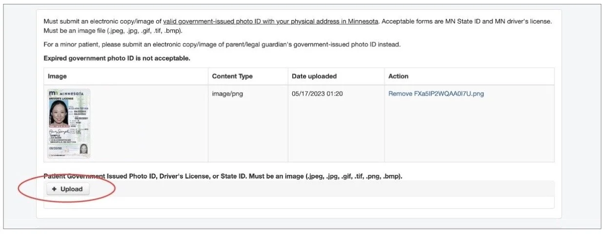
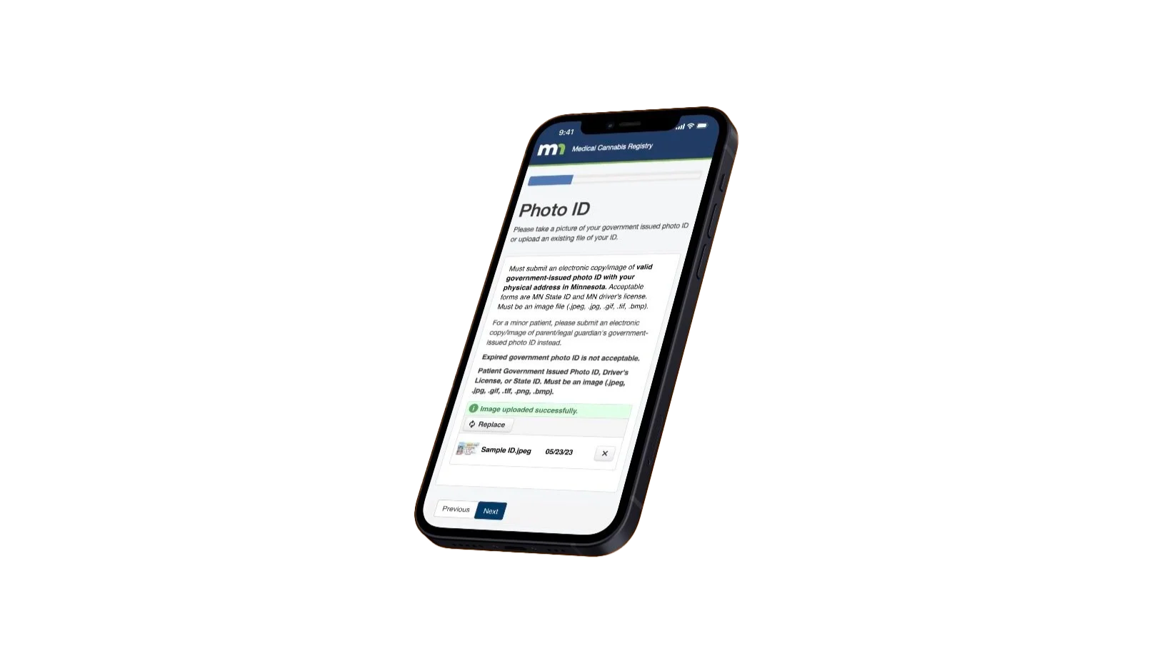
Finding: Lack of Feedback
For the next finding, the Lack of Feedback, we found that users often thought they were required to upload more than one photo of their ID because there wasn’t any feedback letting the user know that the image of their ID had uploaded. In addition, the upload button was still present after uploading an image. This caused users to become frustrated and confused thinking they had to upload multiple images.
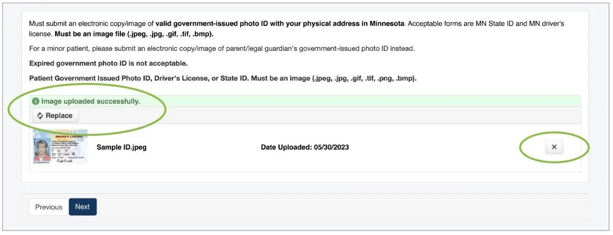
Recommendation: Lack of Feedback
Our solution for this was to change the upload button after uploading an image and add confirmation to let the user know they have uploaded an image successfully. In addition, we also reformatted the layout of the feature to match the overall simplicity of the website, while still containing all of the previous information.
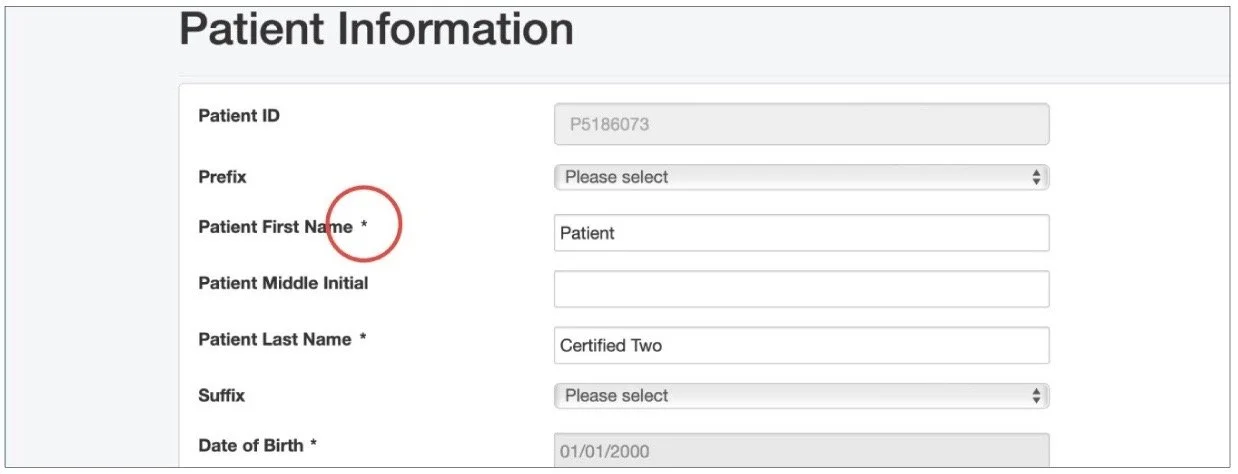
Finding: Visibility
Now we can move on to the next solution, which is visibility with certain designs of the website. For this finding, we found that it was difficult to know what information was and wasn’t required to fill out, specifically because the asterisks blended in with the overall text of the page. This caused users to take extra time to fill out information on certain pages.
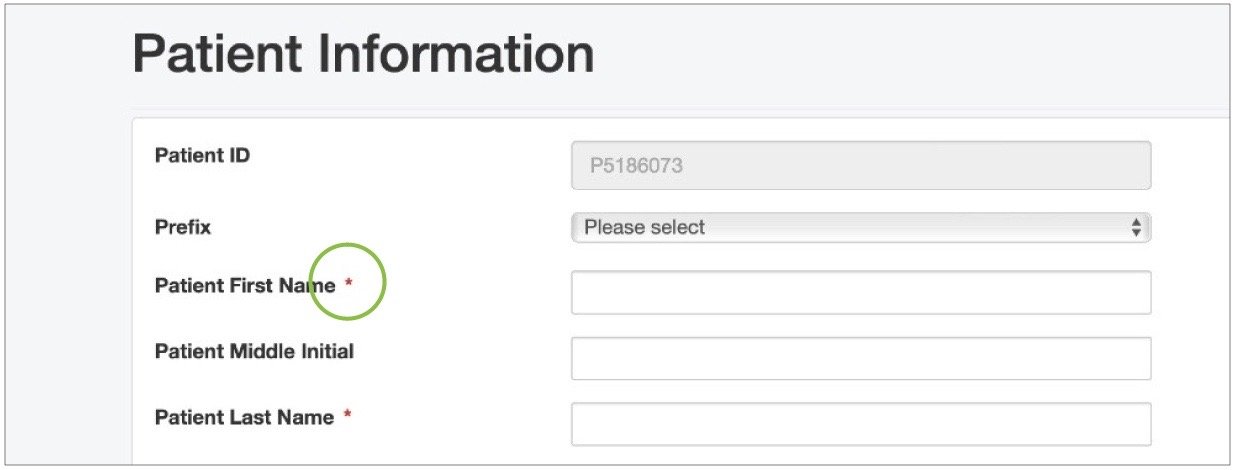
Recommendation: Visibility
To combat this, we decided to change the color of all of the asterisks into a red color. This allows users to easily identify what required information they would have to input and would allow them to navigate through the registry more efficiently.
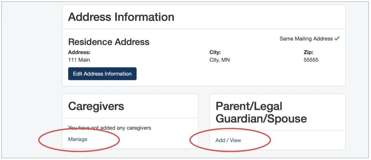
Finding: Inconsistency
For final finding, we found that there were multiple inconsistencies with the design throughout the entire website, specifically with the design of the buttons. The design of the buttons ranged from buttons with blue text (circled in red) to white and dark blue boxes with text. This causes the overall website to not feel cohesive and consistent to the user. Users had a difficult time knowing if buttons were clickable because they were not consistent with the existing buttons.
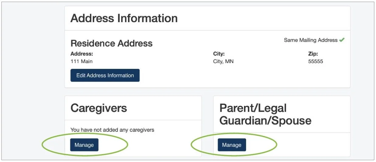
Recommendation: Inconsistency
To solve this issue, we replaced the inconsistent blue text buttons with the already-existing buttons. Instead of having two buttons for adding a parent, legal guardian or spouse, Now users will easily know that they can edit their information by clicking on “Manage”.
Next Steps
Due to time constraints and key factors to focus on, we were not able to implement every solution based on our findings and research. We’ve considered these five main criteria to implement as we look into the next steps of this project:
1
2
3
4
5
Trying to reduce the amount of legal text.
Adding a language function for non english speaking users.
Determine more potential issues for a larger demographic through usability tests.
Implementing more feedback that we received from our research.
Finding out ways to show current status enrollment.