

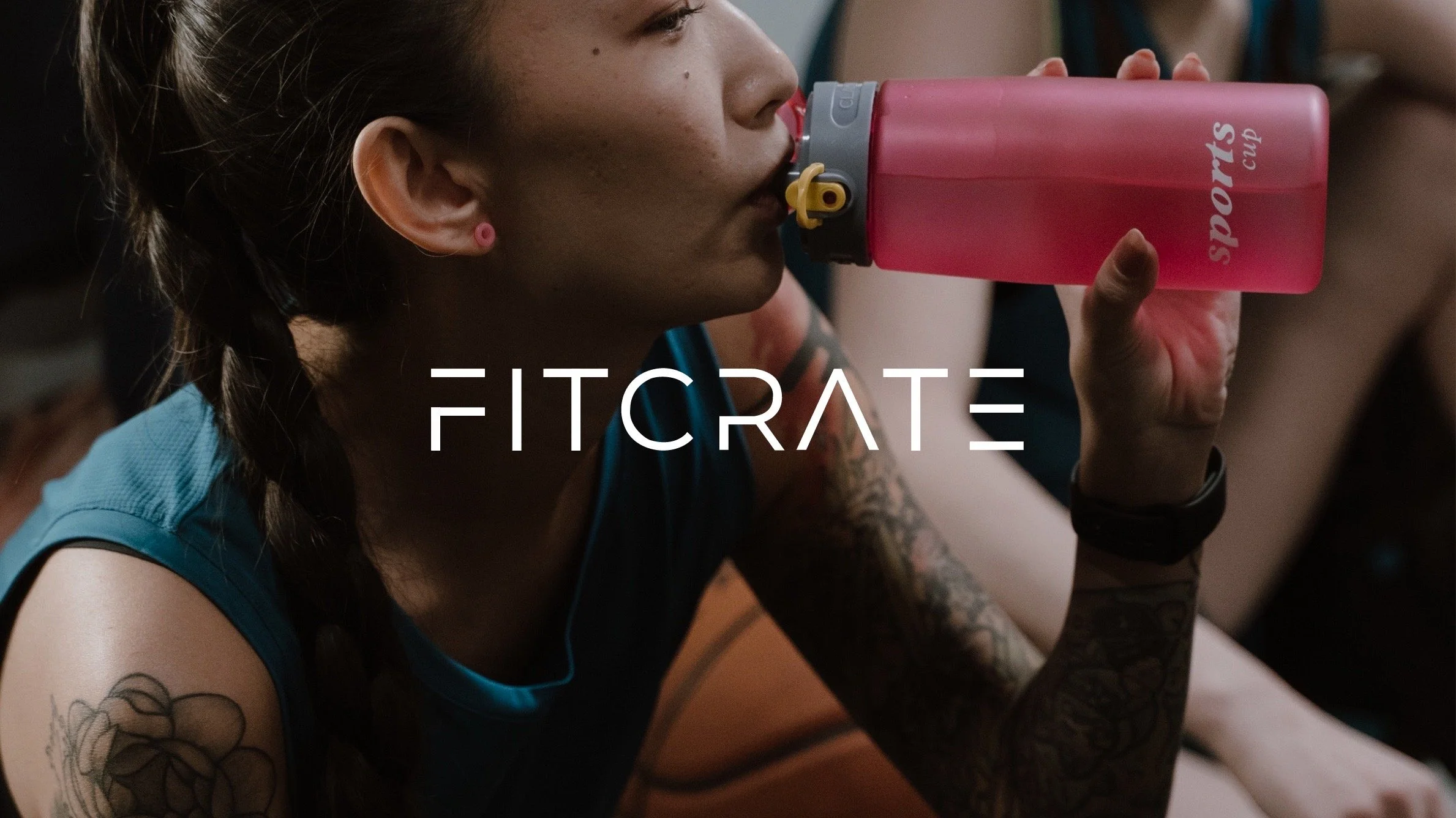
Achieve a greater you
Fitness Supplement Website
A website designed for beginner and intermediate fitness goers who want to know what supplements are best for them, personalize their products and select from a wide variety of supplements.

Methods & Tools
User Flows
Directed Storytelling
Competitive Analysis
Prototyping
Ideation
Figma
The Problem
Every individual is unique and has their own health goals whether they’re a casual fitness goer or an avid weightlifter. The inability to have personalized nutrition, knowledge of what works best for each individual, and a way to receive supplements in one package directly to consumers is definitely a recurring problem.


The Solution
A website where users can easily know what supplements are best for them, customize their own subscription box plan, and be able to select from a wide selection of supplements in order to achieve their health and fitness goals.
Directed Storytelling
The first part of coming up with the solution (Fitcrate) was conducting user research. Directed storytelling through interviews with three participants allowed me to really understand the different pain points when it came to buying or using nutritional supplements.

"What if I don’t even need it? What if I am wasting my money? How will I know it will work? It needs to address the skepticism”
Participant 2
Wants feature where users can see all the ingredients, key ingredients, and specific information about the supplements they are purchasing
Participant 1
Wants to see reviews and numerous amount of real-life feedback because it allows users to gain a higher trust compared to just believing what the product says
“For me, I think actual reviews are so beneficial because you can somewhat feel the frustrations or experiences that they have had with the products. It gives trust”
Participant 3
Wants to receive all of their products online and in one package rather than having to get each product individually
“I would like to order online because it’s easier and I don't have to drive there. I wish it would all come in one single package instead one multiple”


Competitive Analysis
After user research, I conducted a competitive analysis to help me identify the strengths and weaknesses of the current competitors and allowed me to identify opportunities to create a product that could exist in the current market space. There were six competitors: Gainful, Ritual, Cratejoy, Hungryroot, Pluto, Bespoke Post. Gainful — a supplement subscription based company was the main competitor.
Insight Summary
Through directed storytelling and analysis of competitor websites, I discovered that users want an easy way to find supplements catered to their needs, why the products are good for them, and want to be able to trust the information presented.
1
2
3
Users want to have an easy way to find personalized supplements
Users want to know what products are the best for them and why
Users want to be able to trust the information presented for supplements
CRITERIA
Variety
Personalization
Trustworthy
Knowledge
Key Criteria
These insights led me to making sure that Fitcrate would have personalization, provide trustworthy and knowledgeable information, and offer a wide variety of quality products. These criteria would be represented in features of a questionnaire, product customization, and reviews and partnerships with different supplement brands and companies.
1
2
3
Have a questionnaire to get suggested products for the user
Be able to adjust and customize products in the bundle
Be able to see the partnerships and reviews to add trustworthiness
Wireframes
I started implementing the criteria in the design of my website. I ideated and came up with how each key feature would look like.

Homepage
Onboarding
Partnerships
Customize Products

Site Map
After sketching low-fidelity wireframes, I created a site map in Figma to see what the website would contain with its key features.
User Flow
In addition, I created a user flow in Figma to see how the website would navigate and function in the most common scenario as a beginner or intermediate user.


Design Language
After wireframing, I created a style guide to have a better understanding of how the website’s aesthetic and typography would look like. I wanted to convey a serious, modern, and uplifting aesthetic for the website.
Take the Quiz
This feature allows users to take a quiz in order to find out what specific products are best for them. After finishing each question, the user submits their information to receive a bundle of supplements relating to the quiz answers. This feature is completely optional, but highly recommended for beginner and intermediate fitness goers. If users do not want to take the quiz, they can explore and create their own subscription bundle from a wide variety of products.


Customize your Products
Users are able to look at the key ingredients of products and customize their bundle. In addition, users can explore a wide variety of products that are similar to their suggested products. This gives the user convenience and flexibility when obtaining the right supplement.
View Partnerships
This page allows users to view the different partnerships that Fitcrate partners with to gain a higher level of trust in Fitcrate’s selection of products. The user can scroll through the carousel and view more information about each company.

Next Steps
Some things that I am excited to dig deeper into is finding more ways to compare the products that are listed. For example, maybe thinking about having a way to compare two products side-by-side or maybe even looking into more ways of verification for high quality products. I would also like to ask the questions: how will Fitcrate keep users up to date when obtaining new partnerships or can Fitcrate offer its own brand of products while still having partnerships?


Challenges
Some challenges creating this product was focusing on the design language of the website, while also making it entirely functional. Another challenge that I personally faced was making sure I focused on the overall product rather than spending a lot of time perfecting one little area or feature of the website.